Make a Bar Chart Online with Chart Studio and Excel
Bar charts with Chart Studio
Upload your Excel Data to Chart Studio's Grid
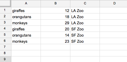
Open the data file for this tutorial in Excel. You can download the file here in CSV format
Head to Chart Studio
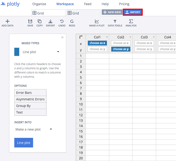
Head to the Chart Studio Workspace and sign into your free Chart Studio account. Go to 'Import', click 'Upload a file', then choose your Excel file to upload. Your Excel file will now open in Chart Studio's grid. For more about Chart Studio's grid, see this tutorial
Upload your Excel Data to Chart Studio's Grid (two traces)
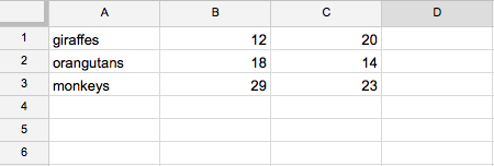
The first option is to arrange these two data sets into two different columns.
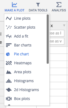
Select 'Bar Charts' from the MAKE A PLOT menu
Click the blue plot button in the sidebar to create the chart.
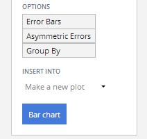
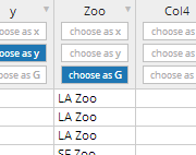
Upload your Excel data to Chart Studio's Grid (group by)
Your second option is to have a column of variables identifying which dataset each row belongs to, and then 'grouping by' this column.
Select 'Group by' from the OPTIONS in the sidebar, and select your options column.
Click the blue plot button in the sidebar to create the chart.
Setting the Traces
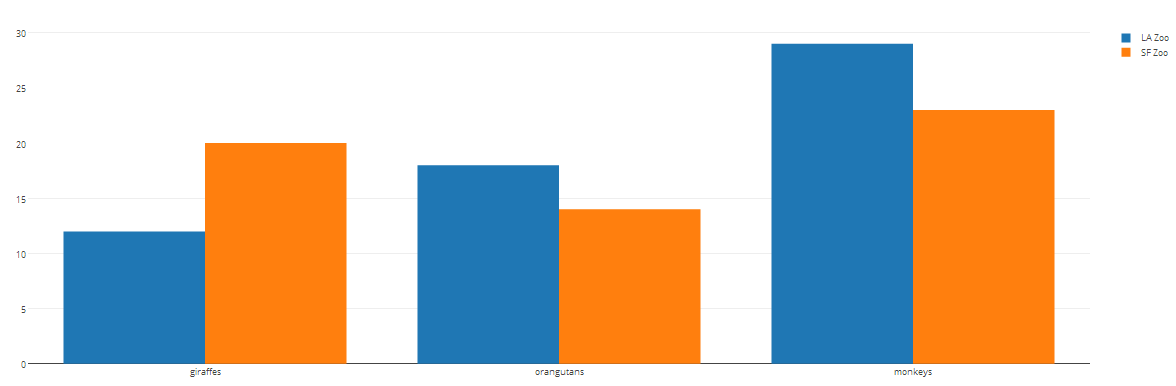
Your plot should look something like this.
The first step to styling it into the horizontal bar graph above is to open the TRACES popover in the toolbar.
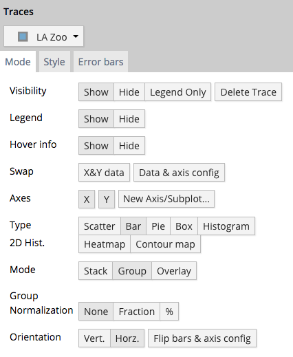
Here's how the MODE tab of the TRACES popover for 'All Traces (Bar)' should look.
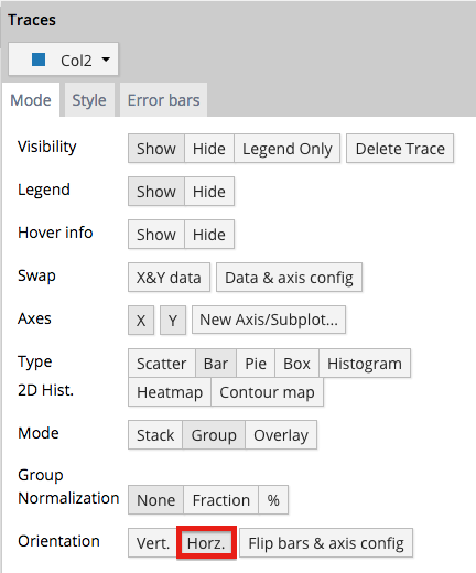
(Alternative: if you want to stack or overlay your bars, instead of grouping them, just change the 'Mode' setting.)
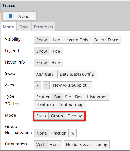
Stacked
Style it!
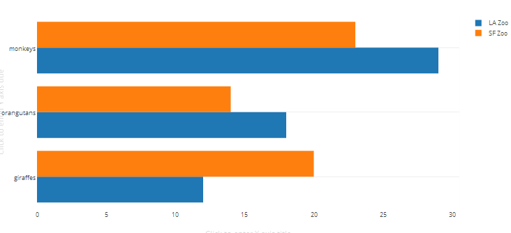
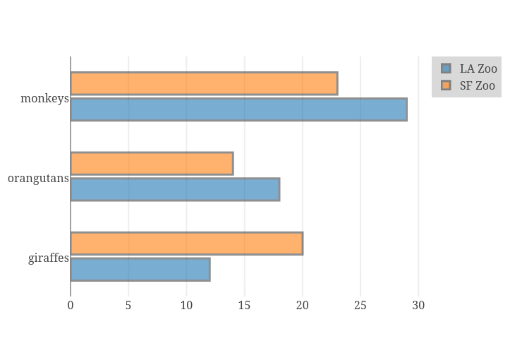
Now your plot should look something like this: a grouped horizontal bar chart. We still have some styling to do to get the plot at the top of this tutorial! Open TRACES again.
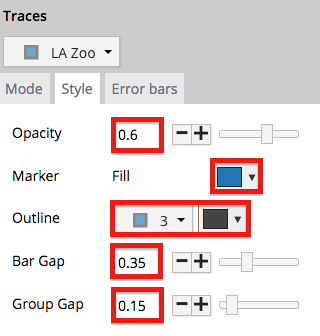
This is how the STYLE tab of the TRACES popover on LA Zoo should look. We've altered every option in this panel Opacity, Bar Gap, Group Gap, Fill, and Outline.
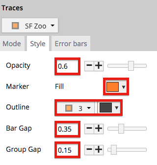
This is how the 'Style' tab of the TRACES popover on 'SF Zoo' should look. These are the same as for LA Zoo, but fill and outline are different colors.
This is how the LAYOUT popover should look. We're changing the font throughout the plot.
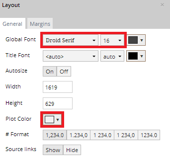
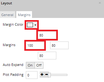
We're also giving the plot a grey background, and nudging the margins.
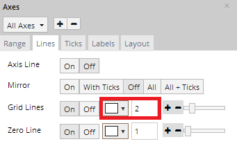
This is how the AXES popover should look. We're giving the plot thicker white gridlines.
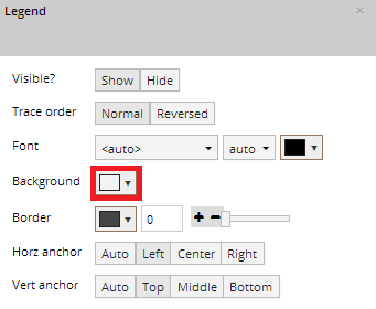
This is how the LEGEND popover should look, we're giving it a grey background, too.
Export and Share
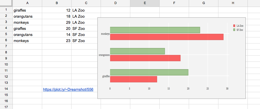
You can download your finished Chart Studio graph to embed in your Excel workbook. We also recommend including the Chart Studio link to the graph inside your Excel workbook for easy access to the interactive Chart Studio version. Get the link to your graph by clicking the 'Share' button. Download an image of your Chart Studio graph by clicking EXPORT on the toolbar.

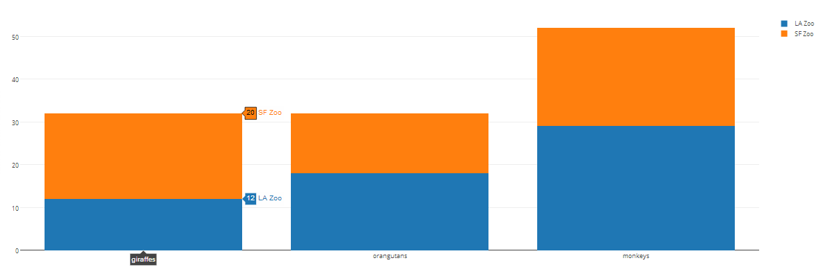
Your finished chart should look something like this
To add the Excel file to your workbook, click where you want to insert the picture inside Excel. On the INSERT tab inside Excel, in the ILLUSTRATIONS group, click PICTURE. Locate the Chart Studio graph image that you downloaded and then double-click it. Notice that we also copy-pasted the Chart Studio graph link in a cell for easy access to the interactive Chart Studio version.