Make a Contour Plot Online with Chart Studio and Excel
Contour Plots with Chart Studio
Upload your Excel data to Chart Studio's grid
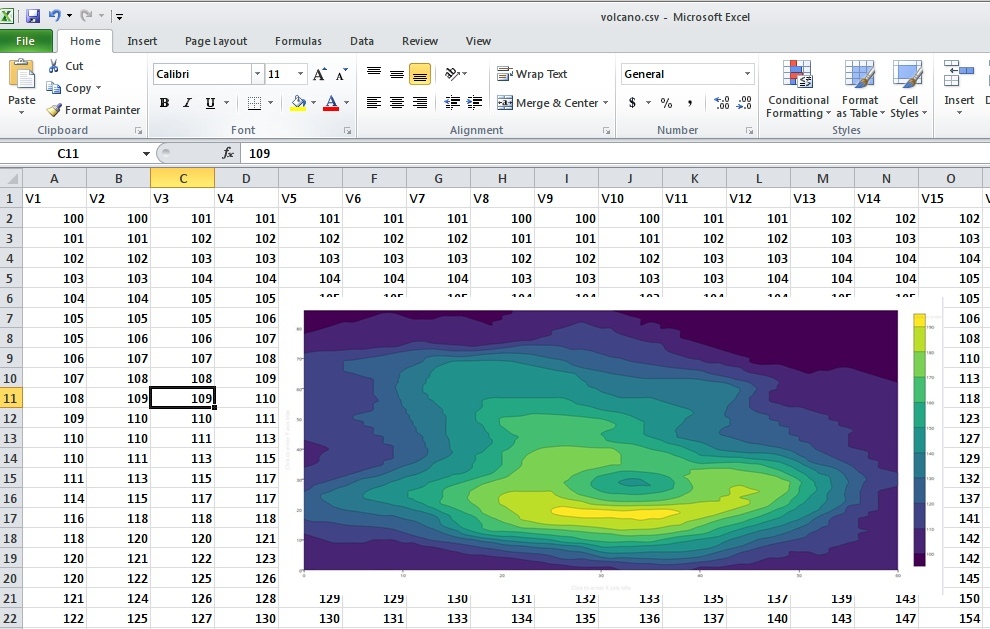
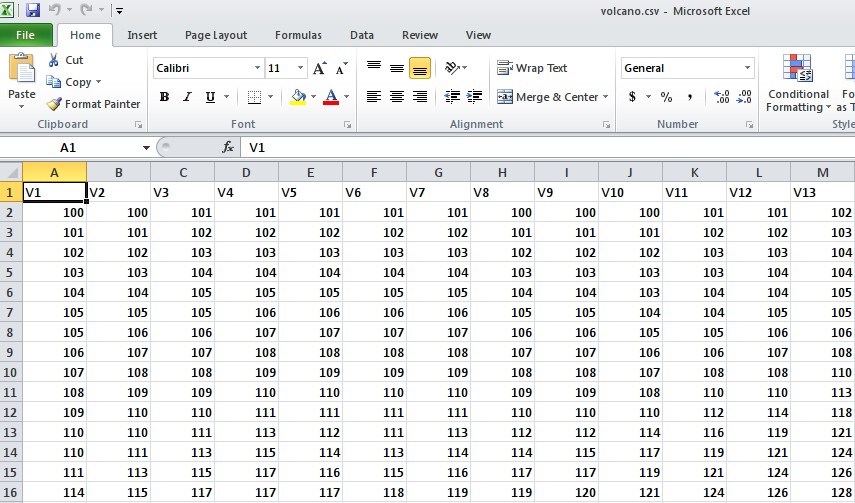
Open the data file for this tutorial in Excel. You can download the file here in CSV format
Head to Chart Studio
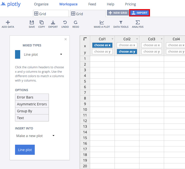
Head to the Chart Studio Workspace and sign into your free Chart Studio account. Go to 'Import', click 'Upload a file', then choose your Excel file to upload. Your Excel file will now open in Chart Studio's grid. For more about Chart Studio's grid, see this tutorial
Creating the Chart
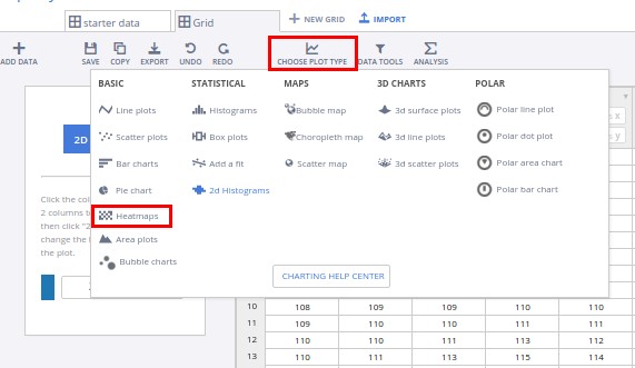
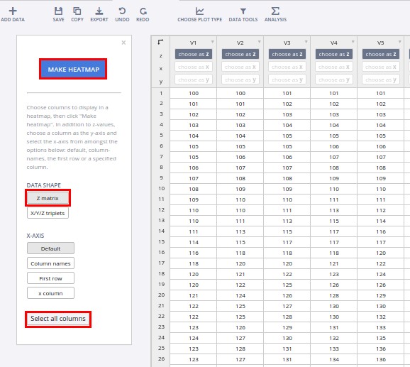
After importing the data, select the 'heatmaps' option from 'Choose Plot Type' dropdown.
Select 'Z Matrix' as the data shape, click on 'Select all columns', and then on the 'Make Heatmap' button to create the plot.
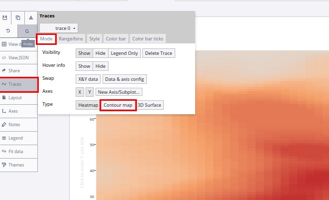
This will create a heatmap chart using the data. To convert the heatmap to a contour plot, we need to select 'Contour map' from the TRACE popover, as shown in the figure below.
Optional styling of the plot
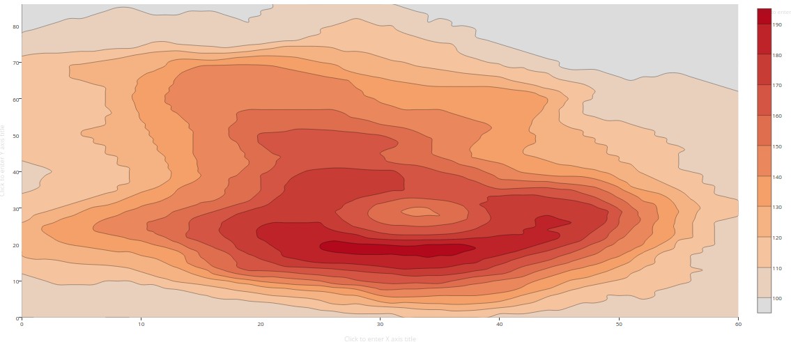
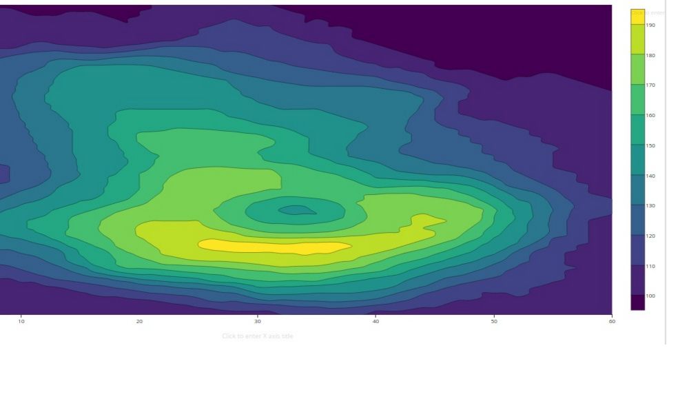
We should have a contour plot created like the one below. Now we are going to style it to make it more presentable.
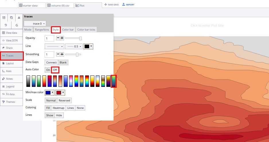
In the 'Traces' popover, under the 'style' tab, toggle 'auto-color' to off, and then select one of the styles from the list below.
This is how the final chart looks like!
Export & Share
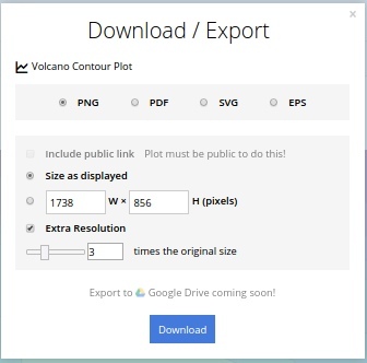
You can also export a static image of your plotly graph. Download an image of your Chart Studio graph by clicking EXPORT on the toolbar.
To add the chart inside an excel sheet, click where you want to insert the picture inside Excel. On the INSERT tab inside Excel, in the ILLUSTRATIONS group, click PICTURE. Locate the Chart Studio graph image that you downloaded and then double-click it.