Create a Pareto Chart with Chart Studio and Excel
A Step-by-Step Guide to Create a Pareto Chart
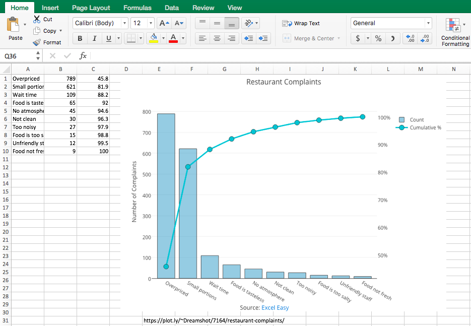
About a Pareto Chart
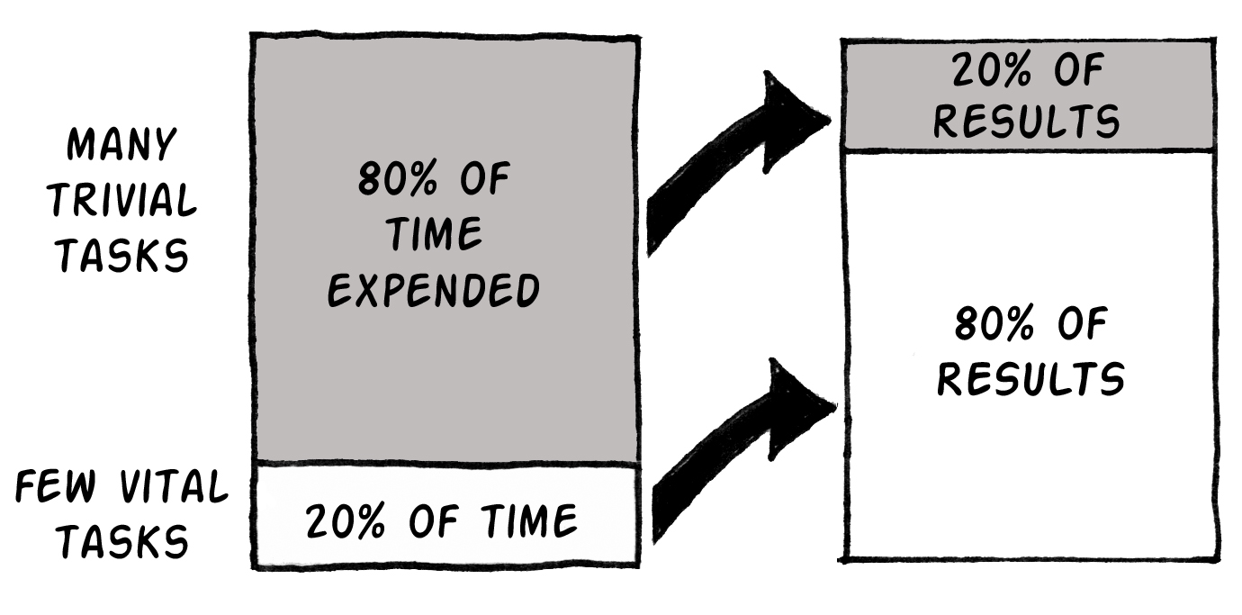
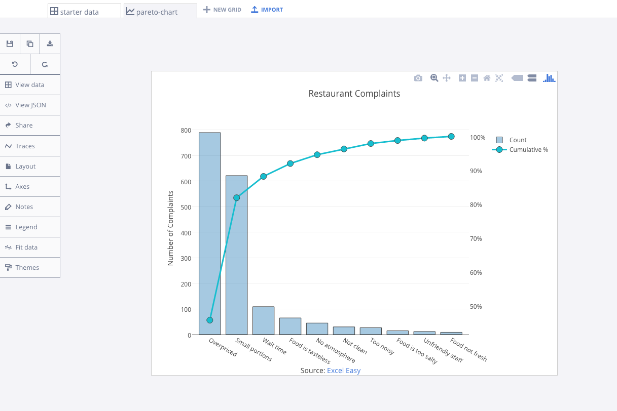
A Pareto chart combines a bar and line chart. The Pareto principle states that, 'for many events, roughly 80% of the effects come from 20% of the causes.' In this example, we will see that 80% of complaints come from 20% of the complaint types.
Upload your Excel data to Chart Studio's grid
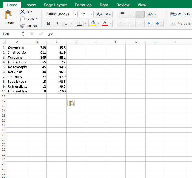
Open the data file for this tutorial in Excel. You can download the file here in CSV format
Head to Chart Studio
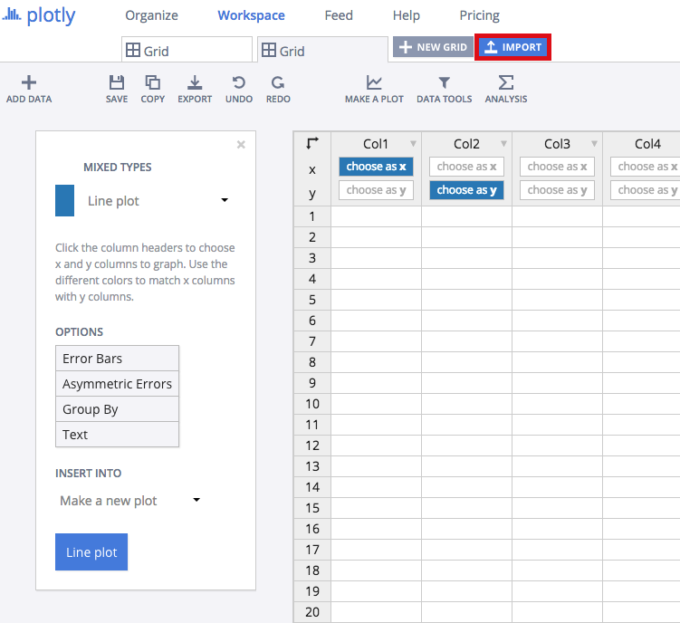
Head to the Chart Studio Workspace and sign into your free Chart Studio account. Go to 'Import,' click 'Upload a file,' then choose your Excel file to upload. Your Excel file will now open in Chart Studio's grid. For more about Chart Studio's grid, see this tutorial
Creating Your Chart
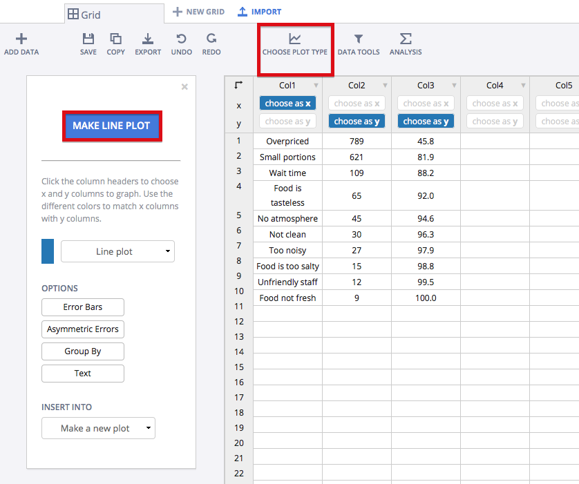
Once you've loaded the data in Chart Studio, label your columns like we did below. You'll have complaint type on the x axis data and complaint count and cumulative percentage on the y axis data. Then, select 'Line plots' from the CHOOSE PLOT TYPE menu. When you're finished, click on the blue 'LINE PLOT' button in the sidebar.
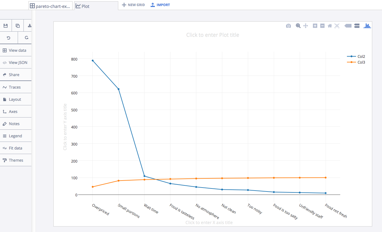
Your plot would initially look something like this.
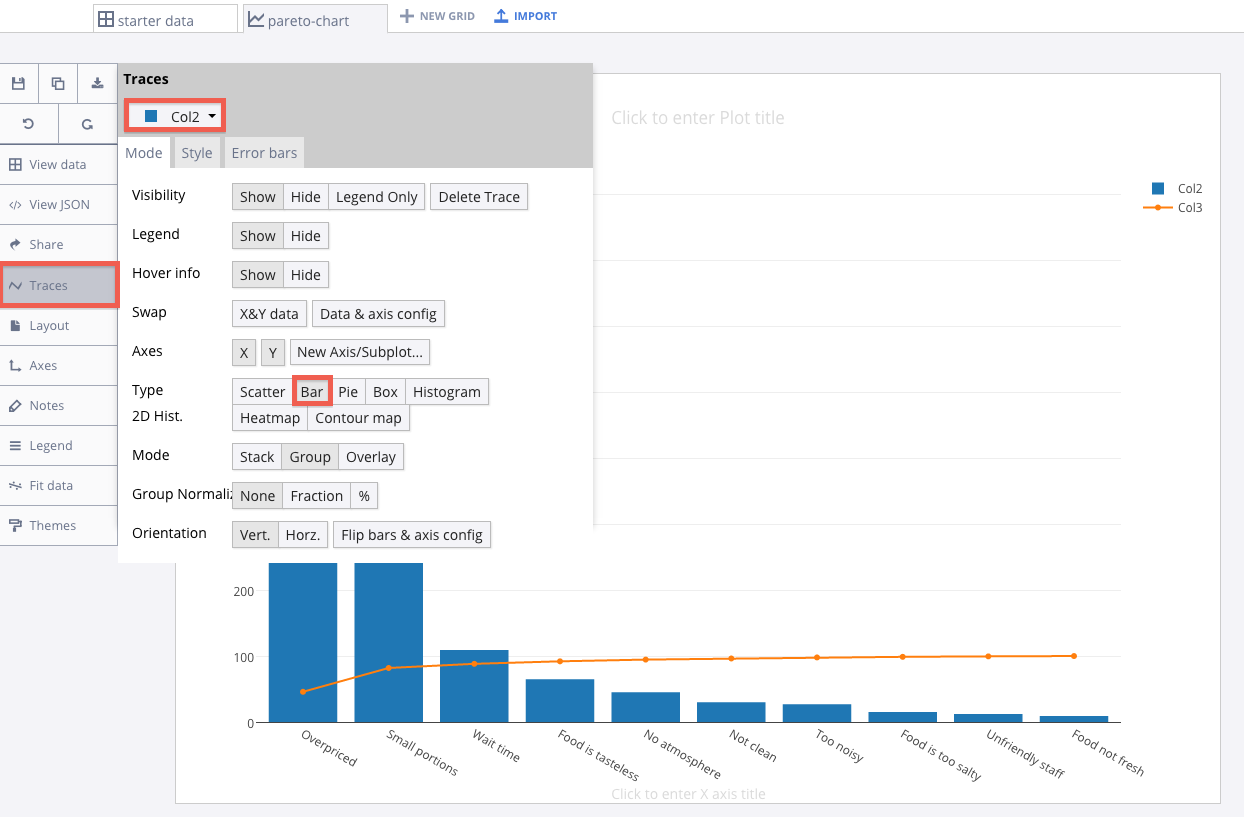
Remember, a Pareto chart combines a bar and line chart. The complaint count will be the 'bar' portion of the chart and the cumulative percentage will be the 'line' portion of the chart. Let's set the complaint count trace (Col2) to 'Bar.' Head to the 'Traces' menu and select 'Bar' as type.
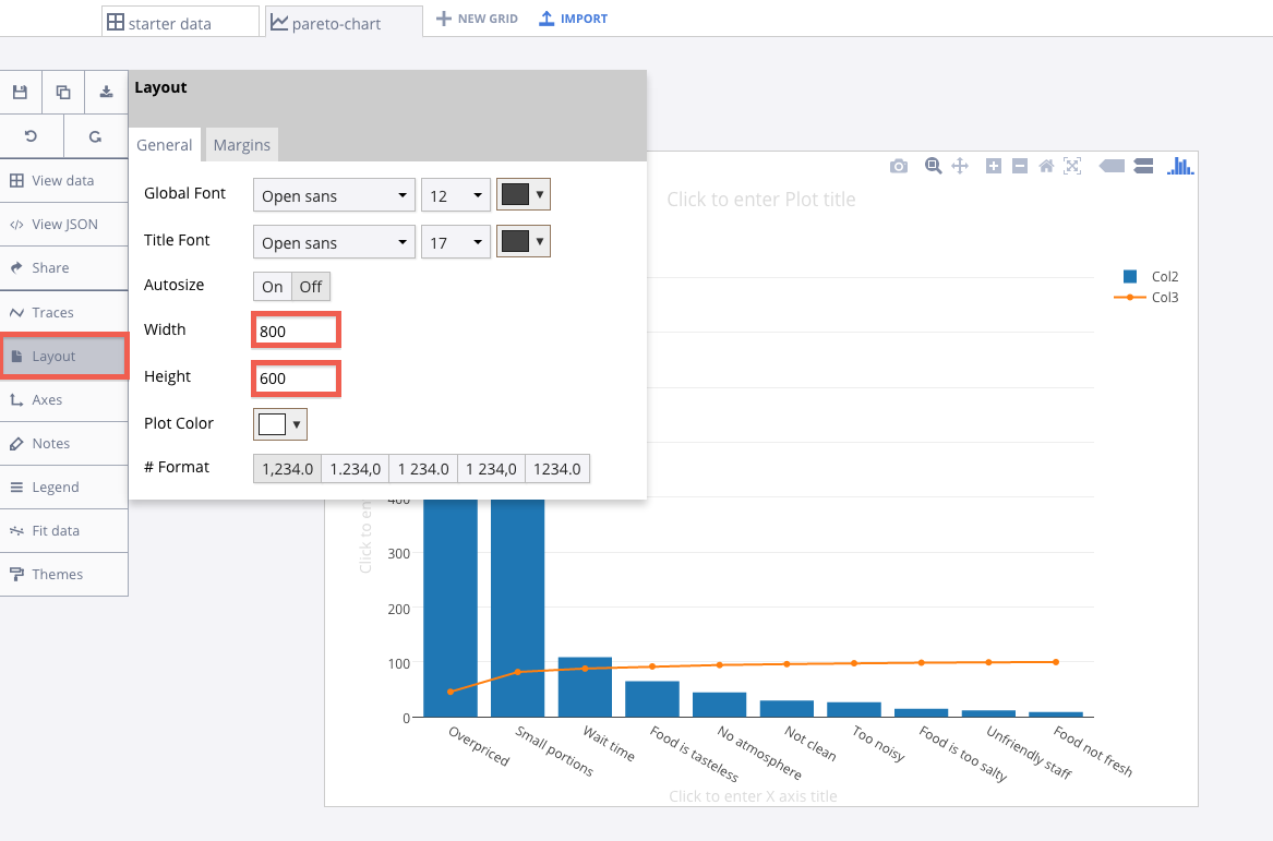
Take a moment to resize your plot to something less wide. A width of 800 and a height of 600 seems reasonable. Head to the layout menu to do this.
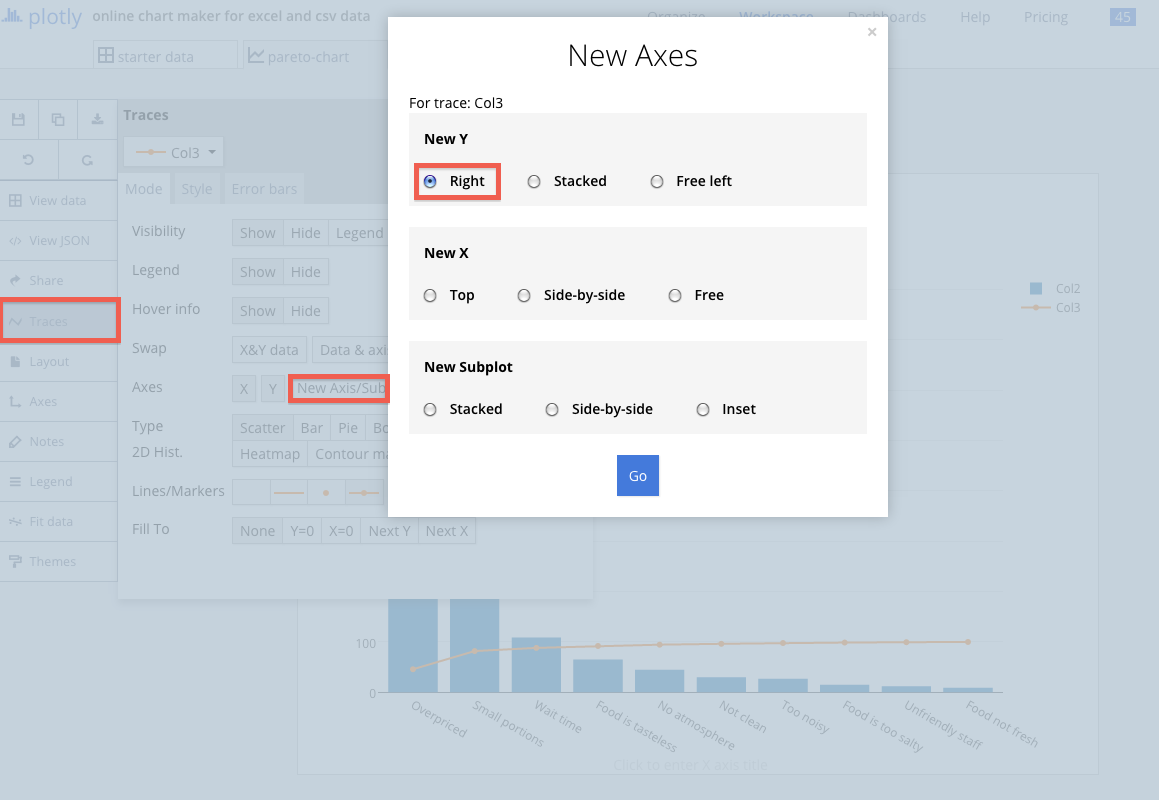
Next, we'll add a second y-axis for the other trace (Col3). To do this, head to the 'Traces' menu then to 'New Axis/Subplot.' Set your 'New Y' to 'Right.'
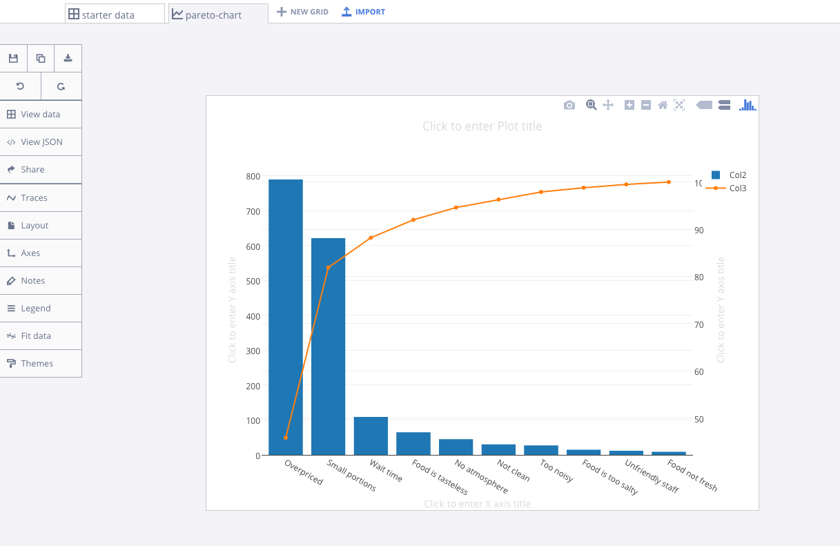
Your plot should now look something like this.
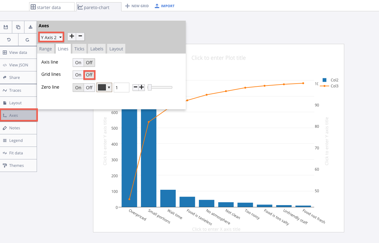
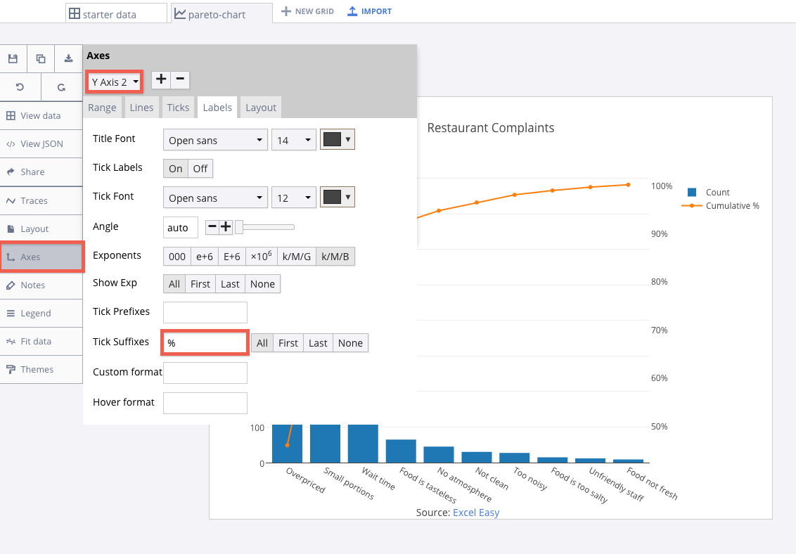
Now, we'll clean up the grid lines. Go to the 'Axes' menu, then select 'Y Axis 2' in the drop down menu. Set 'Grid lines' to off.
Finalizing Your Graph
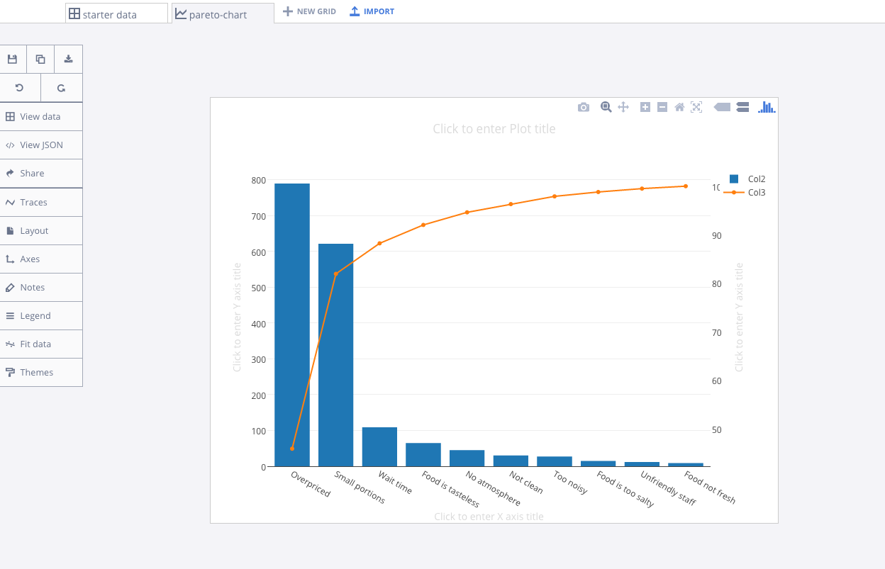
Your graph should now look something like this.
Head to the 'Traces' menu and then the 'Style' tab to set the trace color to your liking. You can title your graph and axes like we did. You can add 'Tick Suffixes' to 'Y Axis 2' by heading to the 'Axes' menu, then the 'Labels' menu within.
Here's our finished graph.
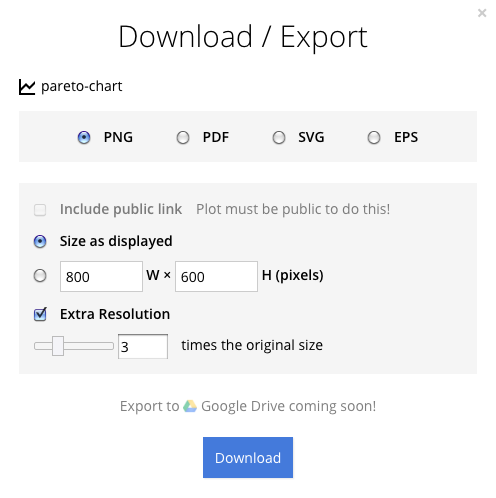
You can download your finished Chart Studio graph to embed in your Excel workbook. We also recommend including the Chart Studio link to the graph inside your Excel workbook for easy access to the interactive Chart Studio version. Get the link to your graph by clicking the 'Share' button. Download an image of your Chart Studio graph by clicking EXPORT on the toolbar.
To add the Excel file to your workbook, click where you want to insert the picture inside Excel. On the INSERT tab inside Excel, in the ILLUSTRATIONS group, click PICTURE. Locate the Chart Studio graph image that you downloaded and then double-click it. Notice that we also copy-pasted the Chart Studio graph link in a cell for easy access to the interactive Chart Studio version.