Create a Shaded Region on a Chart with Chart Studio and Excel
A Step-by-Step Guide to Create a Shaded Region on a Chart
Upload your Excel data to Chart Studio's grid
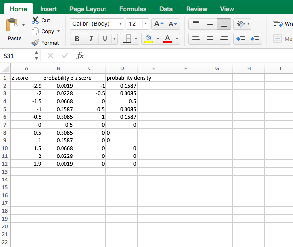
Open the data file for this tutorial in Excel. You can download the file here in CSV format
Head to Chart Studio
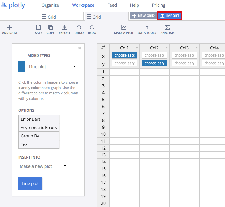
Head to the Chart Studio Workspace and sign into your free Chart Studio account. Go to 'Import,' click 'Upload a file,' then choose your Excel file to upload. Your Excel file will now open in Chart Studio's grid. For more about Chart Studio's grid, see this tutorial
Creating Your Chart
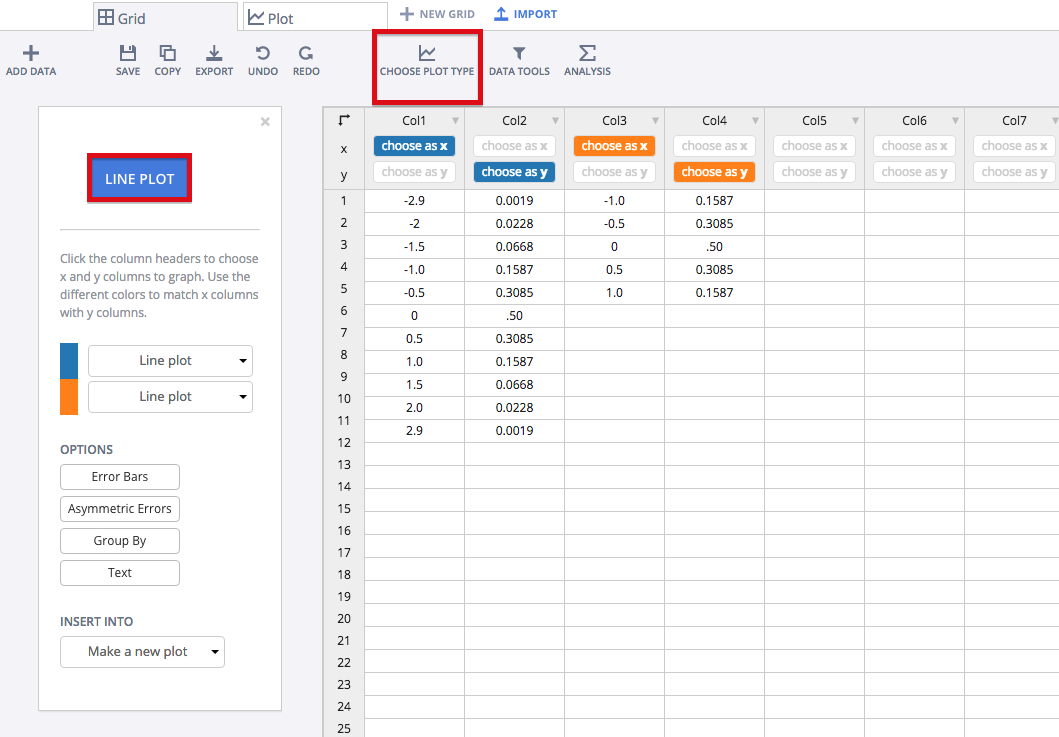
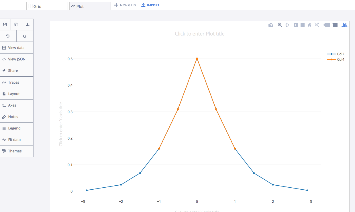
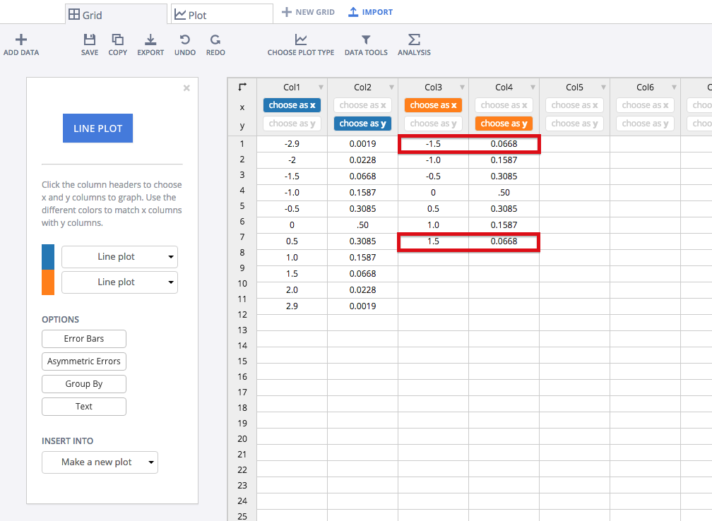
Once you've loaded the data in Chart Studio, label your columns like we did below. You'll have Z scores and probability density as one x-y combination. You'll also have a second x-y combination; this is critical for shading purposes! Then, select 'Line plots' from the CHOOSE PLOT TYPE menu. When you're finished, click on the blue 'LINE PLOT' button in the sidebar.
Your plot would initially look something like this.
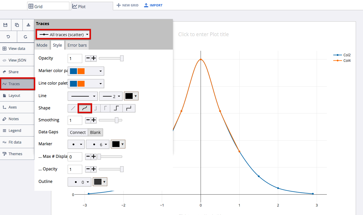
In order recreate a typical Standard Normal Probability Density Function graph, we'll smooth out the traces. Head to the 'Traces' menu and select 'All traces' within the drop down menu. Click the 'Style' menu and select the smooth 'Shape' as we highlight in the image below.
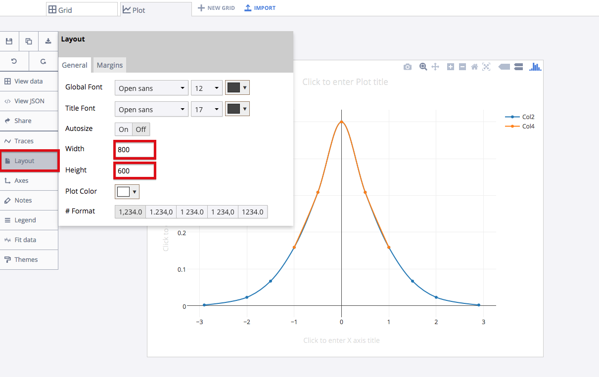
Take a moment to resize your plot to something less wide. A width of 800 and a height of 600 seems reasonable. Head to the layout menu to do this.
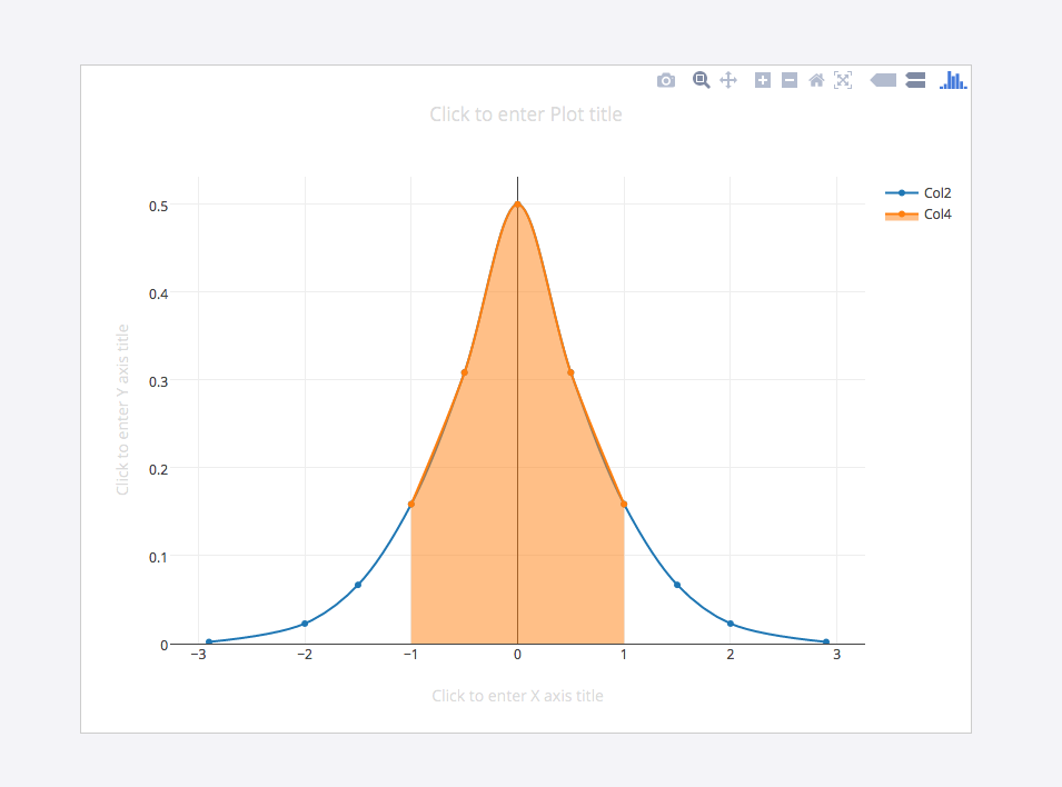
With our particular data, a normal score range is -1 to 1, so we'll shade that region. Head to the 'Traces' menu and select 'Col4' from the drop down menu. Then, within the 'Fill To' area, select 'Y=0.' Your plot should then look similar to the one below.
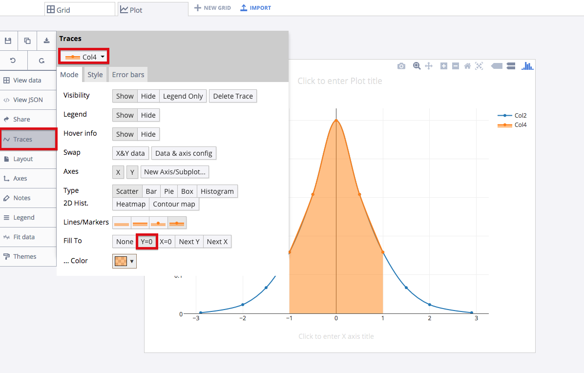
For clarification, we'll revist our grid. Since we wanted the region between -1.0 and 1.0 shaded, our second x-y combination contained values up to -1 and 1. If we wanted the region between -1.5 and 1.5 shaded, for instances, we would have included those values in our second x-y combination. We've highlighted the extra steps to illustrate this difference; it all depends on your indivdual shading needs!
Finalizing Your Graph
Your graph should now look something like this.
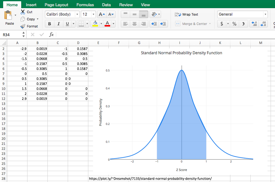
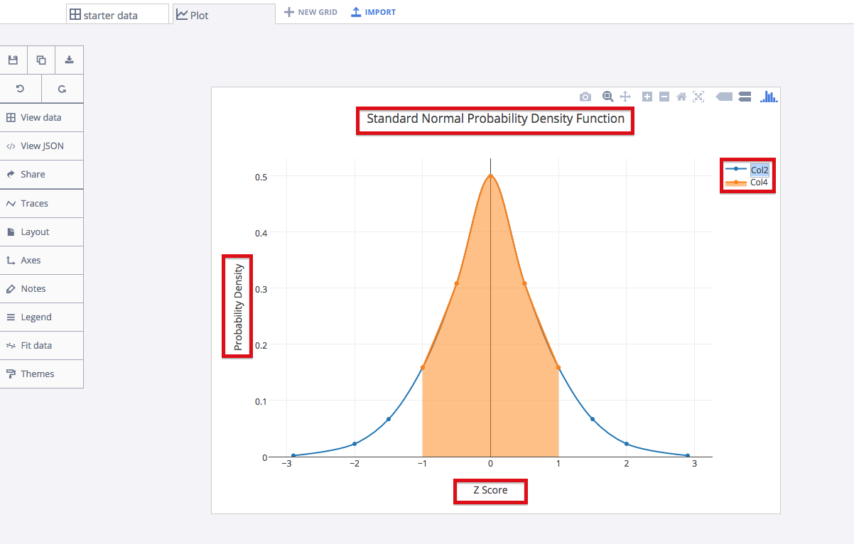
Head to the 'Traces' menu and then the 'Style' tab to set the trace color to your liking. You can title your graph and axes like we did. You can also blank out the legend, as it is not particularly necessary for this graph. Hide the legend within the 'Legend' menu.
Here's our finished graph.
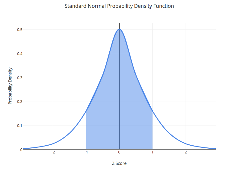
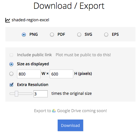
You can download your finished Chart Studio graph to embed in your Excel workbook. We also recommend including the Chart Studio link to the graph inside your Excel workbook for easy access to the interactive Chart Studio version. Get the link to your graph by clicking the 'Share' button. Download an image of your Chart Studio graph by clicking EXPORT on the toolbar.
To add the Excel file to your workbook, click where you want to insert the picture inside Excel. On the INSERT tab inside Excel, in the ILLUSTRATIONS group, click PICTURE. Locate the Chart Studio graph image that you downloaded and then double-click it. Notice that we also copy-pasted the Chart Studio graph link in a cell for easy access to the interactive Chart Studio version.