Shared X-Axis Subplots in Chart Studio
Shared X-Axis Subplots in Chart Studio
Introduction
In this tutorial we will look at how to create subplots with a shared x-axis.
Add Your Data to Chart Studio
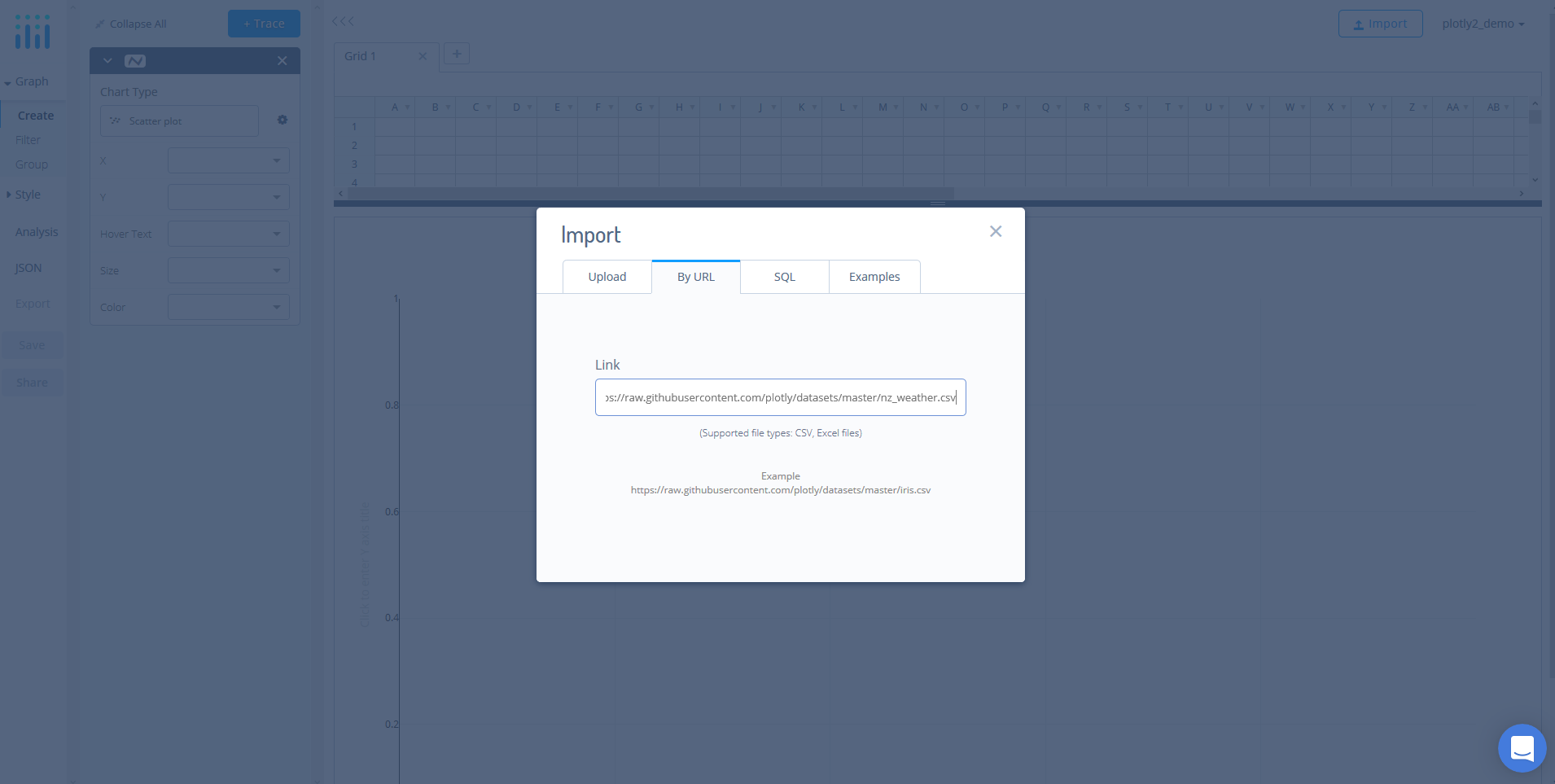
Head to Chart Studio’s new online workspace and add your data. You have the option of typing directly in the grid, uploading your file, or entering a URL of an online dataset. Chart Studio accepts .xls, .xlsx, or .csv files. For more information on how to enter your data, see this tutorial.
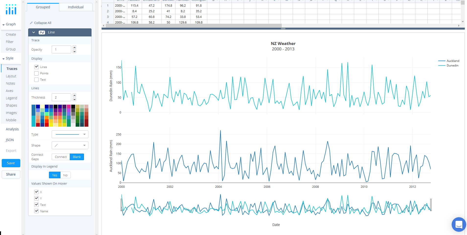
For this tutorial, we'll use the NZ Weather dataset which can be found here. Simply, copy the URL from GitHub. Now, returning to the workspace select 'IMPORT' and then 'By URL'. Here, you just paste the URL from GitHub.
Create Your Chart
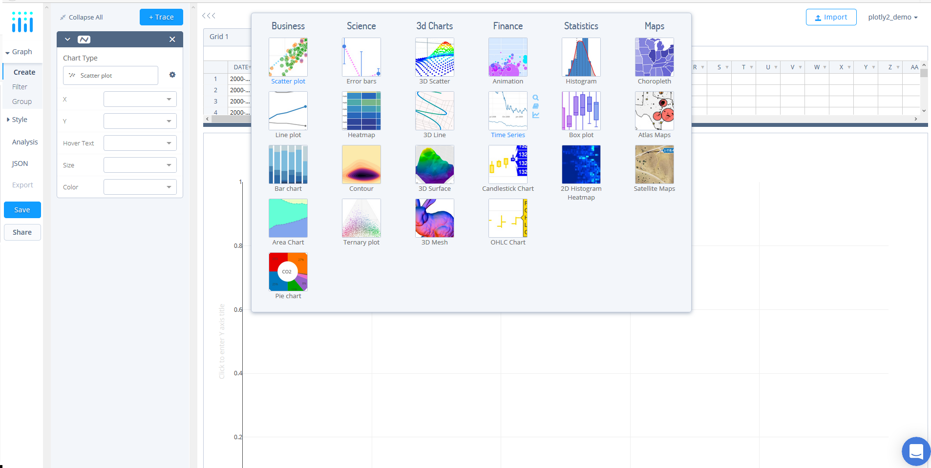
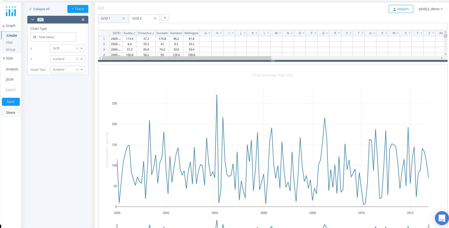
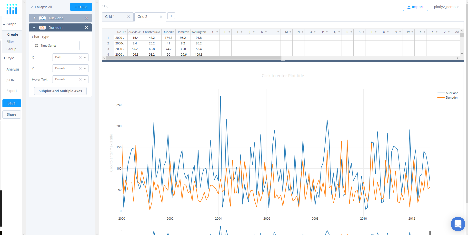
Now that the data has been added, we can select our chart types. Here, we will use a single trace for each subplot. First, we will use the default chart type, 'Time Series'.
Next, we need to define our trace values. To do so, use the dropdowns in the trace panel to select 'DATE' as the X value, 'Auckland' as the Y value, set 'Auckland' as the 'Hover Text'.
Now that we have the first trace, lets add the second. Simply, click the blue '+ Trace' button and then use the dropdowns in the new trace panel to change the Y value and 'Hover Text' value to 'Dunedin'.
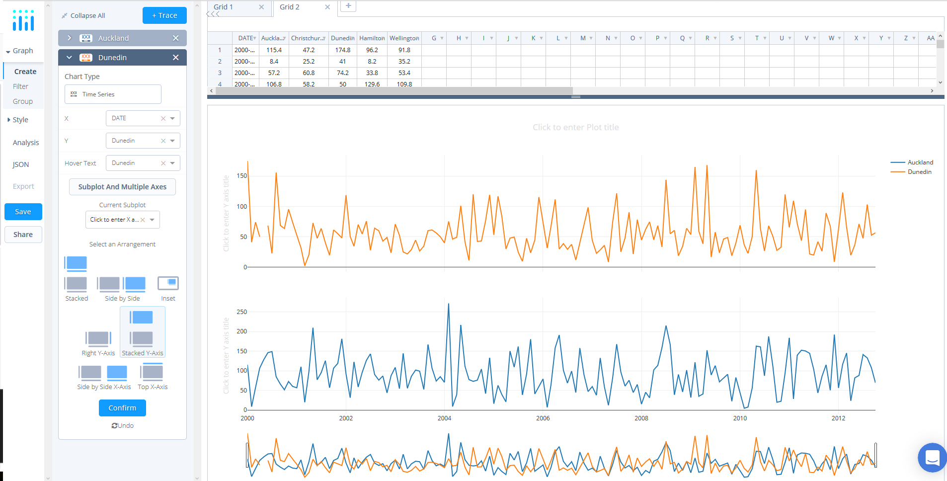
At the bottom of the panel click the 'Subplot & Multiple Axes' button where a selection of subplot arrangements ought to be presented. For this tutorial, select 'Stacked-Y-Axis' - also referred to as shared x-axis - and click 'Confirm'.
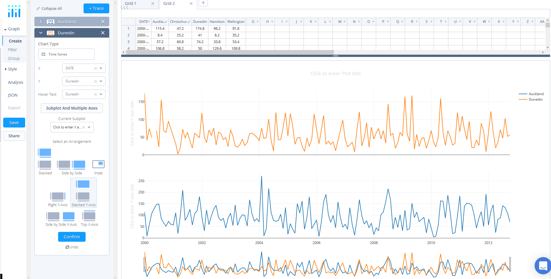
If you make a mistake when selected the subplot layout, you can simply click 'UNDO', which is situated immediately below 'Confirm'.
Style Your Chart
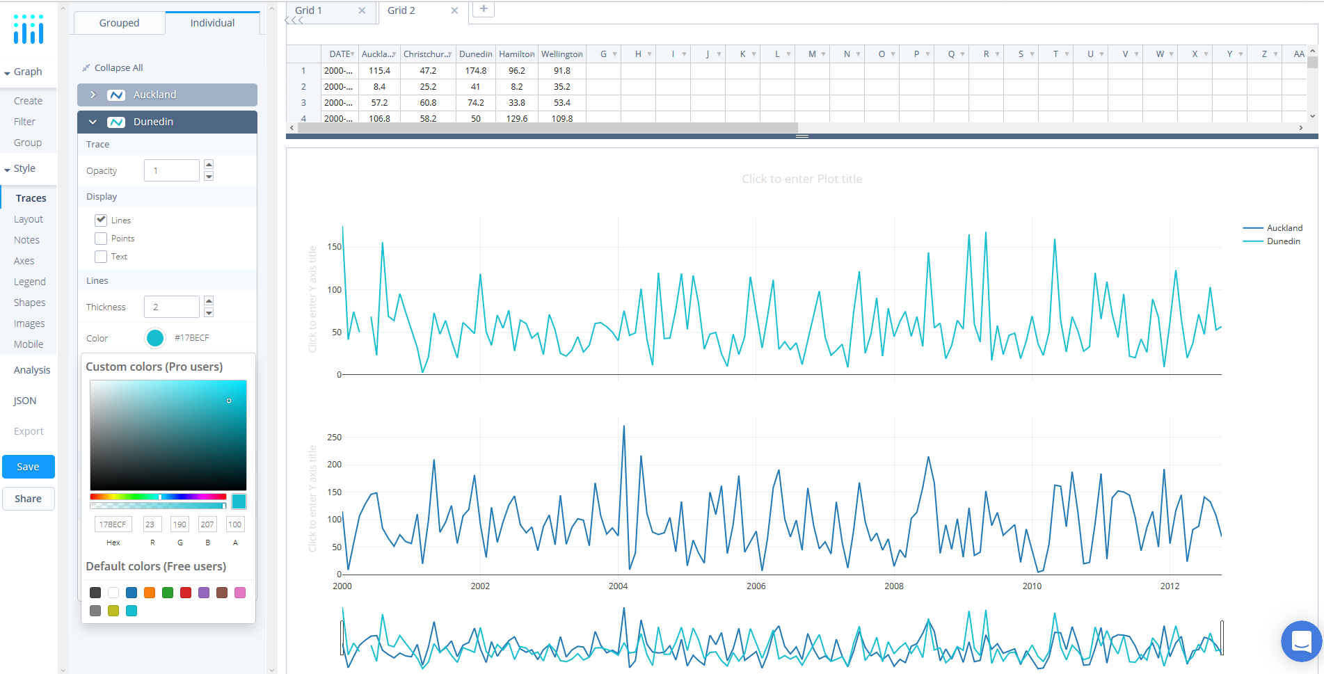
Now we can style our plot! Under STYLE select 'Traces', then click individual at the top of the panel - this will enable you to customize each trace. Here, select the 'Dunedin' trace and then click color, which will force a color panel to appear. For the purpose of this tutorial we picked one of the preselected colors at the bottom.
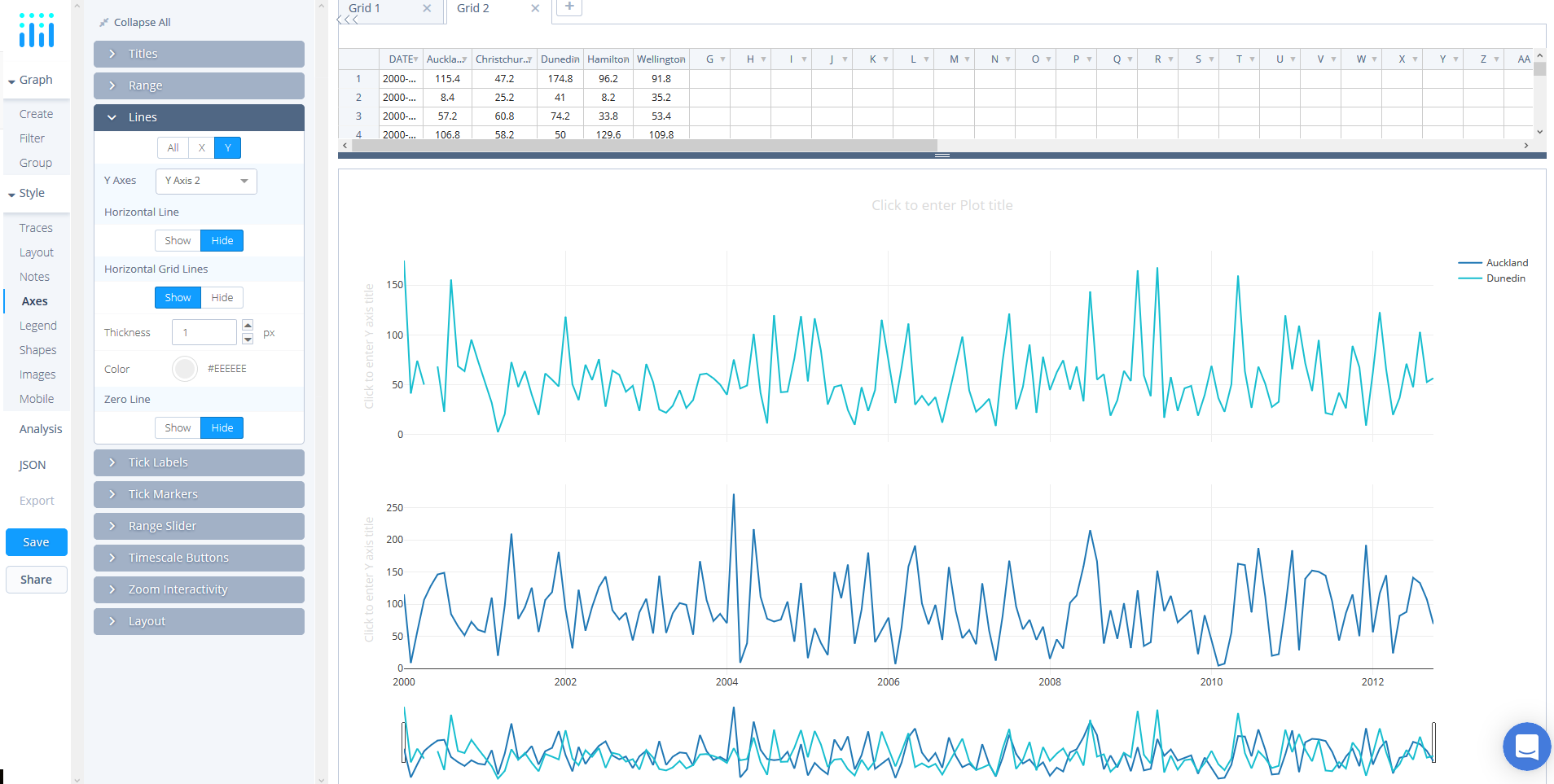
Now, navigate to 'Axes', again under the STYLE tab, and select the 'Lines' panel. At the top of the panel click Y and then select 'Y Axis 2' from the 'Y Axes' dropdown. At the bottom of the panel, change 'Zeroline' to 'Hide'. You ought to notice that the line on the top subplot is now gone.
Staying in the 'Axes' tab under 'STYLE', select the 'Titles' box and then utilise the 'X' and 'Y' options and the dropdown to navigate which axis you wish to title using the textbox. First, select 'X' and enter the title in the textbox like below.
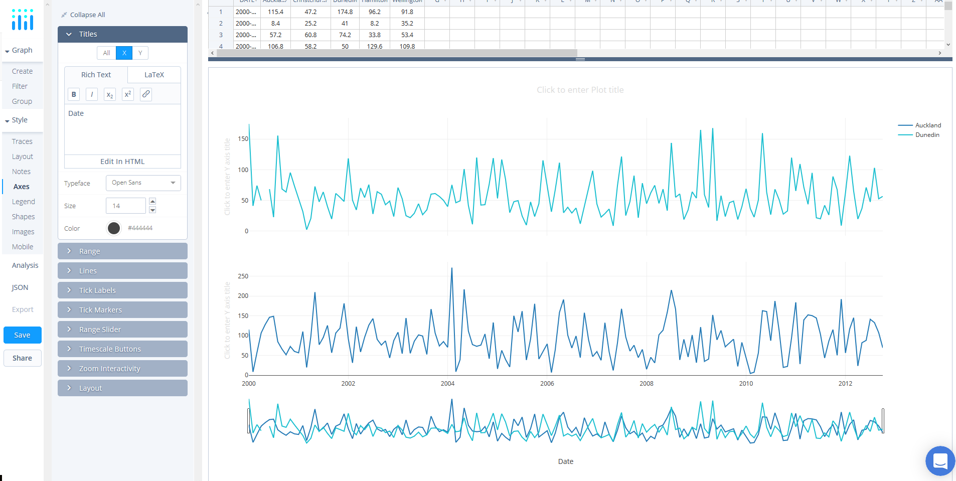
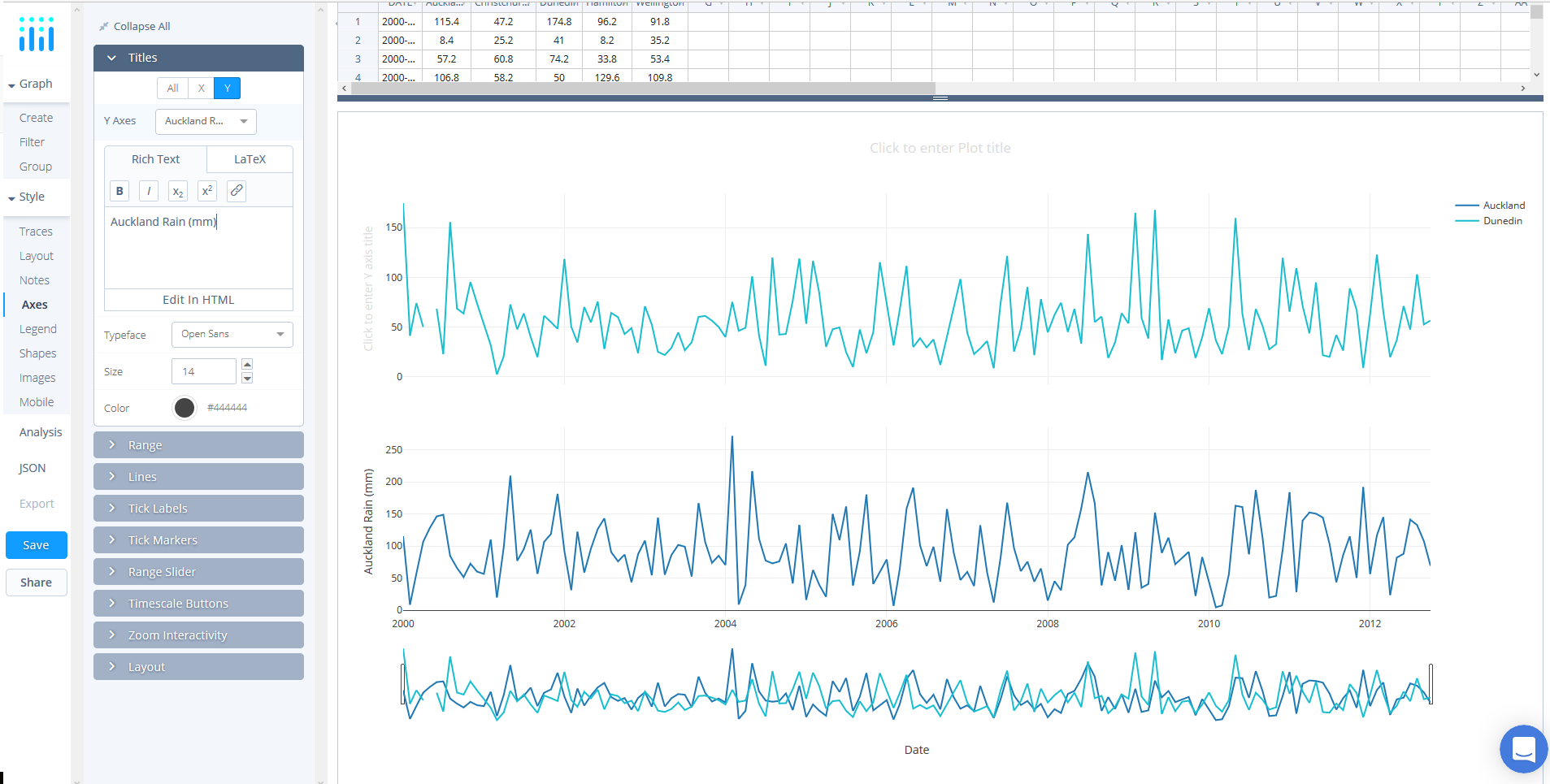
You can repeat the process for the y axis or alternatively try editing the axis title directly on the plot like below.
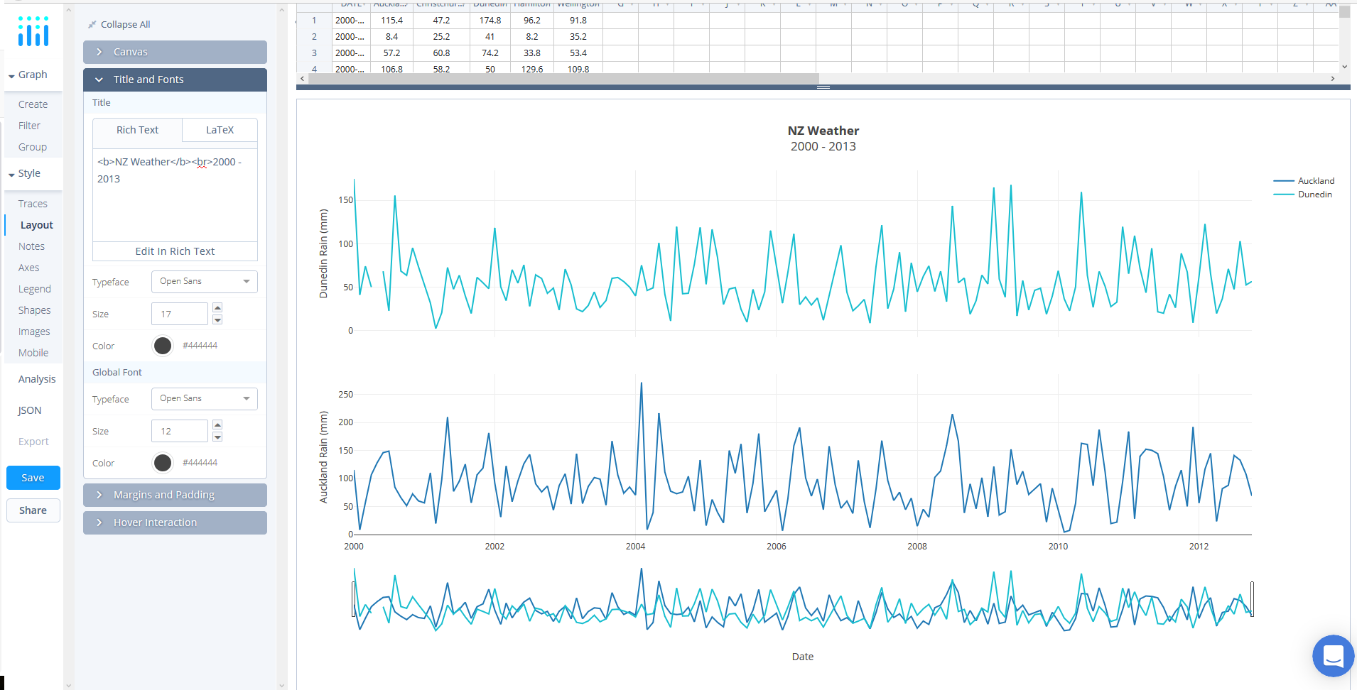
For the chart title, you can navigate to 'Layout' under the STYLE tab and select 'Titles and Fonts'. Below the textbox you can select 'Edit in HTML'. Alternatively, like the axes' title, you can edit directly on the plot.
Save and Share
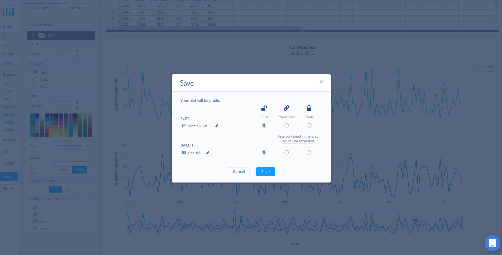
Your chart is now done! Click SAVE on the left-hand side.
After giving your file a name, select your PLOT and DATA as 'Public' or 'Private'. For more information on how sharing works, including the difference between private, public and secret sharing, visit this page.