
Intro to Histograms
What is a histogram?
Intro to Histograms
What is a Histogram?
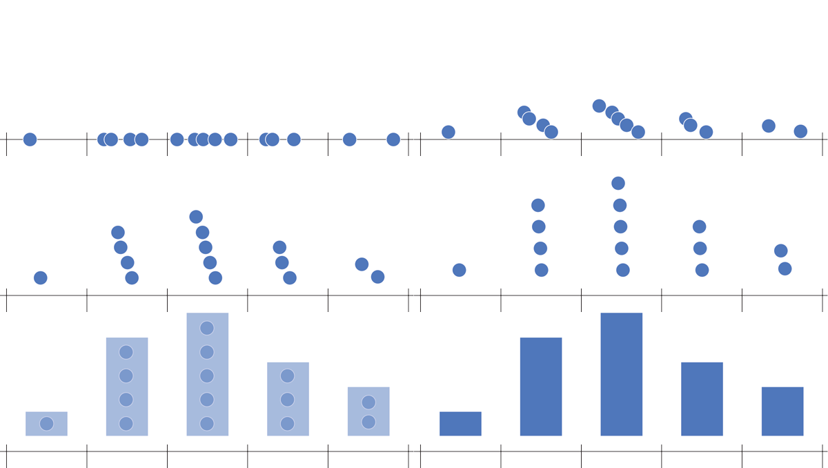
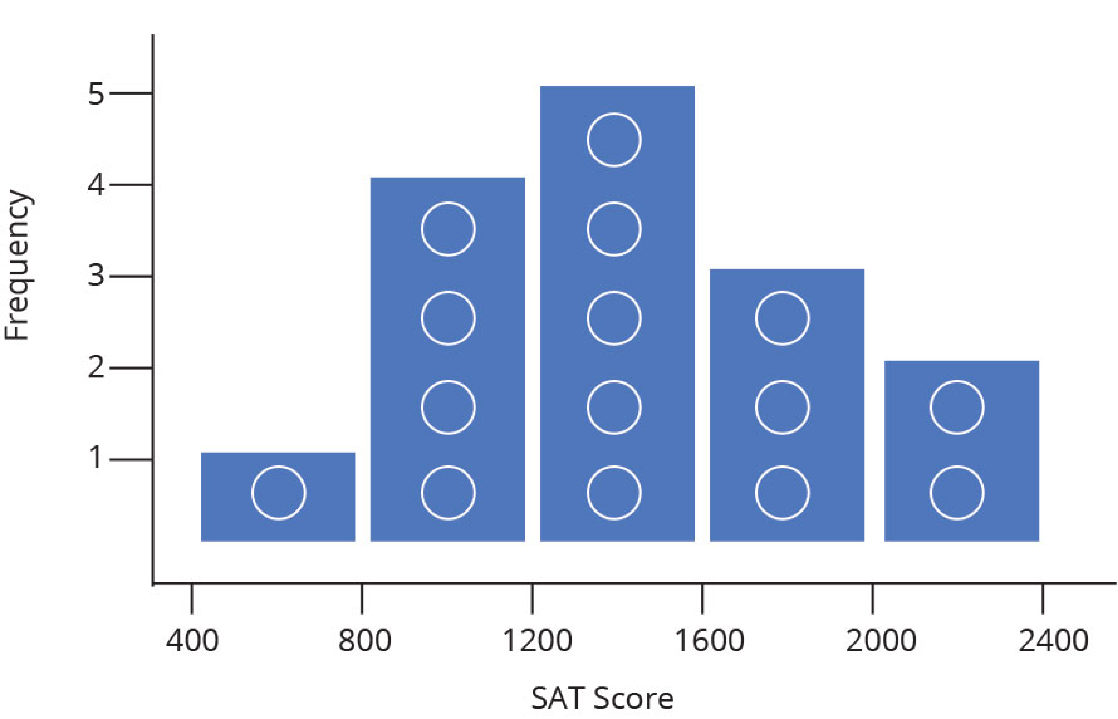
Histogram plots are used to better understand how frequently or infrequently certain values occur in a given set of data. To understand the method behind constructing a histogram, imagine a set of values that are spaced out along a number line. To construct a histogram, a section of the number line is divided into equal chunks, called bins. In the image below, the data is divided into five bins (note that for a histogram, the bins all must be the same width).
![]()
Next, count up how many data points sit inside each bin, and draw bars, one for each bin, whose heights correspond to the number of data points. This process is illustrated below.
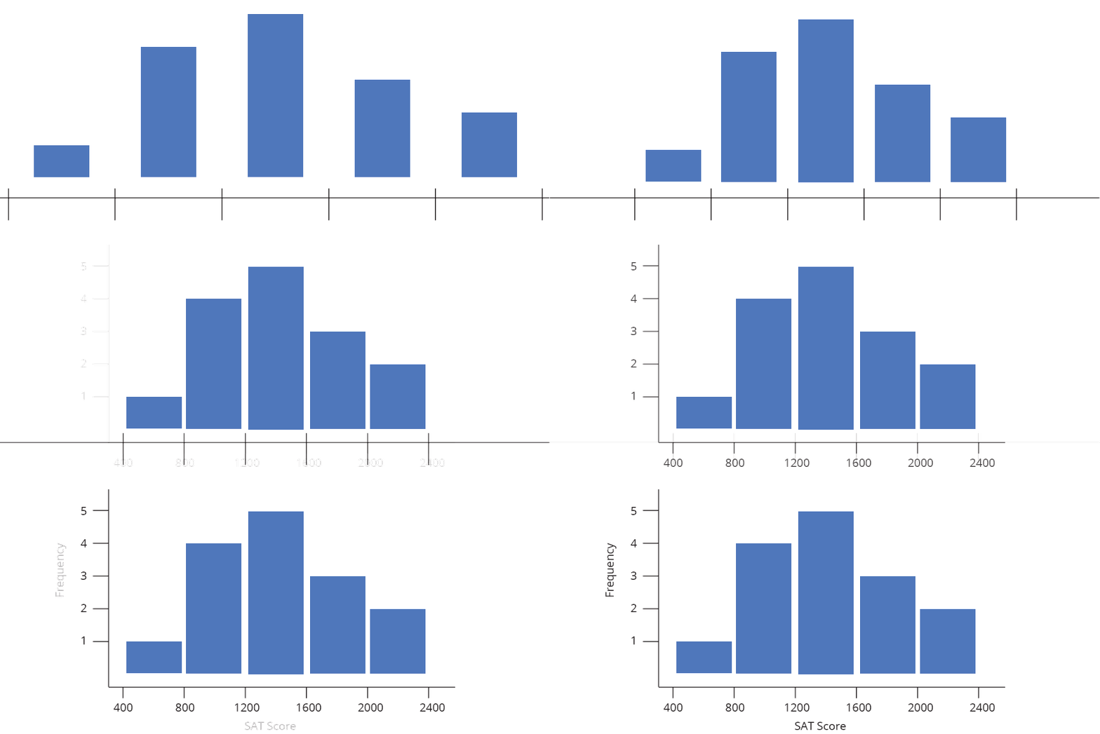
Label the data (in the example below each data point is an SAT score), draw in a y-axis which counts the number of data points in each bin, and finally label your bins.
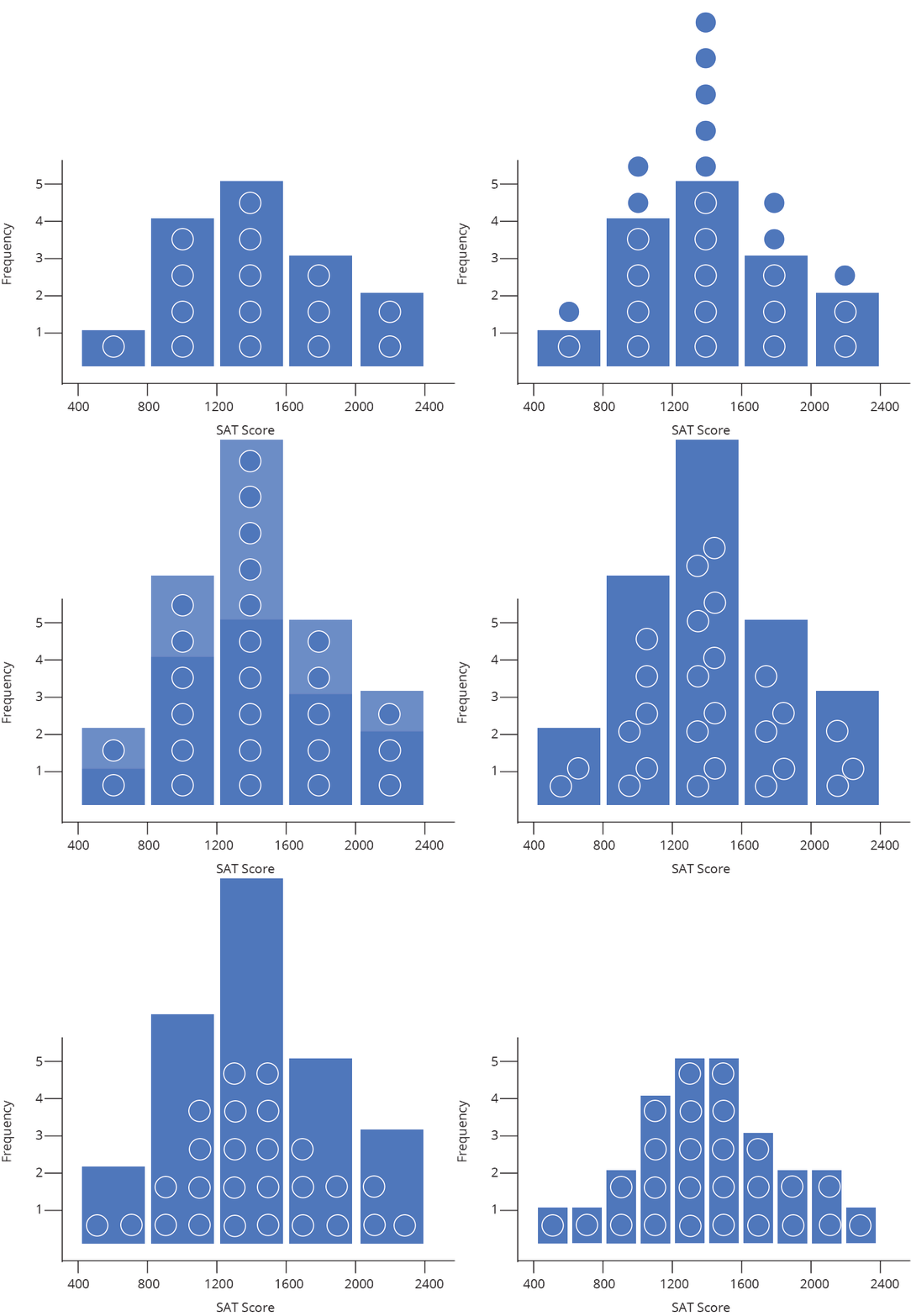
And that’s how to construct a histogram… by hand! Chart Studio can automatically create histogram plots for you (doing the steps above behind the scenes). All you need to do is tell Chart Studio which series of data to plot, and we take care of the rest. Chart Studio automatically determines the range of the histogram (where to start and stop on the number line) as well as the bin size (the width of each bin on the number line). You can change these options later under Style → Range/Bins. As you increase the number of points (also called the sample size), you can draw thinner and thinner bins with a higher level of precision, as illustrated below.
How to Read a Histogram
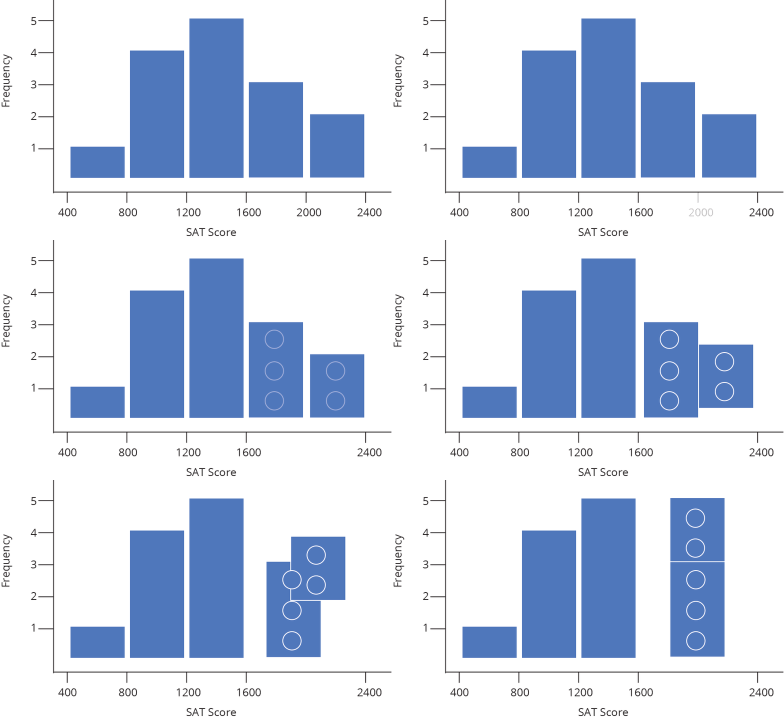
The nature of a histogram makes it easy to find values for ranges of data, across many bins. Say you were interested in how many people scored between 1600 and 2400 on the SAT. Just add up the heights of the bars in that range.
A histogram shows what proportions of a dataset fall within which ranges. Another way of saying this is a histogram shows the approximate shape of the data’s distribution. You can read more about distributions here, but in brief, they are mathematical functions which describe the same frequency vs. value relationship shown on a histogram, but in a theoretical, idealized case.
Often when we create a histogram of a dataset, we want to compare it to a theoretical distribution. SAT scores, for example, are designed to match a common distribution called a Normal (or Gaussian) Distribution. In the image below, you can see our histogram overlaid with a normal distribution (the lighter shaded area).
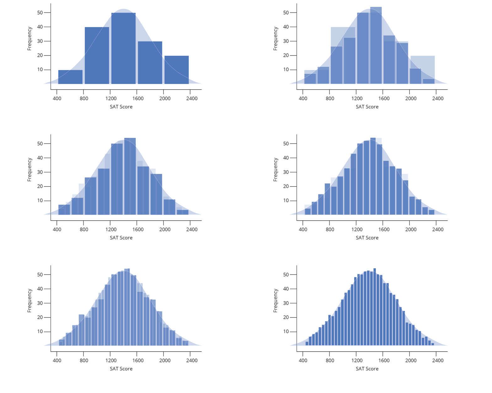
The animation above demonstrates what happens as our sample set of data grows: we are able to create more and more bins within the same range of values. As the sample size grows, we divide the histogram into thinner and thinner bins, and see the shape get closer and closer to a normal distribution.
Normalizing a Histogram
While the shape of a histogram tells us quite a bit, frequency as a value on the y-axis is only useful in specialized cases. Changing the y axis values without changing the shape of the histogram is known as normalizing (not to be confused with Normal distributions!), and can be done in a few different ways.
Probability distributions
While it might sometimes be interesting to know that 47 people received a SAT score between 1500 and 1550, it is often more useful to know how likely is it that a random person taking the SAT will receive a score between 1500 and 1550. In other words, we want to change our frequency distribution into a discrete probability distribution. In a discrete probability distribution, the bar heights all sum to probability of 1 (or 100%), as demonstrated below.
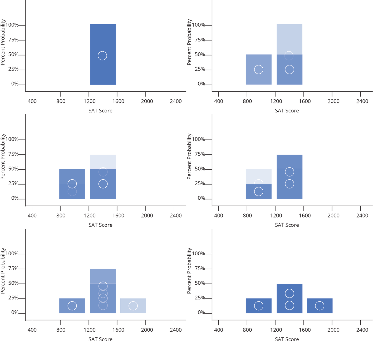
It turns out converting from frequency to probability is very simple, we just divide each frequency by the total sample size (so a given bin with a frequency of 50 out of 200 total data points becomes a probability of 0.25, or 25% likely). Because we divide every bar by the same number, everything shrinks by the same proportion and the shape remains the same.
Probability density distributions
We could also take each probability and divide it by the width of a bin, Δx, (again, not changing the overall shape) to convert our discrete probability distribution to a probability density distribution. These histograms are used to model probability density functions, which have the property that the area underneath the function between two values of x is equal to the probability that a given random variable (in our example, a random SAT test taker) will fall between those two values. That means that the Area under the whole histogram must equal 1 (since the probability of any value occurring is 1).
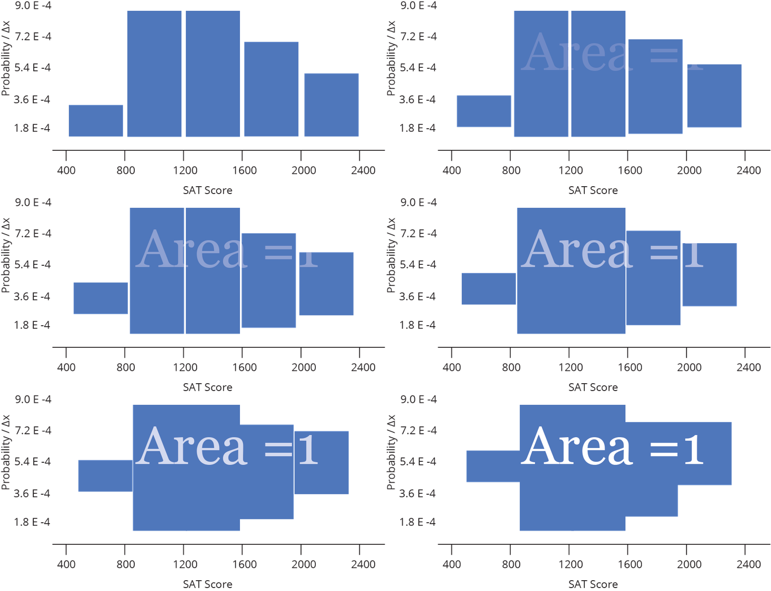
For a fixed data range, probability density functions are a good way to compare histograms of different sample sizes — as the sample size gets larger, the bins get thinner, so the heights stay comparable.
Frequency density distributions
Finally, frequency distributions can also be divided by bin width to give frequency density distributions. Instead of summing to 1, the areas of the bars will sum to the total number of data points in the sample.
Normalization Quick Reference
For a quick summary of the normalization types, let’s look at our sample histogram again, with n data points per bin. Total data points (N) = 15 and bin width (Δx) = 400.
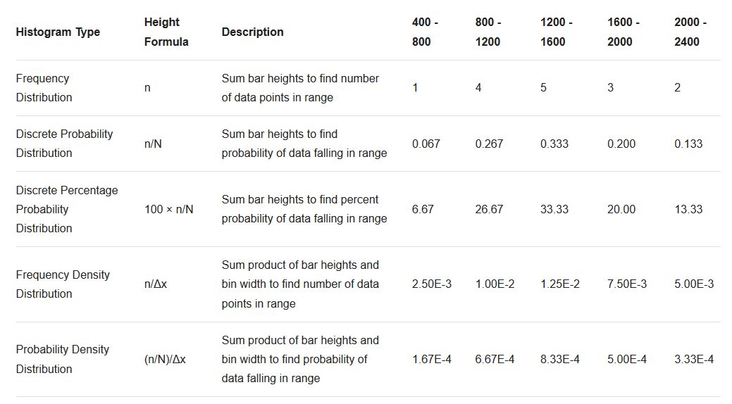
| Histogram Type | Height Formula | Description | 400 - 800 | 800 - 1200 | 1200 - 1600 | 1600 - 2000 | 2000 - 2400 |
|---|---|---|---|---|---|---|---|
| Frequency Distribution | n | Sum bar heights to find number of data points in range | 1 | 4 | 5 | 3 | 2 |
| Discrete Probability Distribution | n/N | Sum bar heights to find probability of data falling in range | 0.067 | 0.267 | 0.333 | 0.200 | 0.133 |
| Discrete Percentage Probability Distribution | 100 × n/N | Sum bar heights to find percent probability of data falling in range | 6.67 | 26.67 | 33.33 | 20.00 | 13.33 |
| Frequency Denisty Distribution | n/Δx | Sum product of bar heights and bin width to find number of data points in range | 2.50E-3 | 1.00E-2 | 1.25E-2 | 7.50E-3 | 5.00E-3 |
| Probability Denisty Distribution | (n/N)/Δx | Sum product of bar heights and bin width to find probability of data falling in range | 1.67E-4 | 6.67E-4 | 8.33E-4 | 5.00E-4 | 3.33E-4 |
Don’t worry if this seems like a lot of calculation. Chart Studio does it for you, and makes it easy to switch between normalization modes under Style → Range/Bins → Normalization.

