
Line and Scatter Plots
Create a plot with multiple traces.
Try an Example
If you want to make a chart with multiple line and scatter traces, this tutorial is for you!
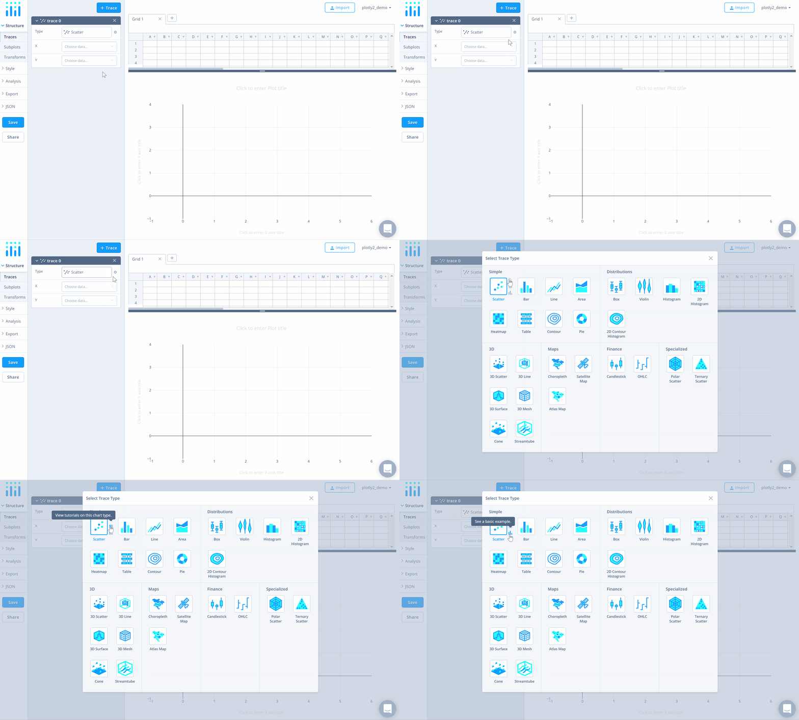
Before getting started with your own dataset, you can check out an example. First, select the 'Type' menu. Hovering the mouse over the chart type icon will display three options: 1) Charts like this by Chart Studio users 2) View tutorials on this chart type 3) See a basic example.
Clicking the 'See a basic example' option will show what a sample chart looks like after adding data and editing with the style. You'll also see what labels and style attributes were selected for this specific chart, as well as the end result.
You can also use the data featured in this tutorial by clicking on 'Open This Data in Chart Studio' on the left-hand side. It'll open in Chart Studio.
Add Data
Head to Chart Studio and add your data. You have the option of typing directly in the grid, uploading your file, or entering a URL of an online dataset. Chart Studio accepts .xls, .xlsx, or .csv files. For more information on how to enter your data, see this tutorial.
Create Chart
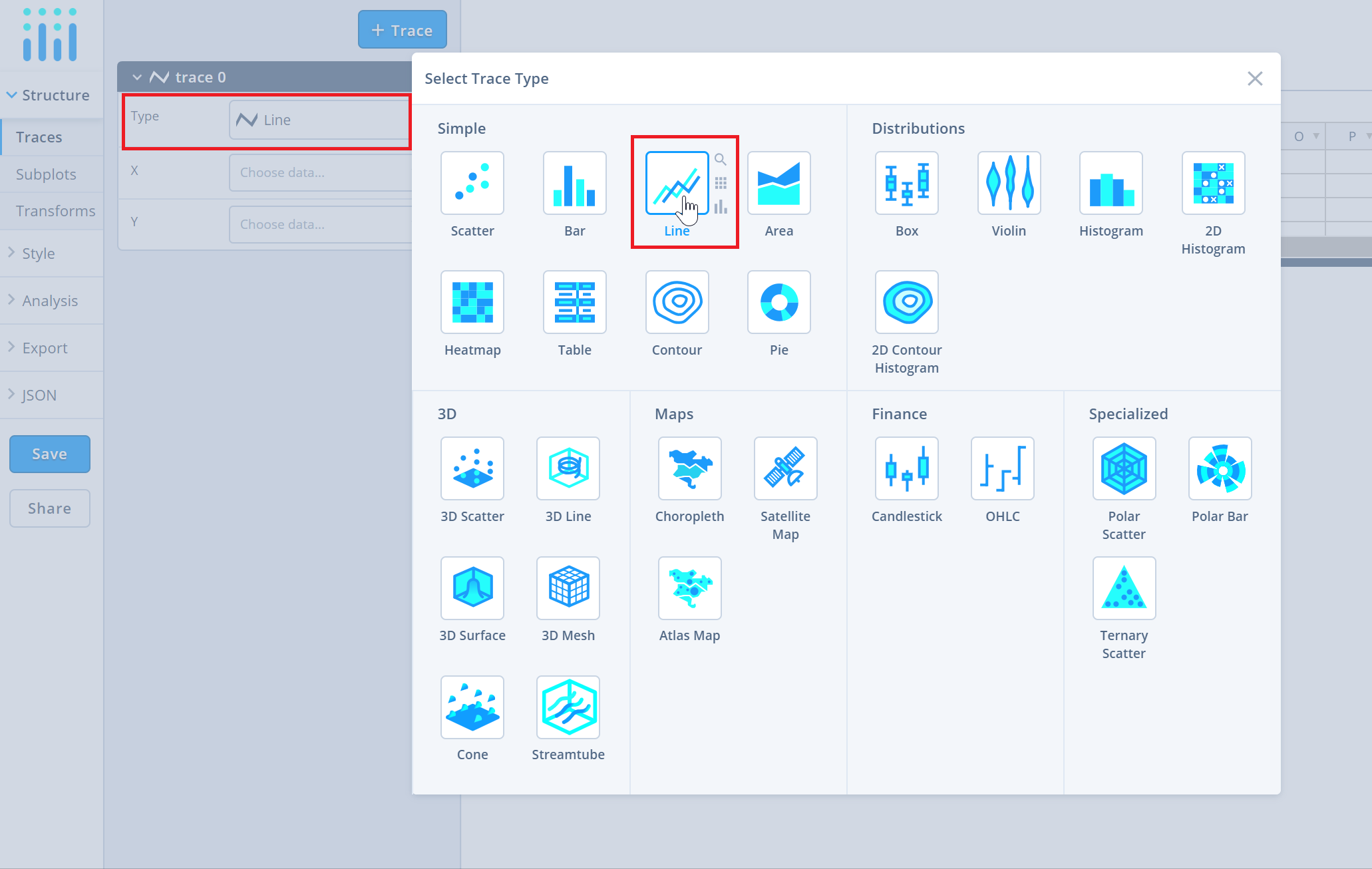
After adding data, go to the 'Traces' section under the 'Structure' menu on the left-hand side. Choose the 'Type' of trace, then choose 'Line' under 'Simple' chart type.
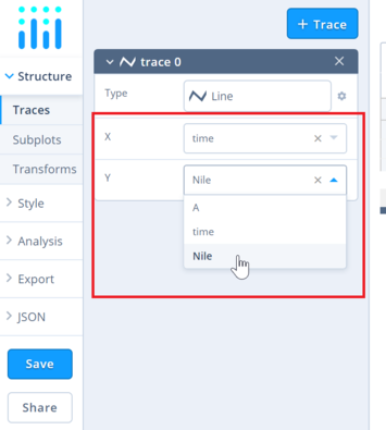
Next, select 'X' and 'Y' values from the dropdown menus.
This will create a line trace as seen below.

To add more traces to the plot, click on '+ Trace' button at the top right corner of the panel in the 'Traces' section under the 'Structure' menu.
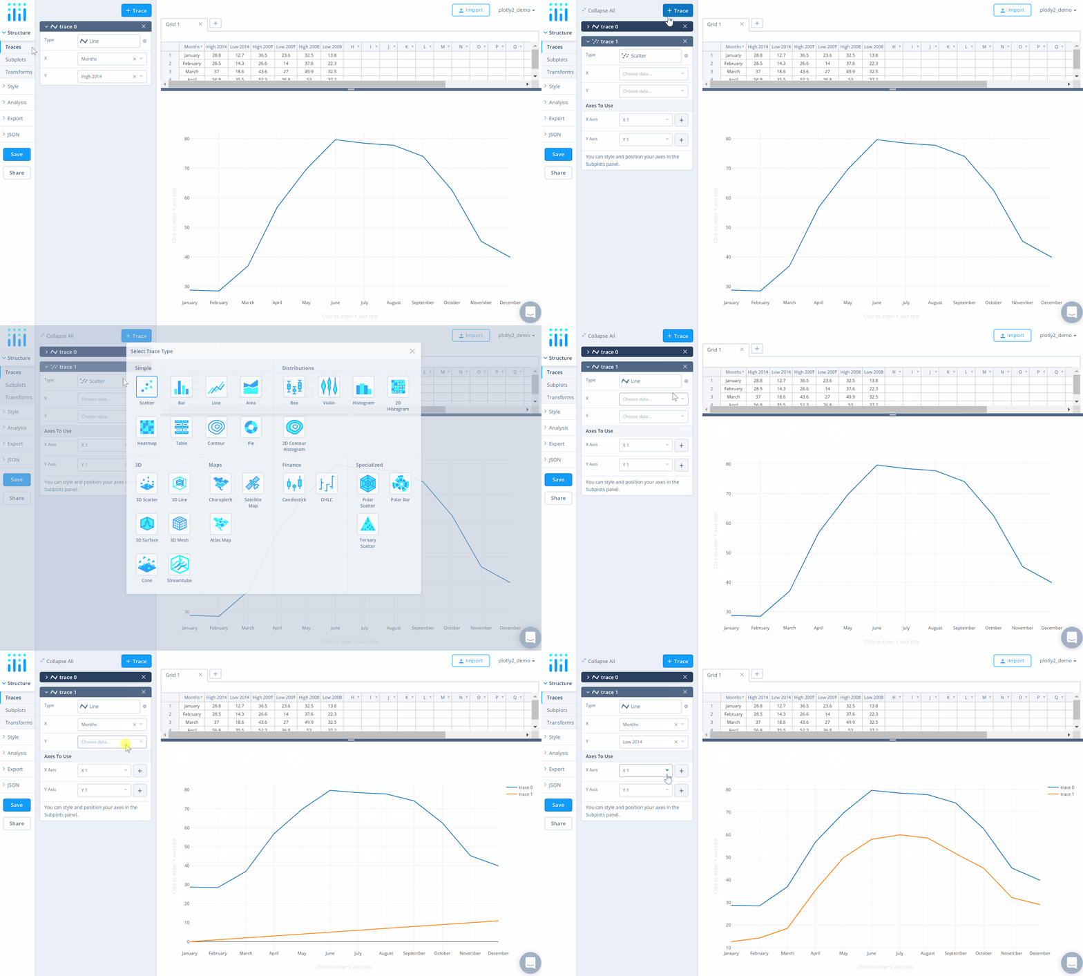
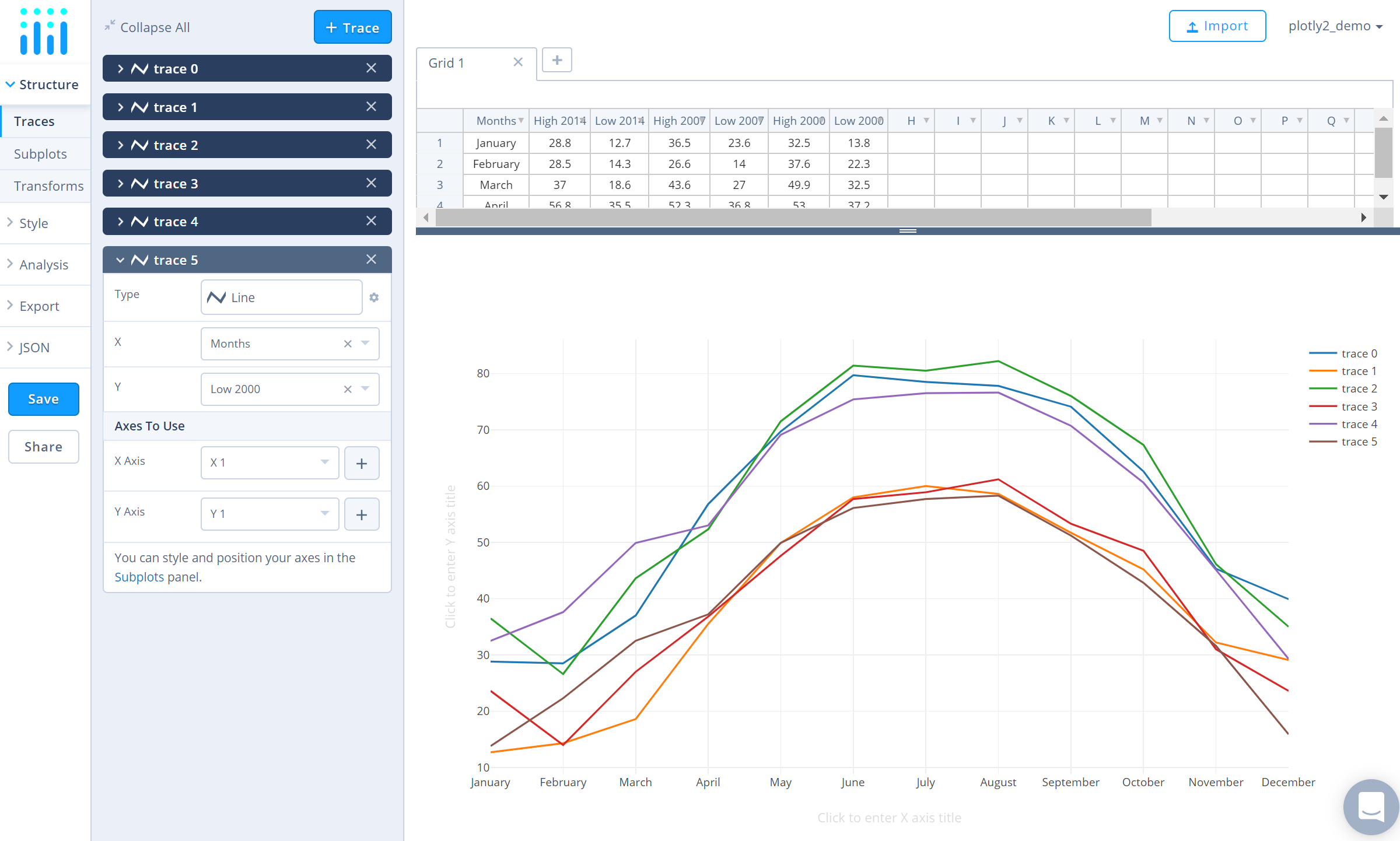
Add as many traces as needed, until the plot is complete! For this particular graph, we compare the average high and low temperatures in New York for the years 2000, 2007 and 2014. We'll need six traces, and this is what the plot looks like after adding them all.
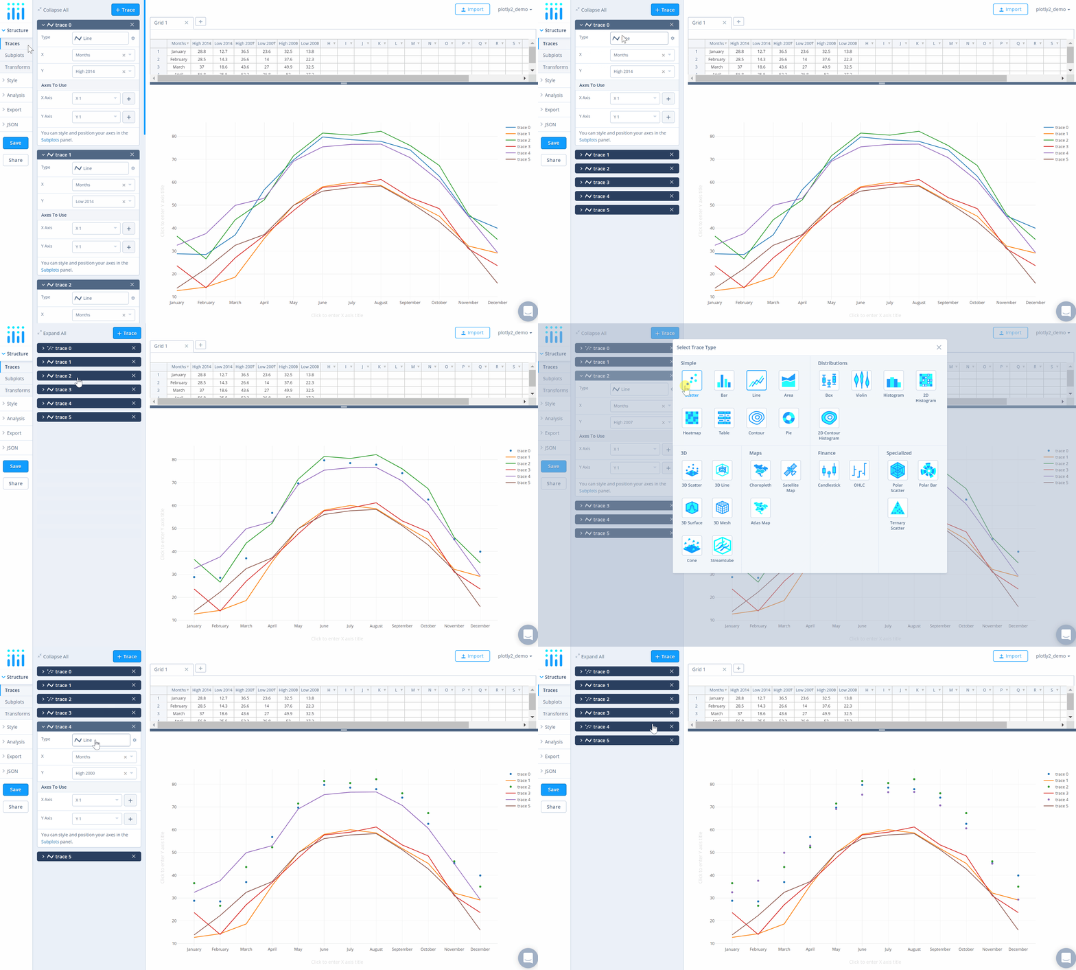
To mix it up a bit, we'll display the average high temperature traces as scatter plots, and the average low temperature traces as line plots. To do this, first go to the 'Traces' section under the 'Structure' and click 'Collapse All' on the top left corner of that panel. Now open the traces that need to be switched to 'Scatter' trace type – in this case, the average high temperature traces (trace 0, trace 2 and trace 4). Choose 'Scatter' under 'Simple' chart type in the 'Type' option.
Style Chart
The 'Style' menu displays many options to modify characteristics of the overall chart layout or the individual traces. To see more options about styling the chart, visit the style and layout section of the Chart Studio documentation.
To change the properties of the traces, go to the 'Traces' section under the 'Style' menu.
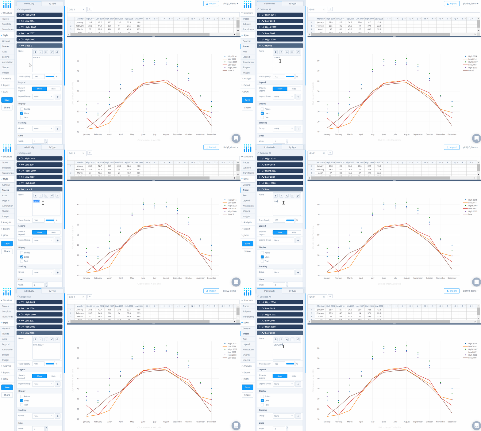
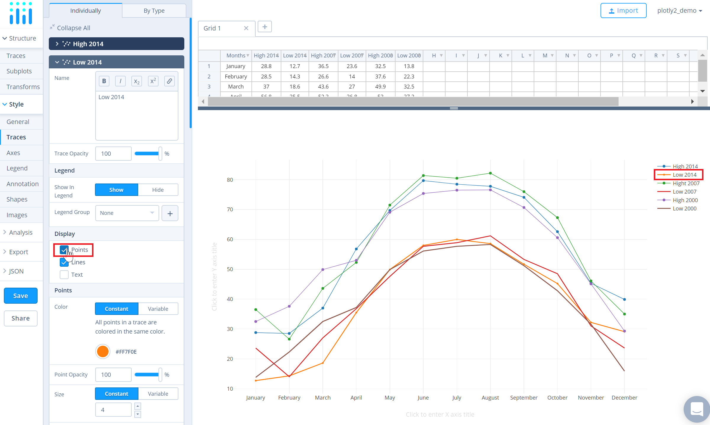
To set the trace names, type the name in the textbox provided under 'Name' property for each trace. Note that updating the trace name will update the legends as well.
To display a line that connects the markers in a scatter trace, click the checkbox corresponding to 'Lines' under the 'Display' option.
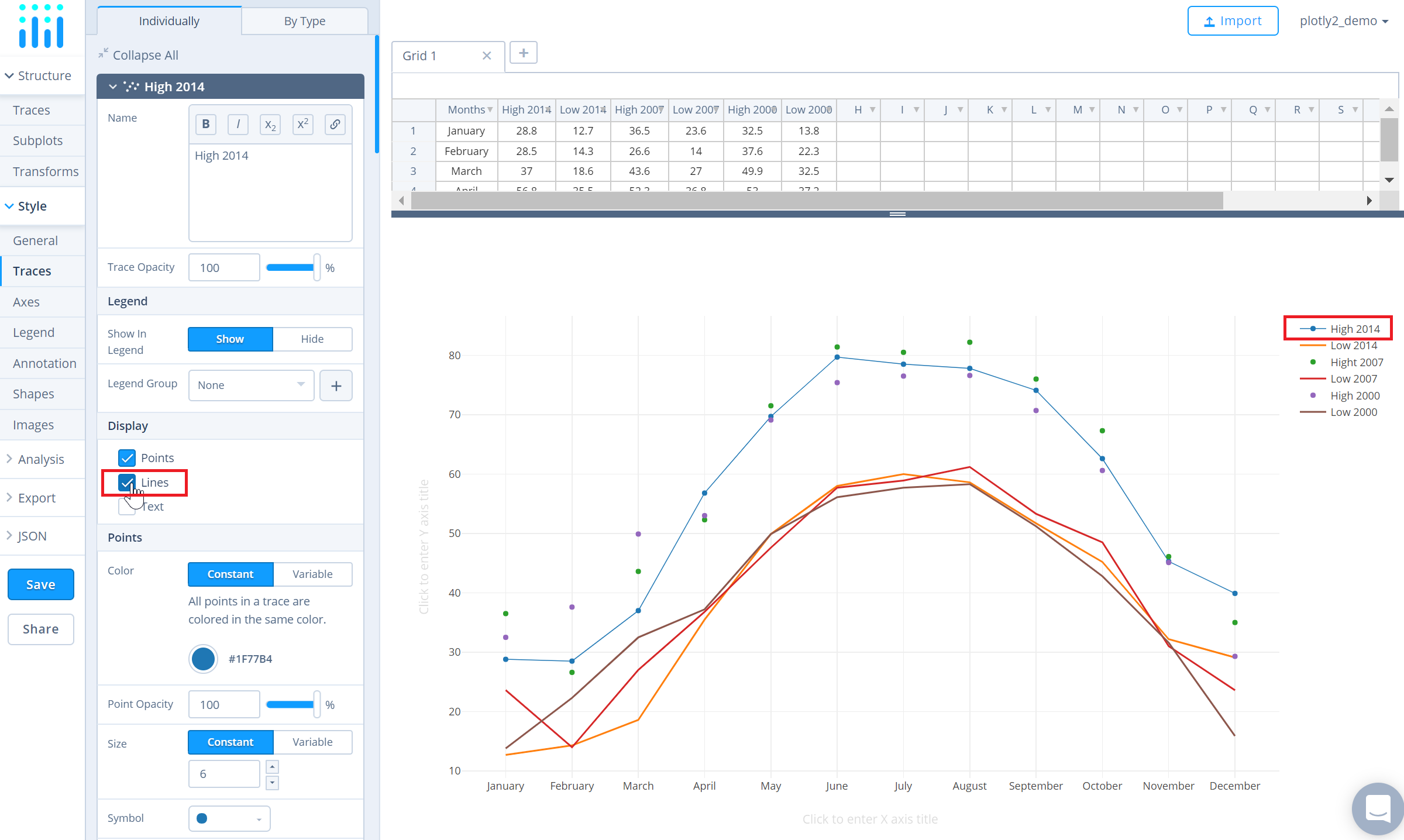
Similarly, to display markers along the line, click the checkbox corresponding to 'Points' under the 'Display' option.
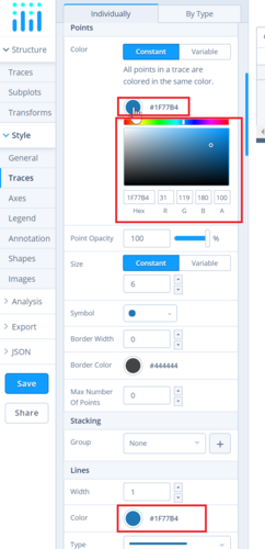
To change the color of the traces, click on the color palette as seen below.
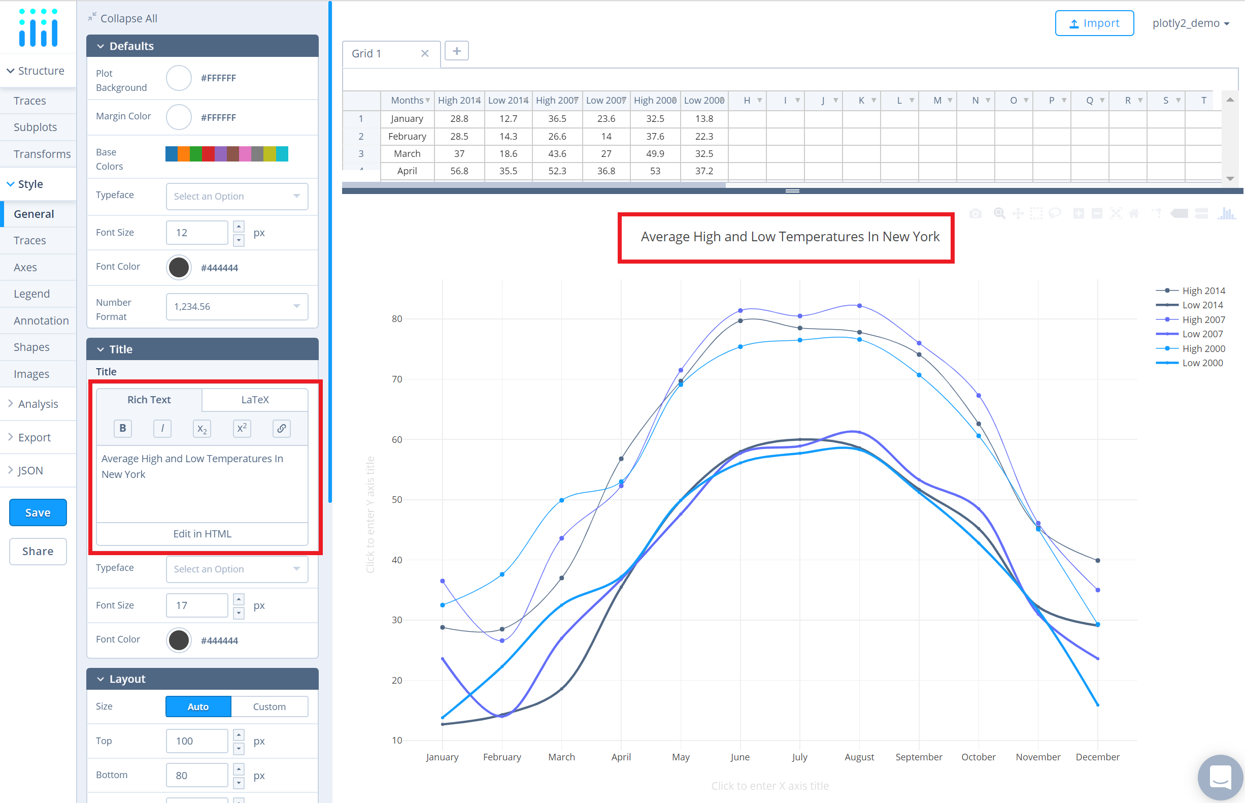
To set the plot title, go to the 'General' section under the 'Style' menu and type in the plot title within the textbox provided under 'Title'.
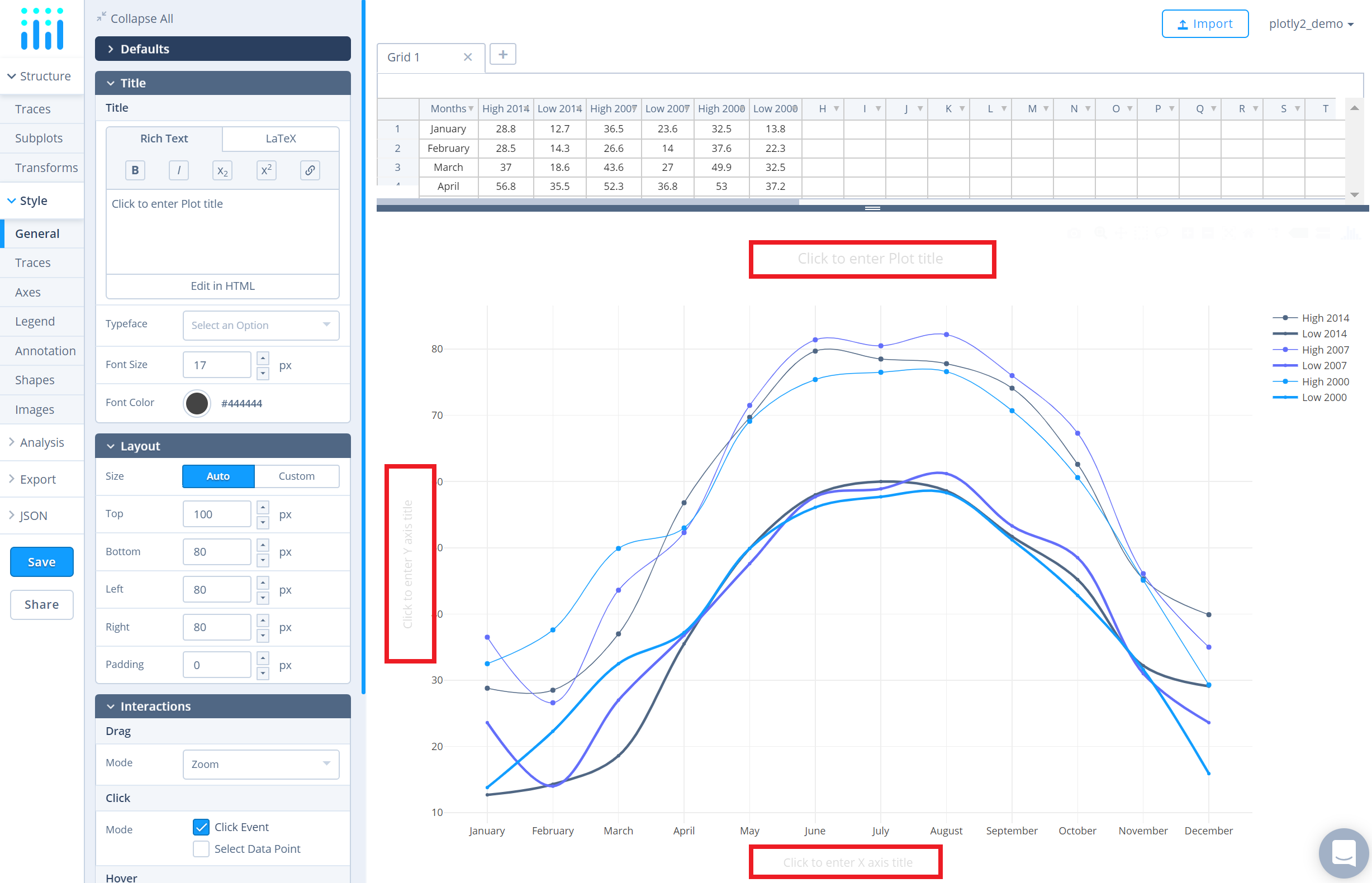
Another approach is to click and then enter the title directly on the plot interface. The same can be done for the axes title and the legends.
Save and Share
To save the plot click the 'Save' button on the left-hand side. A save modal will appear, as seen below, where you can specify the filenames and privacy settings for your plot and data grid.
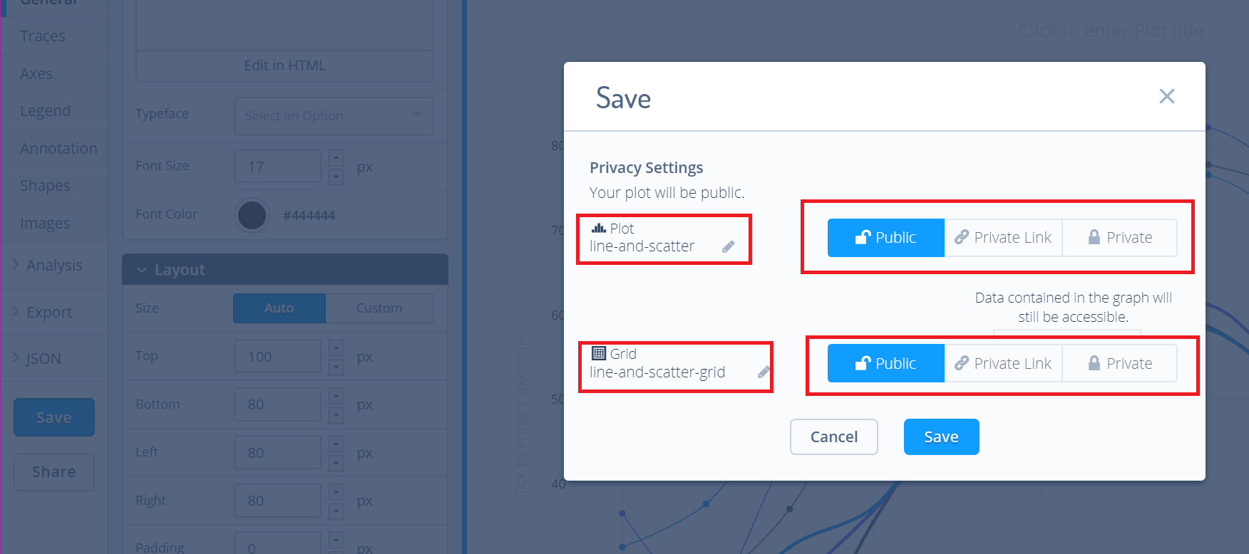
For more information on privacy settings and how sharing works, visit Chart Studio's sharing tutorial.

