Subplot Layouts in Chart Studio
Subplot Layouts in Chart Studio
Introduction
In this tutorial we will look at how to control the layout of subplots.
Add Your Data to Chart Studio
Head to Chart Studio’s new online workspace and add your data. You have the option of typing directly in the grid, uploading your file, or entering a URL of an online dataset. Chart Studio accepts .xls, .xlsx, or .csv files. For more information on how to enter your data, see this tutorial.
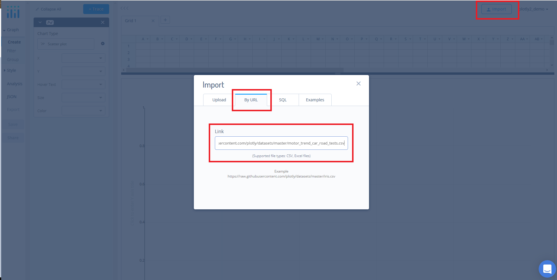
For this tutorial, we'll use the mtcars dataset which can be found here. Simply, copy the URL from GitHub. Now, returning to the workspace select 'IMPORT' and then 'By URL'. Here, you just paste the URL from GitHub.
Create Your Chart
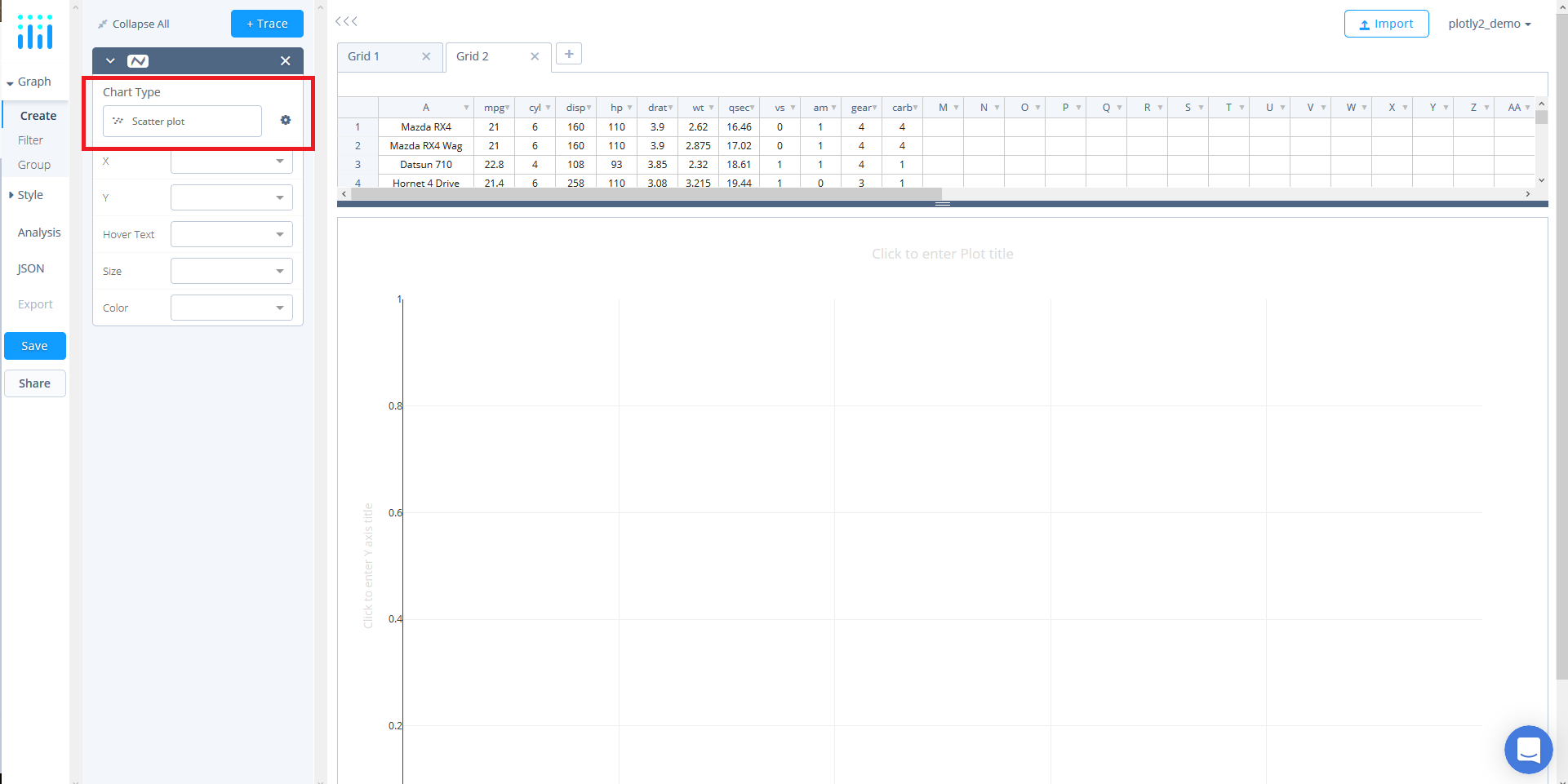
Now that the data has been added, we can select our chart types. Here, we will use a single trace for each subplot. First, we will use the default chart type, 'Scatter'.
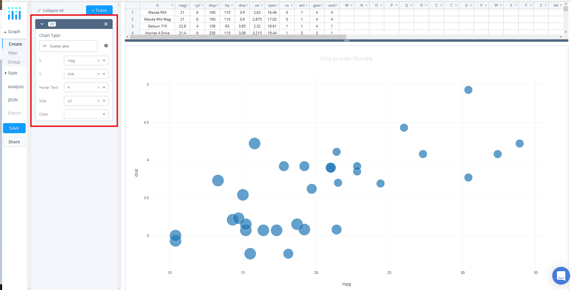
Next, we need to define our trace values. To do so, use the dropdowns in the trace panel to select 'mpg' as the X value, 'drat' as the Y value, set 'A' as the 'Hover Text', and set the 'Size' as 'cyl.
Now, lets add a second plot. Click '+ Trace' button and when a new trace panel box appears change the Y value to 'qsec'.
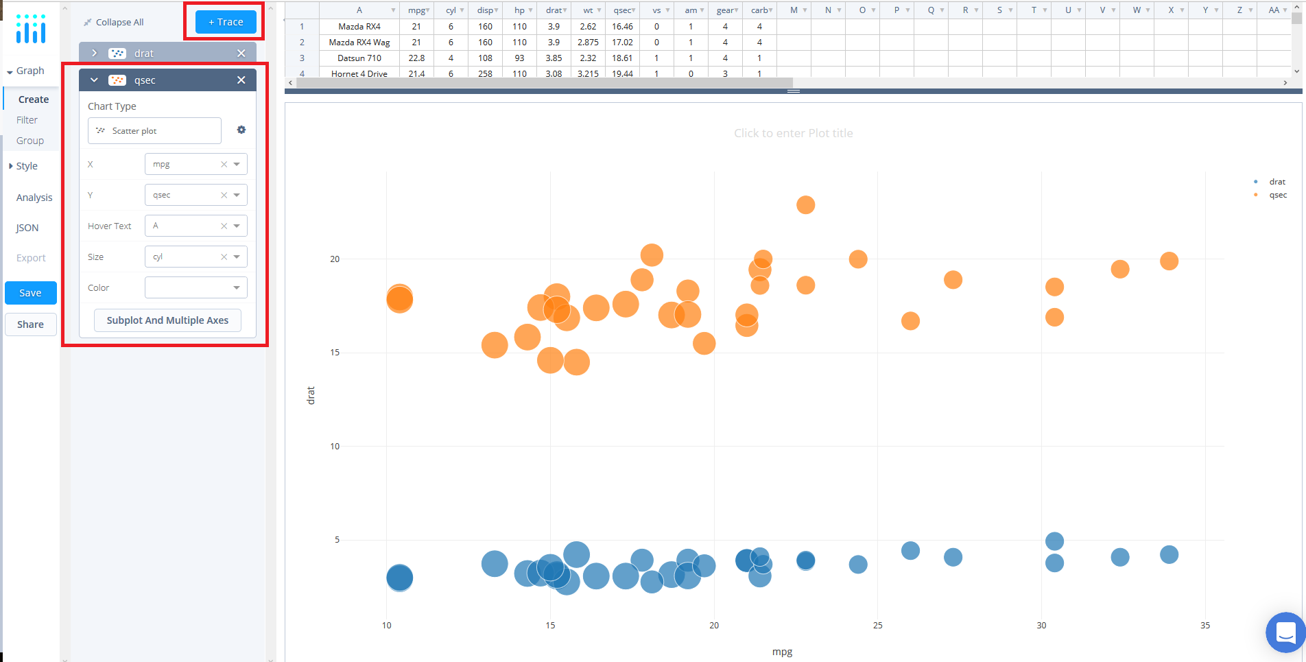
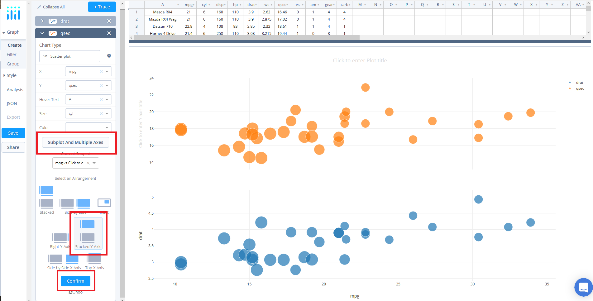
At the bottom of the panel click the 'Subplot & Multiple Axes' button where a selection of subplot arrangements ought to be presented. For this tutorial, select 'Stacked-Y-Axis' - also referred to as shared x-axis - and click 'Confirm'.
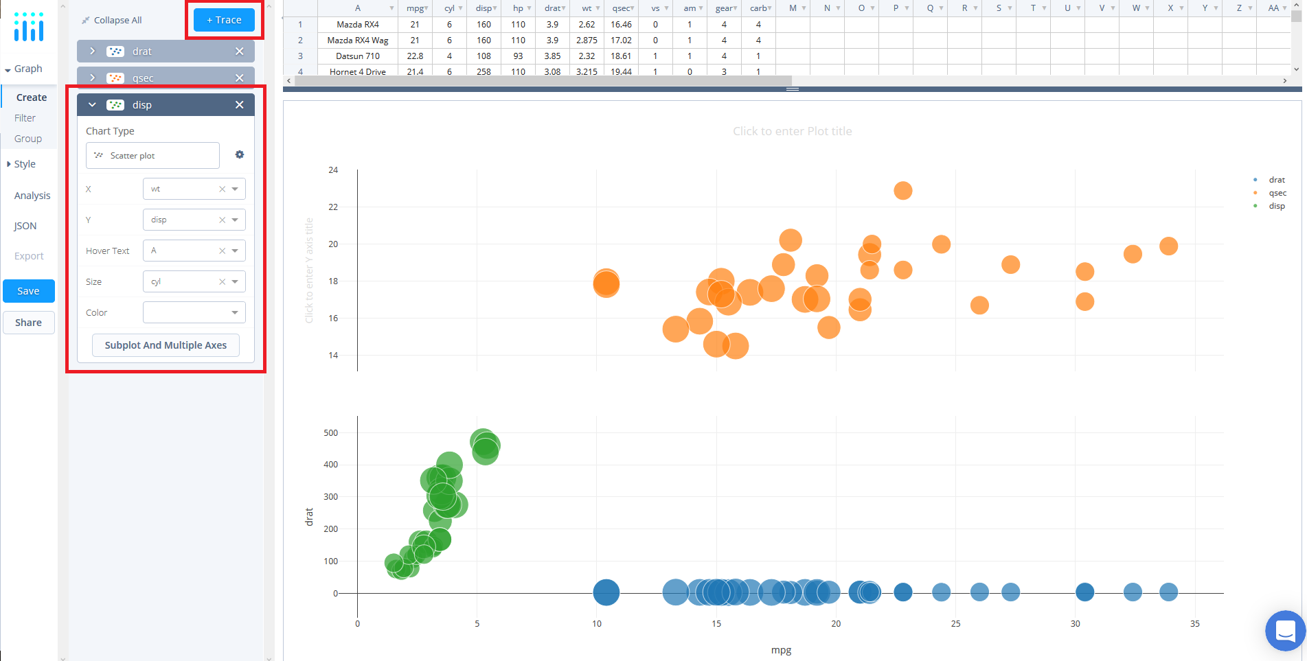
Now, we can add a third subplot by repeating the previous process. Add another trace by clicking the '+ Trace' button and when a new trace panel box appears change the X value to 'wt' and the Y value to 'disp'.
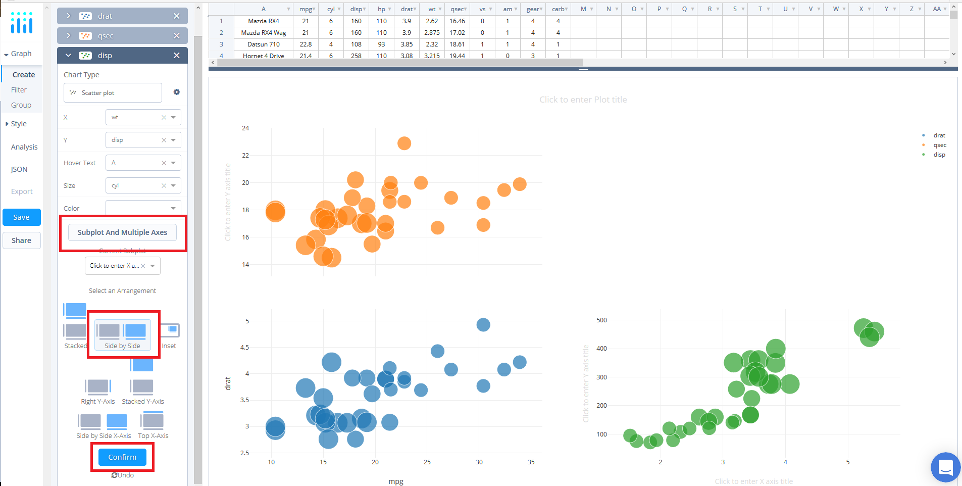
Again, click the 'Subplot & Multiple Axes' button in the third trace panel where a selection of subplot arrangements ought to be presented. For this subplot, select 'Side By Side' and click 'Confirm'. You may notice that the layout isn't what you want but we will address this once we have added all the plots.
For the fourth subplot start by adding another trace by clicking the '+ Trace' button and when a new trace panel box appears change the chart type to 'Bar'
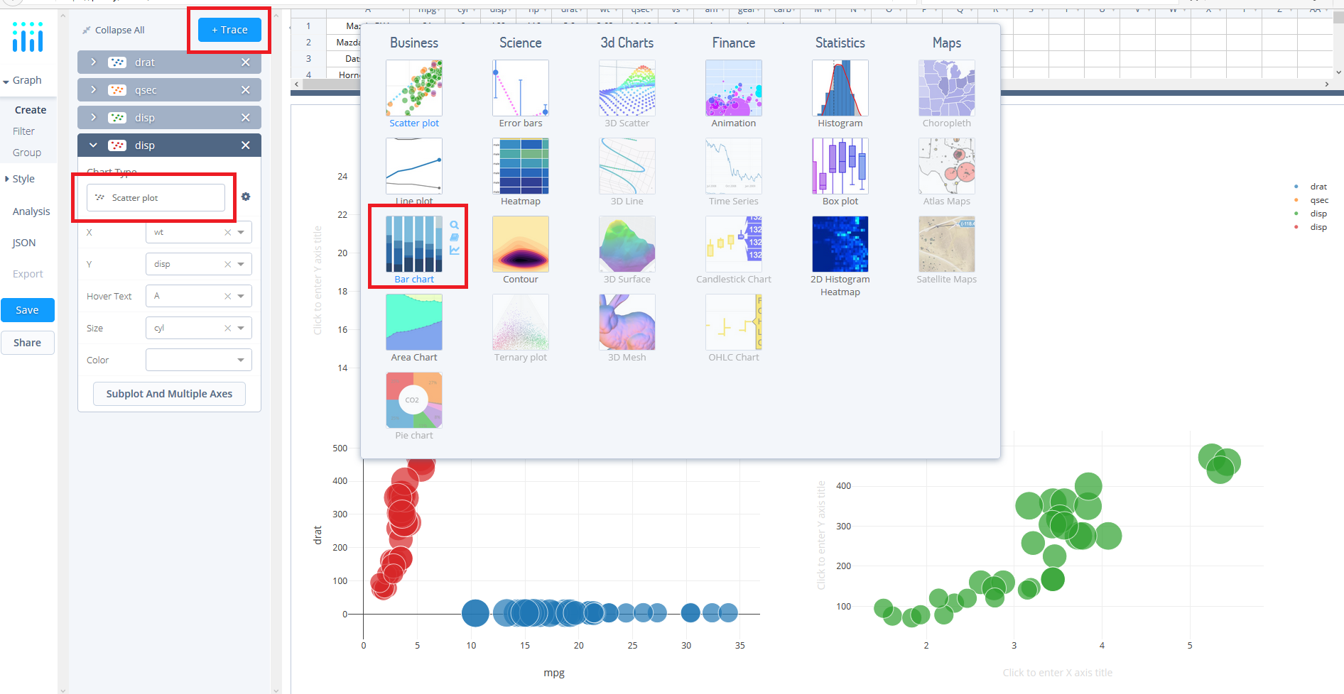
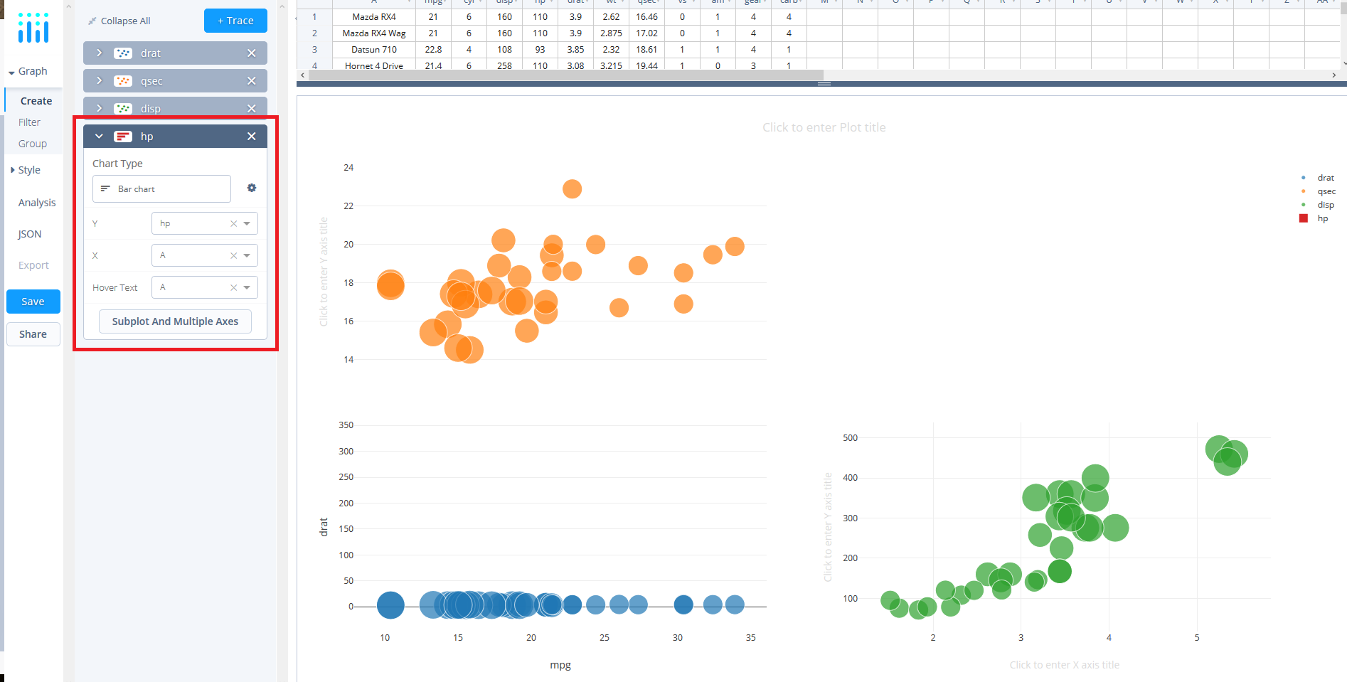
then the X value to 'A' and the Y value to 'hp'.
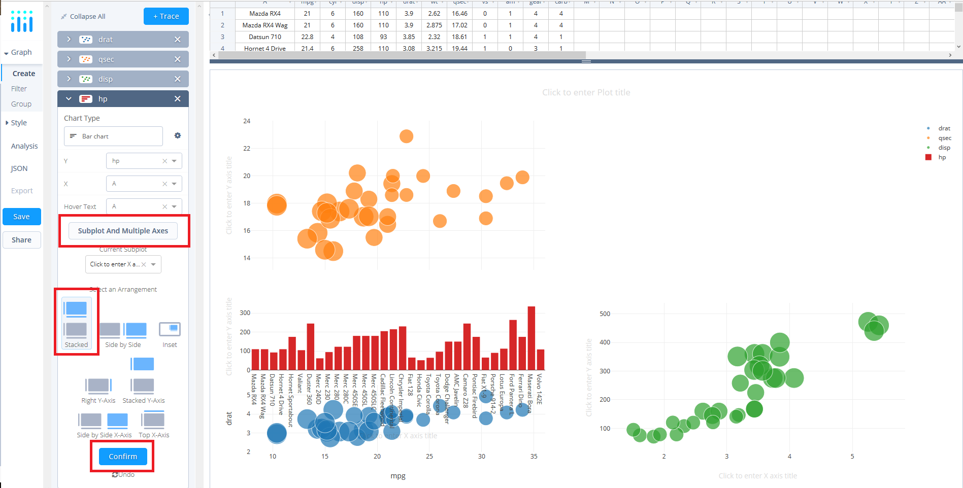
Like previously, click the 'Subplot & Multiple Axes' button in the fourth trace panel where a selection of subplot arrangements ought to be presented. For this subplot, select 'Stacked' and click 'Confirm'. As previously mentioned, you may notice that the layout isn't what you want but we will address this once we have added all the plots.
Style Your Chart
Now that we have all the plots and subplots added we need to organise the subplot layouts. Thus, select 'Axes' under the STYLE tab and navigate to 'Layout'. Here, we'll make a serious of changes to each axis across all plots.
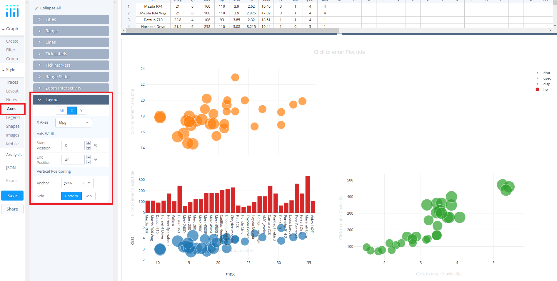
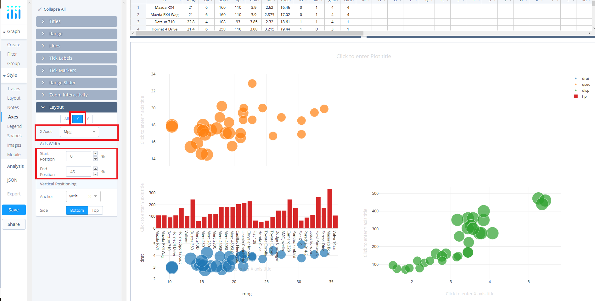
By default, the 'X axis' ought to be selected and 'Mpg' ought to be the option in the 'X Axes dropdown'. Ensure that the axis width is set at a 'Start Position' of 0 and an 'End Position' of 45. Leave other values to their default settings.
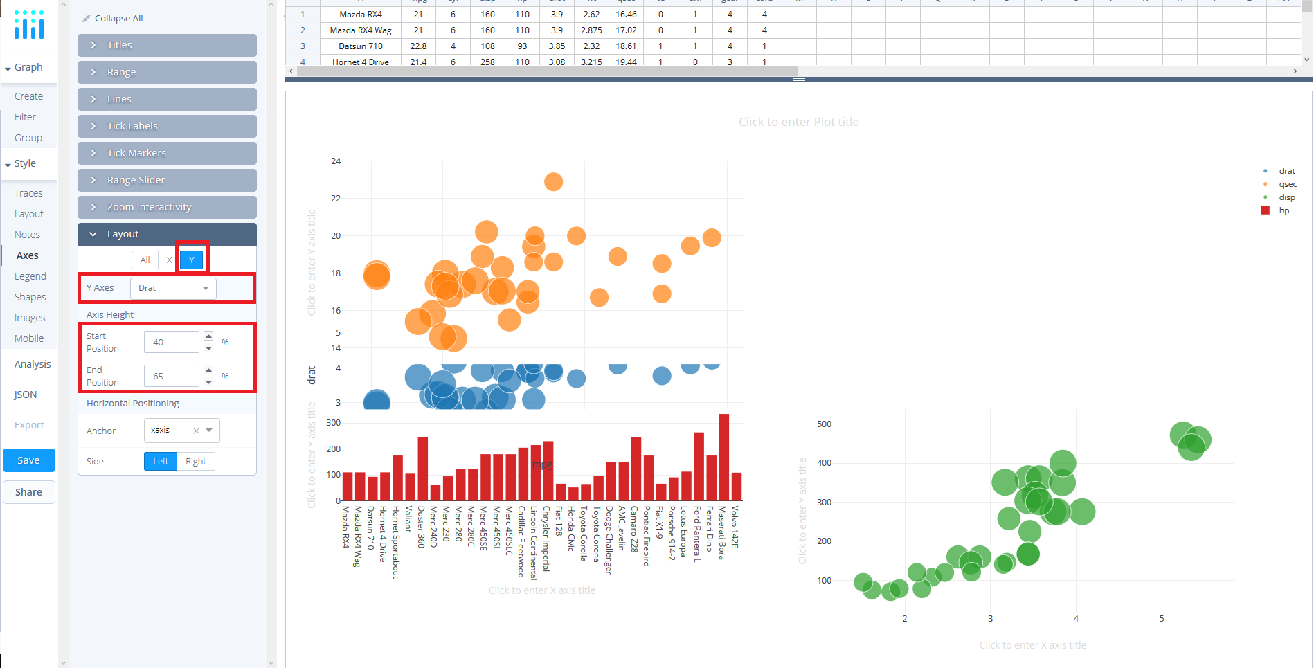
Now change to the 'Y axis' and in the 'Y Axes dropdown' ensure that 'Drat' is selected. Here, set the 'positions' to 40 and 65, respectively.
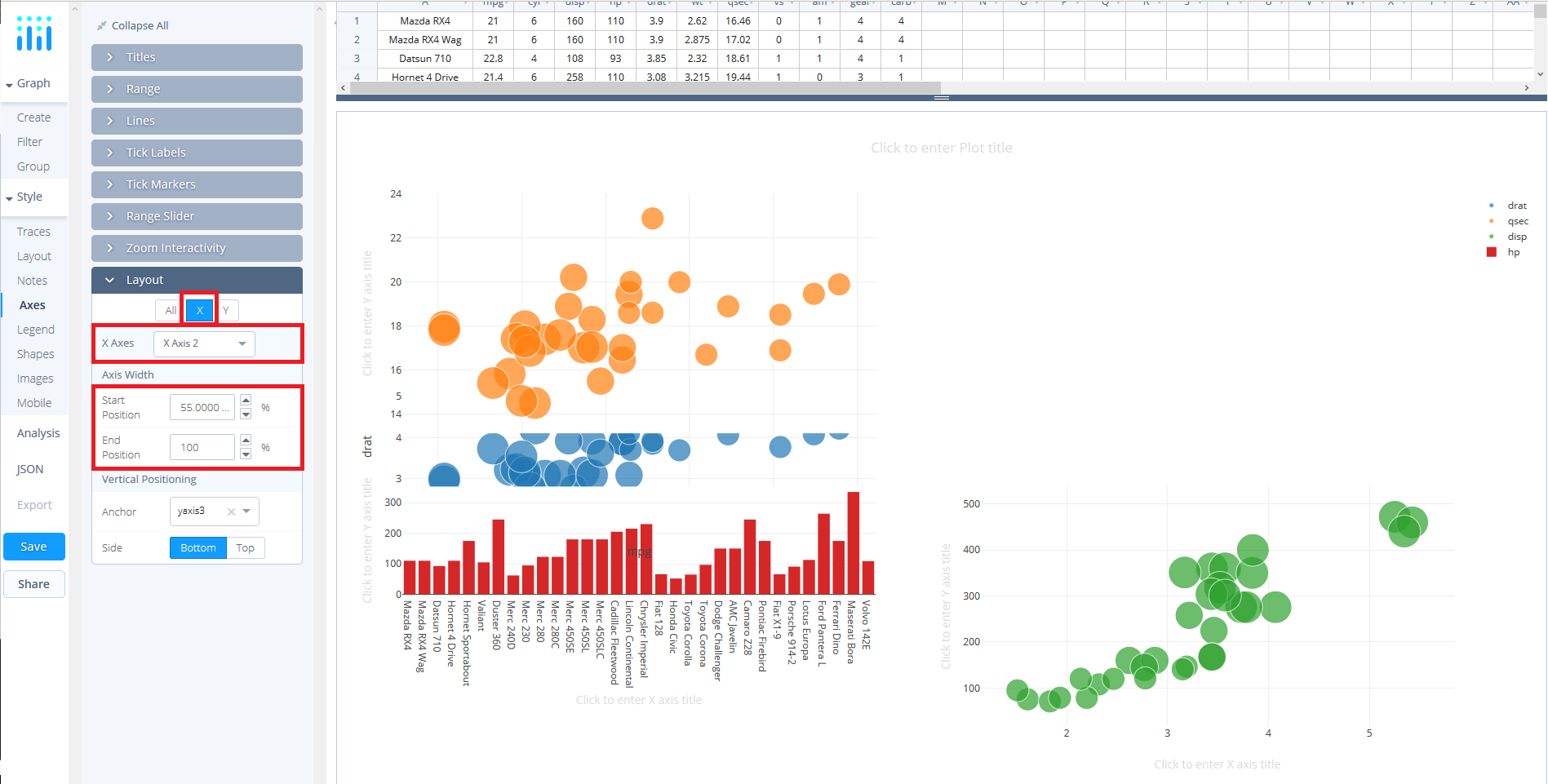
Switch back to the 'X axis' and select 'X Axis 2' from the 'X Axes dropdown'. Set the 'position' values to 55 and 100, respectively.
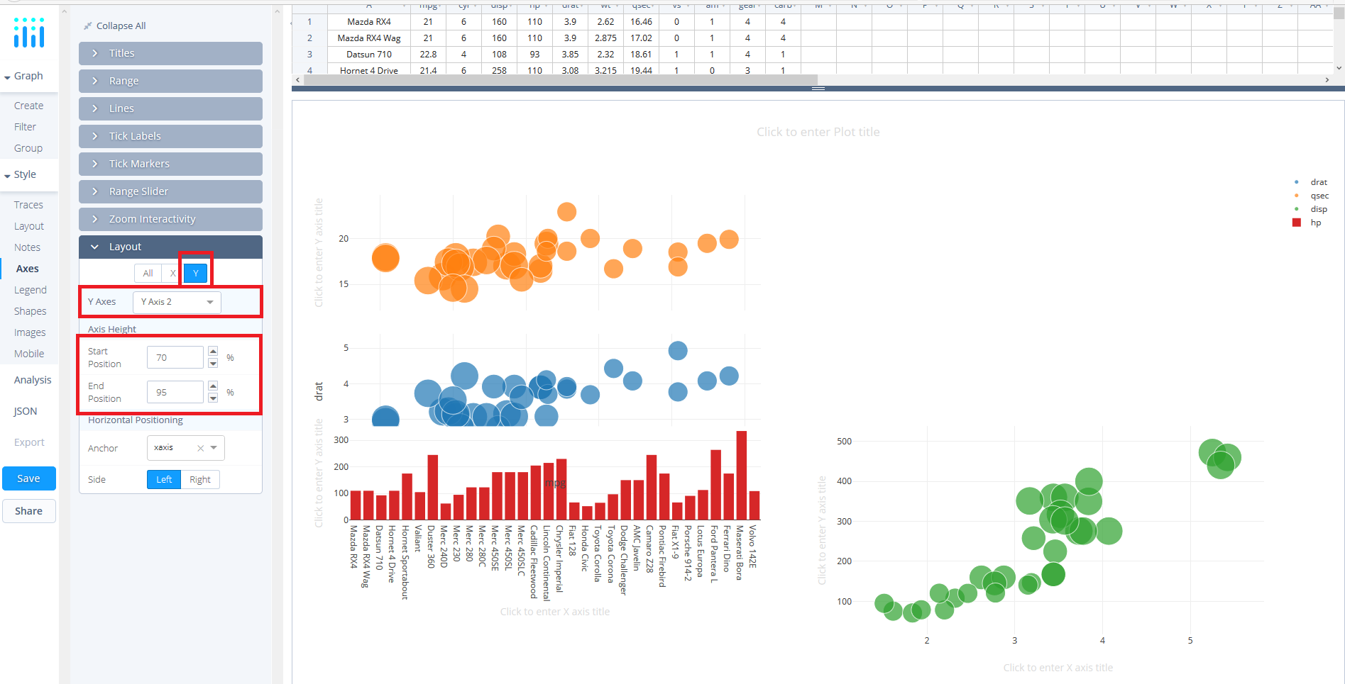
Likewise, click the 'Y axis' and select 'Y Axis 2' form the 'Y Axes dropdown'. Enter the 'position' values of 70 and 95, respectively.
Again, back to the 'X axis', select the 'X Axis 3' from the 'X Axes dropdown' and then set the 'Start Position' to 0 and the 'End Position' to 100.
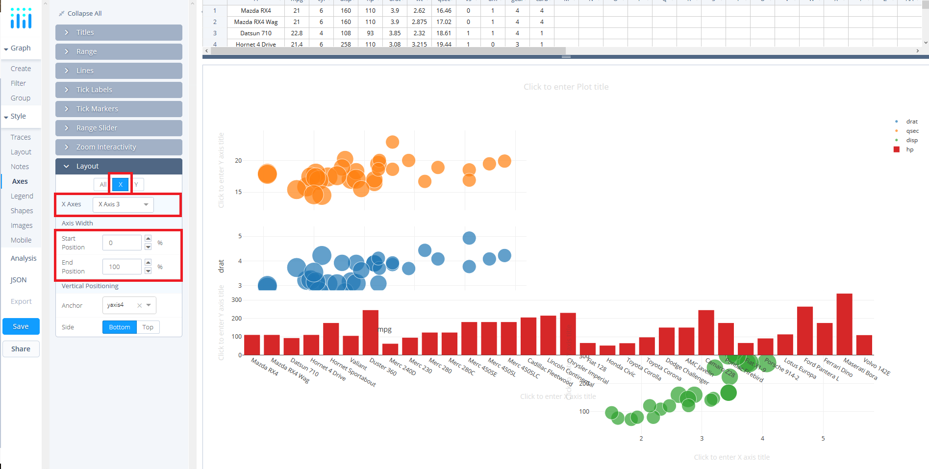
Flick back to the 'Y axis' and select 'Y Axis 3' from the 'Y Axes dropdown' and enter the values 40 and 100, respectively. Hopefully, now you're beginning to see some organization.
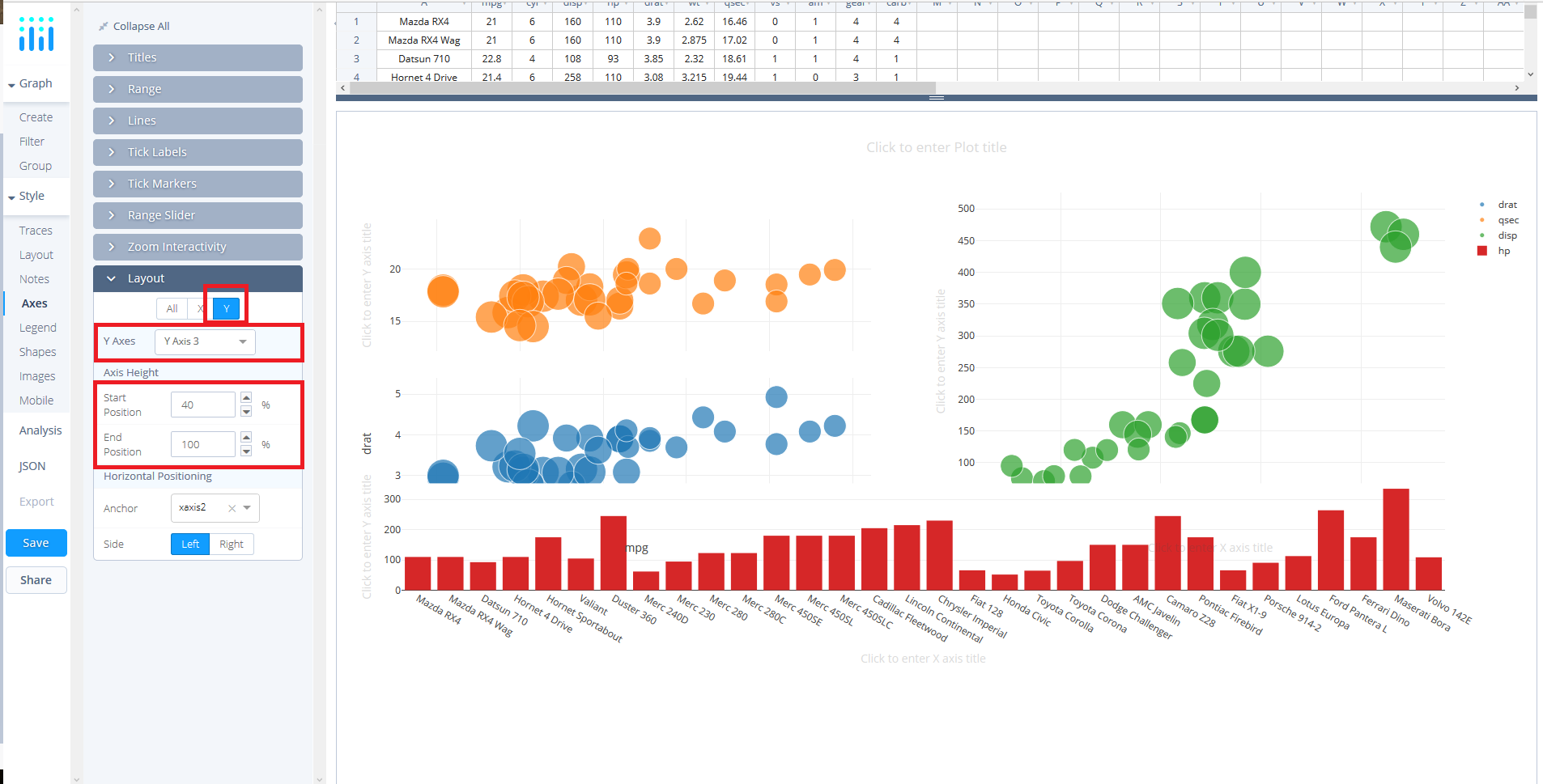
Staying with the 'Y axis', select 'Y Axis 4' from the dropdown and set the 'Start Position' to 10 and the 'End Position' to 30.
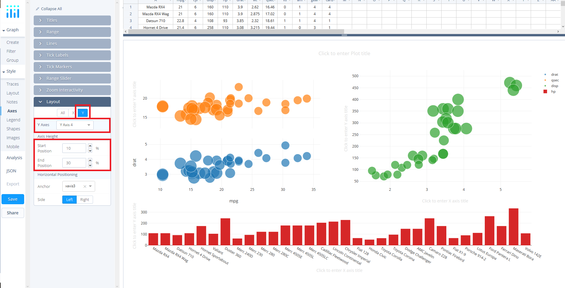
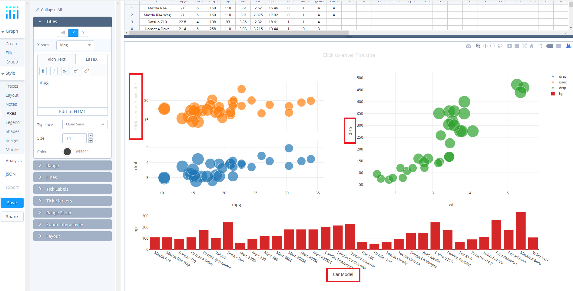
Now, you ought to be seeing all the plots in the right locations so we can work on styling the plot a little more. Staying in the 'Axes' tab under 'STYLE', select the 'Titles' box and then utilise the 'X' and 'Y' options and the dropdown to navigate which axis you wish to title using the textbox.
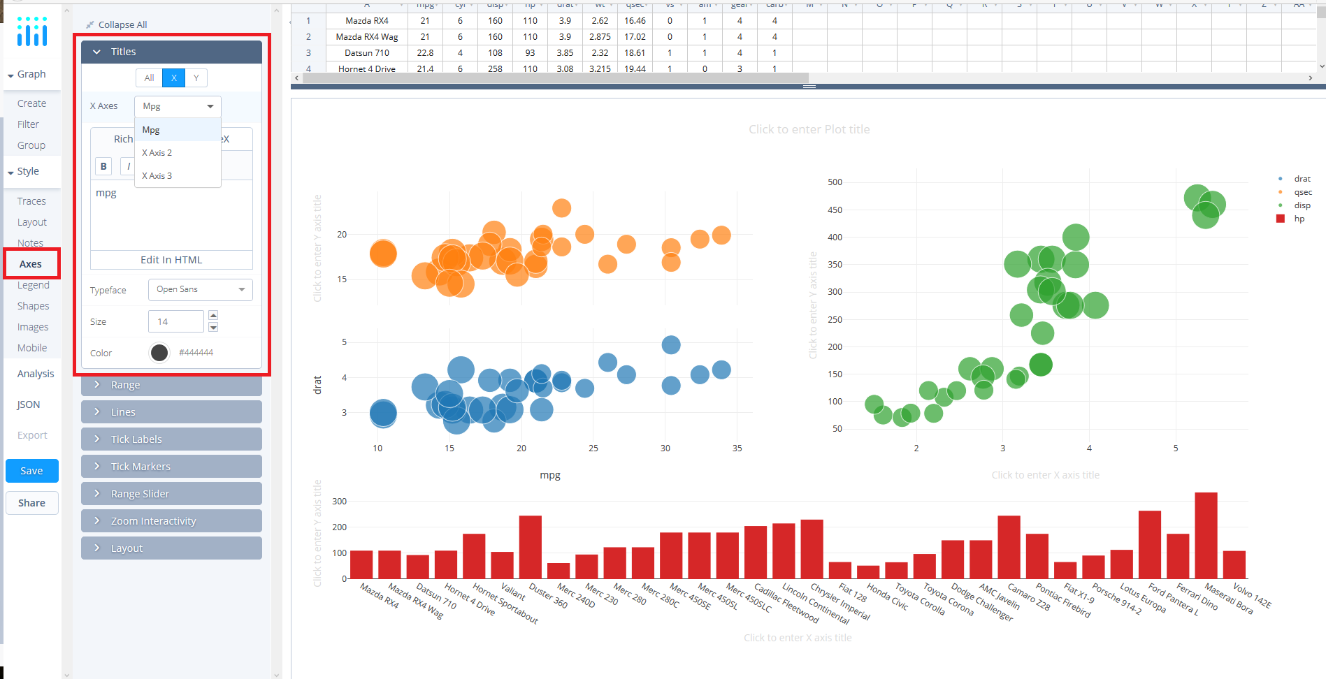
Alternatively, you can simply edit these directly in the plot by clicking on the area where is says 'Click to Enter … Title'.
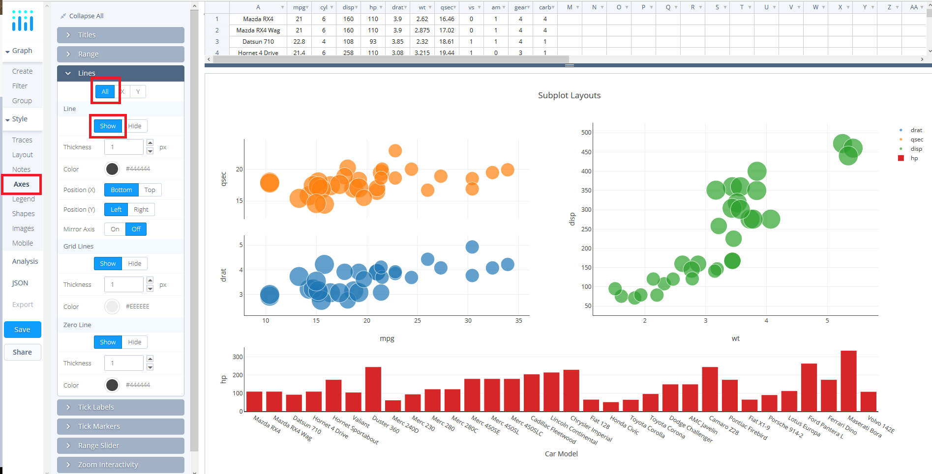
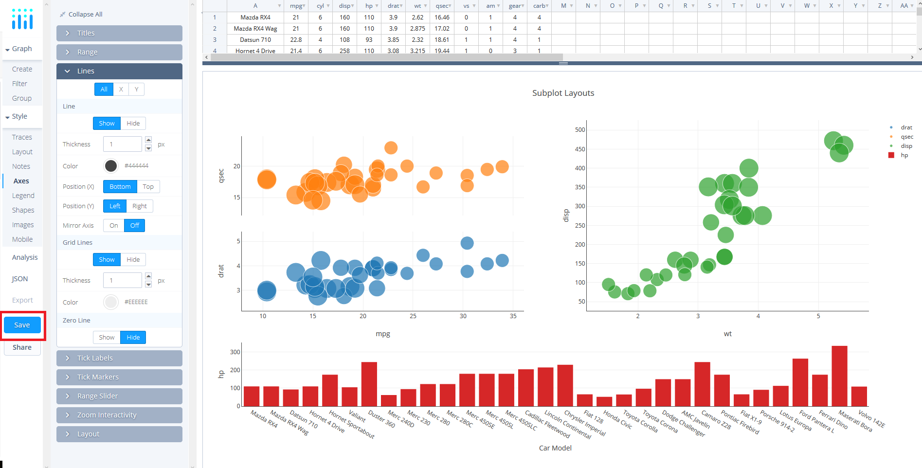
Before leaving the 'Axes' tab under 'STYLE', navigate to the 'Lines' box. Here, we can add lines to our axes by clicking the 'ALL' option and under 'Line' select 'Show'. Now, you ought to see 3 X axis lines and 4 Y axis lines (remember that the subplot in the top left-hand shares and X axis).
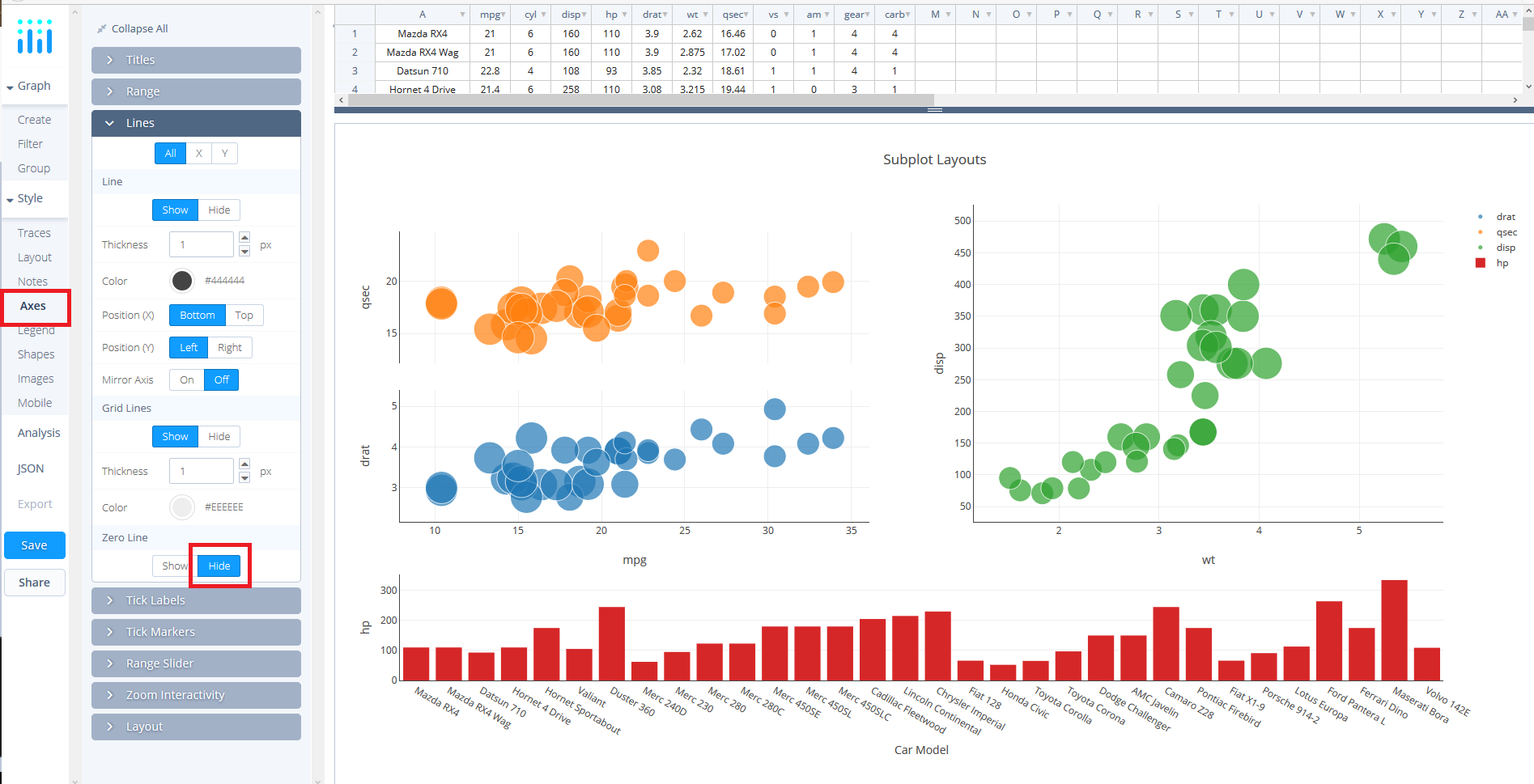
In the same box, 'Lines', but immediately below set 'Zero Line' to 'Hide'. Somewhat self-evident, this removes the line on the axis at 0.
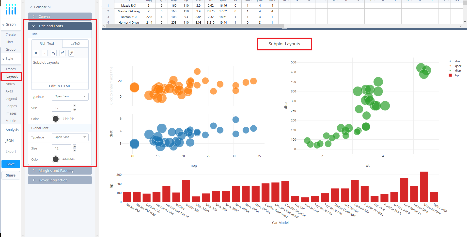
Lastly, we want to add a title to the plot. For this, navigate to 'Layout' under 'STYLE' and then select 'Titles and Fonts'. In the text box enter 'Subplot Layouts' or alternatively, like before, you can enter it directly in the plot where it says 'Click to Enter Plot Title'.
Save and Share
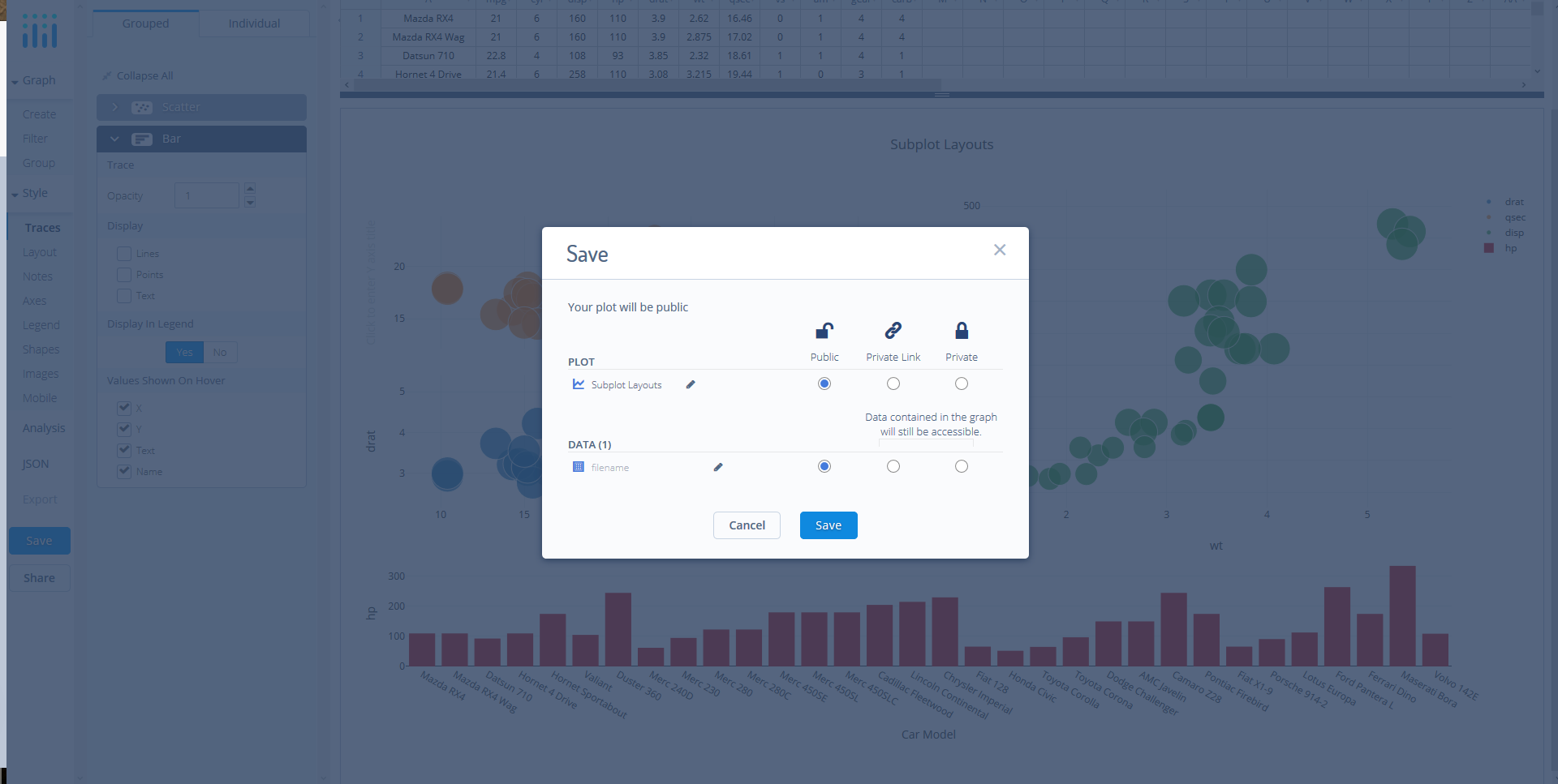
Your chart is now done! Click SAVE on the left-hand side.
After giving your file a name, select your PLOT and DATA as 'Public' or 'Private'. For more information on how sharing works, including the difference between private, public and secret sharing, visit this page.
