

Plotly.rs
Plotly.rs is a plotting library powered by Plotly.js. The aim is to bring over to Rust all the functionality that Python users have come to rely on with the added benefit of type safety and speed.
Plotly.rs is free and open source. You can find the source on GitHub. Issues and feature requests can be posted on the issue tracker.
API Docs
This book is intended to be a recipe index, which closely follows the plotly.js examples, and is complemented by the API documentation.
Contributing
Contributions are always welcomed, no matter how large or small. Refer to the contributing guidelines for further pointers, and, if in doubt, open an issue.
License
Plotly.rs is distributed under the terms of the MIT license.
See LICENSE
Getting Started
To start using plotly.rs in your project add the following to your Cargo.toml:
[dependencies]
plotly = "0.14"
Plotly.rs is ultimately a thin wrapper around the plotly.js library. The main job of this library is to provide structs and enums which get serialized to json and passed to the plotly.js library to actually do the heavy lifting. As such, if you are familiar with plotly.js or its derivatives (e.g. the equivalent Python library), then you should find plotly.rs intuitive to use.
A Plot struct contains one or more Trace objects which describe the structure of data to be displayed. Optional Layout and Configuration structs can be used to specify the layout and config of the plot, respectively.
The builder pattern is used extensively throughout the library, which means you only need to specify the attributes and details you desire. Any attributes that are not set will fall back to the default value used by plotly.js.
All available traces (e.g. Scatter, Bar, Histogram, etc), the Layout, Configuration and Plot have been hoisted in the plotly namespace so that they can be imported simply using the following:
#![allow(unused)] fn main() { use plotly::{Plot, Layout, Scatter}; }
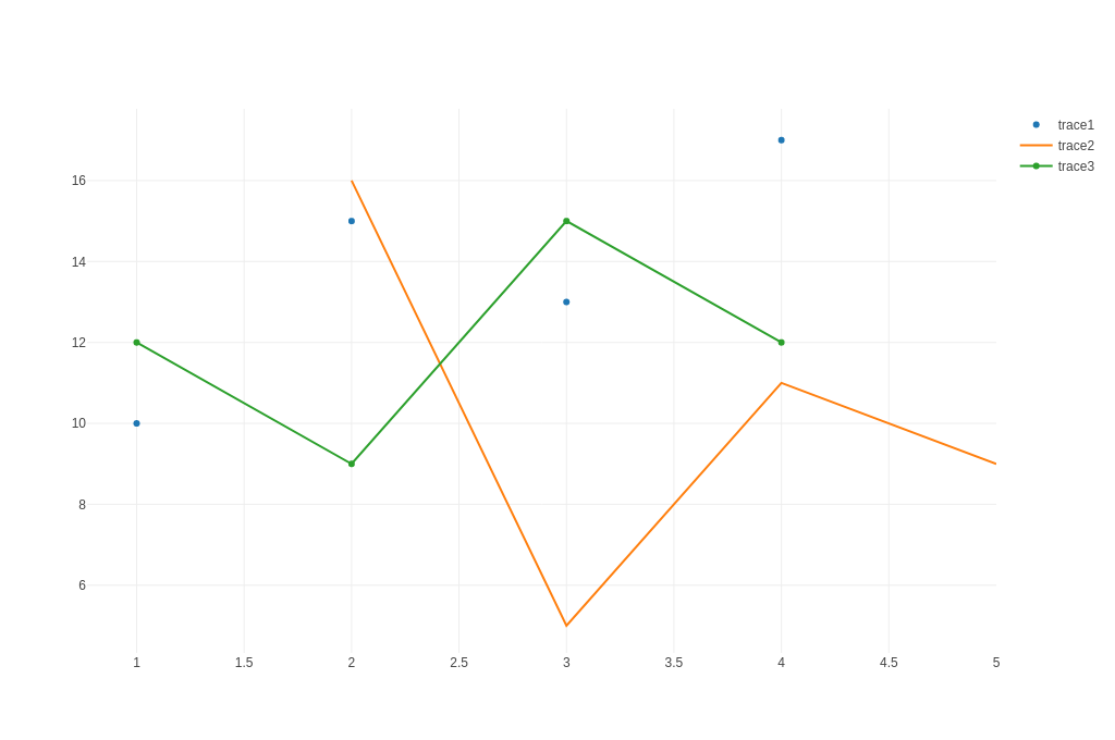
The aforementioned components can be combined to produce as simple plot as follows:
use plotly::common::Mode; use plotly::{Plot, Scatter}; fn line_and_scatter_plot() { let trace1 = Scatter::new(vec![1, 2, 3, 4], vec![10, 15, 13, 17]) .name("trace1") .mode(Mode::Markers); let trace2 = Scatter::new(vec![2, 3, 4, 5], vec![16, 5, 11, 9]) .name("trace2") .mode(Mode::Lines); let trace3 = Scatter::new(vec![1, 2, 3, 4], vec![12, 9, 15, 12]).name("trace3"); let mut plot = Plot::new(); plot.add_trace(trace1); plot.add_trace(trace2); plot.add_trace(trace3); plot.show(); } fn main() -> std::io::Result<()> { line_and_scatter_plot(); Ok(()) }
which results in the following figure (displayed here as a static png file):
The above code will generate an interactive html page of the Plot and display it in the default browser. The html for the plot is stored in the platform specific temporary directory. To save the html result, you can do so quite simply:
#![allow(unused)] fn main() { plot.write_html("/home/user/line_and_scatter_plot.html"); }
It is often the case that plots are produced to be included in a document and a different format for the plot is desirable (e.g. png, jpeg, etc). Given that the html version of the plot is composed of vector graphics, the display when converted to a non-vector format (e.g. png) is not guaranteed to be identical to the one displayed in html. This means that some fine tuning may be required to get to the desired output. To support that iterative workflow, Plot has a show_image() method which will display the rasterised output to the target format, for example:
#![allow(unused)] fn main() { plot.show_image(ImageFormat::PNG, 1280, 900); }
will display in the browser the rasterised plot; 1280 pixels wide and 900 pixels tall, in png format.
Once a satisfactory result is achieved, and assuming the kaleido feature is enabled, the plot can be saved using the following:
#![allow(unused)] fn main() { plot.write_image("/home/user/plot_name.ext", ImageFormat::PNG, 1280, 900, 1.0); }
The extension in the file-name path is optional as the appropriate extension (ImageFormat::PNG) will be included. Note that in all functions that save files to disk, both relative and absolute paths are supported.
Saving Plots with Kaleido (legacy)
To add the ability to save plots in the following formats: png, jpeg, webp, svg, pdf and eps, you can use the kaleido feature. This feature depends on plotly/Kaleido: a cross-platform open source library for generating static images. All the necessary binaries have been included with plotly_kaleido for Linux, Windows and MacOS. Previous versions of plotly.rs used the orca feature, however, this has been deprecated as it provided the same functionality but required additional installation steps. To enable the kaleido feature add the following to your Cargo.toml:
[dependencies]
plotly = { version = "0.14", features = ["kaleido"] }
Static Image Export with WebDriver (recommended)
For static image export using WebDriver and headless browsers, you can use the plotly_static feature. This feature supports the same formats as Kaleido (png, jpeg, webp, svg, pdf) but uses WebDriver for the static export process. To enable static export, add the following to your Cargo.toml:
[dependencies]
plotly = { version = "0.14", features = ["static_export_default"] }
The static_export_default feature includes Chrome WebDriver support with automatic download. For Firefox support, use static_export_geckodriver instead. See the Static Image Export chapter for a detailed usage example.
WebAssembly Support
As of v0.8.0, plotly.rs can now be used in a Wasm environment by enabling the wasm feature in your Cargo.toml:
[dependencies]
plotly = { version = ">=0.8.0" features = ["wasm"] }
The wasm feature exposes rudimentary bindings to the plotly.js library, which can then be used in a wasm environment such as the Yew frontend framework.
To make a very simple Plot component might look something like:
#![allow(unused)] fn main() { use yew::prelude::*; #[derive(Properties, PartialEq)] pub struct PlotProps { pub id: String, pub plot: plotly::Plot, pub class: Option<Classes>, } #[function_component(Plot)] pub fn plot(props: &PlotProps) -> Html { let PlotProps { id, plot, class } = props; let p = yew_hooks::use_async::<_, _, ()>({ let id = id.clone(); let plot = plot.clone(); async move { plotly::bindings::new_plot(&id, &plot).await; Ok(()) } }); { let id = id.clone(); let plot = plot.clone(); use_effect_with_deps( move |(_, _)| { p.run(); || () }, (id, plot), ); } html! { <div id={id.clone()} class={class.clone()}></div> } } }
Fundamentals
Functionality that applies to the library as a whole is described in the next sections.
Core Features
- Jupyter Support: Interactive plotting in Jupyter notebooks
- ndarray Support: Integration with the ndarray crate for numerical computing
- Shapes: Adding shapes and annotations to plots
- Themes: Customizing plot appearance with themes
- Static Image Export: Exporting plots to static images (PNG, JPEG, SVG, PDF) using WebDriver
- Timeseries Downsampling: Downsampling Timeseries for Visualization
Jupyter Support
As of version 0.7.0, Plotly.rs has native support for the EvCxR Jupyter Kernel.
Once you've installed the required packages you'll be able to run all the examples shown here as well as all the recipes in Jupyter Lab!
Installation
It is assumed that an installation of the Anaconda Python distribution is already present in the system. If that is not the case you can follow these instructions to get up and running with Anaconda.
conda install -c plotly plotly=4.9.0
conda install jupyterlab "ipywidgets=7.5"
optionally (or instead of jupyterlab) you can also install Jupyter Notebook:
conda install notebook
Although there are alternative methods to enable support for the EvCxR Jupyter Kernel, we have elected to keep the requirements consistent with what those of other languages, e.g. Julia, Python and R. This way users know what to expect; and also the folks at Plotly have done already most of the heavy lifting to create an extension for Jupyter Lab that works very well.
Run the following to install the Plotly Jupyter Lab extension:
jupyter labextension install jupyterlab-plotly@4.9.0
Once this step is complete to make sure the installation so far was successful, run the following command:
jupyter lab
Open a Python 3 kernel copy/paste the following code in a cell and run it:
import plotly.graph_objects as go
fig = go.Figure(data=go.Bar(x=['a', 'b', 'c'], y=[11, 22, 33]))
fig.show()
You should see the following figure:
Next you need to install the EvCxR Jupyter Kernel. Note that EvCxR requires CMake as it has to compile ZMQ. If CMake is already installed on your system and is in your path (to test that simply run cmake --version if that returns a version you're good to go) then continue to the next steps.
In a command line execute the following commands:
cargo install evcxr_jupyter
evcxr_jupyter --install
If you're not familiar with the EvCxR kernel it would be good that you at least glance over the EvCxR Jupyter Tour.
Usage
Launch Jupyter Lab:
jupyter lab
create a new notebook and select the Rust kernel. Then create the following three cells and execute them in order:
:dep ndarray = "0.15.6"
:dep plotly = { version = ">=0.7.0" }
#![allow(unused)] fn main() { extern crate ndarray; extern crate plotly; extern crate rand_distr; }
#![allow(unused)] fn main() { use ndarray::Array; use plotly::common::Mode; use plotly::layout::{Layout}; use plotly::{Plot, Scatter}; use rand_distr::{num_traits::Float, Distribution}; }
Now we're ready to start plotting!
#![allow(unused)] fn main() { let x0 = Array::linspace(1.0, 3.0, 200).into_raw_vec(); let y0 = x0.iter().map(|v| *v * (v.powf(2.)).sin() + 1.).collect(); let trace = Scatter::new(x0, y0); let mut plot = Plot::new(); plot.add_trace(trace); let layout = Layout::new().height(525); plot.set_layout(layout); plot.lab_display(); format!("EVCXR_BEGIN_CONTENT application/vnd.plotly.v1+json\n{}\nEVCXR_END_CONTENT", plot.to_json()) }
For Jupyter Lab there are two ways to display a plot in the EvCxR kernel, either have the plot object be in the last line without a semicolon or directly invoke the Plot::lab_display method on it; both have the same result. You can also find an example notebook here that will periodically be updated with examples.
The process for Jupyter Notebook is very much the same with one exception; the Plot::notebook_display method must be used to display the plot. You can find an example notebook here
ndarray Support
To enable ndarray support in Plotly.rs add the following feature to your Cargo.toml file:
[dependencies]
plotly = { version = ">=0.7.0", features = ["plotly_ndarray"] }
This extends the Plotly.rs API in two ways:
Scattertraces can now be created using theScatter::from_ndarrayconstructor,- and also multiple traces can be created with the
Scatter::to_tracesmethod.
The full source code for the examples below can be found here.
ndarray Traces
The following imports have been used to produce the plots below:
#![allow(unused)] fn main() { use plotly::common::{Mode}; use plotly::{Plot, Scatter}; use ndarray::{Array, Ix1, Ix2}; use plotly::ndarray::ArrayTraces; }
Single Trace
#![allow(unused)] fn main() { fn single_ndarray_trace(show: bool) { let n: usize = 11; let t: Array<f64, Ix1> = Array::range(0., 10., 10. / n as f64); let ys: Array<f64, Ix1> = t.iter().map(|v| (*v).powf(2.)).collect(); let trace = Scatter::from_array(t, ys).mode(Mode::LinesMarkers); let mut plot = Plot::new(); plot.add_trace(trace); if show { plot.show(); } println!("{}", plot.to_inline_html(Some("single_ndarray_trace"))); } }
Multiple Traces
To display a 2D array (Array<_, Ix2>) you can use the Scatter::to_traces method. The first argument of the method represents the common axis for the traces (x axis) whilst the second argument contains a collection of traces. At this point it should be noted that there is some ambiguity when passing a 2D array; namely are the traces arranged along the columns or the rows of the matrix? This ambiguity is resolved by the third argument of the Scatter::to_traces method. If that argument is set to ArrayTraces::OverColumns then the library assumes that every column represents an individual trace, alternatively if this is set to ArrayTraces::OverRows the assumption is that every row represents a trace.
To illustrate this distinction consider the following examples:
#![allow(unused)] fn main() { fn multiple_ndarray_traces_over_columns(show: bool) { let n: usize = 11; let t: Array<f64, Ix1> = Array::range(0., 10., 10. / n as f64); let mut ys: Array<f64, Ix2> = Array::zeros((11, 11)); let mut count = 0.; for mut row in ys.columns_mut() { for index in 0..row.len() { row[index] = count + (index as f64).powf(2.); } count += 1.; } let traces = Scatter::default() .mode(Mode::LinesMarkers) .to_traces(t, ys, ArrayTraces::OverColumns); let mut plot = Plot::new(); plot.add_traces(traces); if show { plot.show(); } println!("{}", plot.to_inline_html(Some("multiple_ndarray_traces_over_columns"))); } }
Replacing ArrayTraces::OverColumns with ArrayTraces::OverRows results in the following:
Shapes
The following imports have been used to produce the plots below:
#![allow(unused)] fn main() { use ndarray::Array; use plotly::common::{ Fill, Font, Mode, }; use plotly::layout::{ Axis, GridPattern, Layout, LayoutGrid, Margin, Shape, ShapeLayer, ShapeLine, ShapeType, }; use plotly::{Bar, color::NamedColor, Plot, Scatter}; use rand::rng; use rand_distr::{Distribution, Normal}; }
The to_inline_html method is used to produce the html plot displayed in this page.
Filled Area Chart
#![allow(unused)] fn main() { fn filled_area_chart(show: bool, file_name: &str) { let trace1 = Scatter::new(vec![0, 1, 2, 0], vec![0, 2, 0, 0]).fill(Fill::ToSelf); let trace2 = Scatter::new(vec![3, 3, 5, 5, 3], vec![0.5, 1.5, 1.5, 0.5, 0.5]).fill(Fill::ToSelf); let mut plot = Plot::new(); plot.add_trace(trace1); plot.add_trace(trace2); let path = write_example_to_html(&plot, file_name); if show { plot.show_html(path); } } }
Vertical and Horizontal Lines Positioned Relative to Axes
#![allow(unused)] fn main() { fn vertical_and_horizontal_lines_positioned_relative_to_axes(show: bool, file_name: &str) { let trace = Scatter::new(vec![2.0, 3.5, 6.0], vec![1.0, 1.5, 1.0]) .text_array(vec![ "Vertical Line", "Horizontal Dashed Line", "Diagonal dotted Line", ]) .mode(Mode::Text); let mut plot = Plot::new(); plot.add_trace(trace); let mut layout = Layout::new() .x_axis(Axis::new().range(vec![0.0, 7.0])) .y_axis(Axis::new().range(vec![0.0, 2.5])); layout.add_shape( Shape::new() .shape_type(ShapeType::Line) .x0(1) .y0(0) .x1(1) .y1(2) .line(ShapeLine::new().color(NamedColor::RoyalBlue).width(3.)), ); layout.add_shape( Shape::new() .shape_type(ShapeType::Line) .x0(2) .y0(2) .x1(5) .y1(2) .line( ShapeLine::new() .color(NamedColor::LightSeaGreen) .width(3.) .dash(DashType::DashDot), ), ); layout.add_shape( Shape::new() .shape_type(ShapeType::Line) .x0(4) .y0(0) .x1(6) .y1(2) .line( ShapeLine::new() .color(NamedColor::MediumPurple) .width(3.) .dash(DashType::Dot), ), ); plot.set_layout(layout); let path = write_example_to_html(&plot, file_name); if show { plot.show_html(path); } } }
Lines Positioned Relative to the Plot and to the Axes
#![allow(unused)] fn main() { fn lines_positioned_relative_to_the_plot_and_to_the_axes(show: bool, file_name: &str) { let trace = Scatter::new(vec![2.0, 6.0], vec![1.0, 1.0]) .text_array(vec![ "Line positioned relative to the plot", "Line positioned relative to the axes", ]) .mode(Mode::Text); let mut plot = Plot::new(); plot.add_trace(trace); let mut layout = Layout::new() .x_axis(Axis::new().range(vec![0.0, 8.0])) .y_axis(Axis::new().range(vec![0.0, 2.])); layout.add_shape( Shape::new() .x_ref("x") .y_ref("y") .shape_type(ShapeType::Line) .x0(4) .y0(0) .x1(8) .y1(1) .line(ShapeLine::new().color(NamedColor::LightSeaGreen).width(3.)), ); layout.add_shape( Shape::new() .x_ref("paper") .y_ref("paper") .shape_type(ShapeType::Line) .x0(0.0) .y0(0.0) .x1(0.5) .y1(0.5) .line(ShapeLine::new().color(NamedColor::DarkOrange).width(3.)), ); plot.set_layout(layout); let path = write_example_to_html(&plot, file_name); if show { plot.show_html(path); } } }
Creating Tangent Lines with Shapes
#![allow(unused)] fn main() { fn creating_tangent_lines_with_shapes(show: bool, file_name: &str) { let x0 = Array::linspace(1.0, 3.0, 200).into_raw_vec_and_offset().0; let y0 = x0.iter().map(|v| *v * (v.powf(2.)).sin() + 1.).collect(); let trace = Scatter::new(x0, y0); let mut plot = Plot::new(); plot.add_trace(trace); let mut layout = Layout::new().title("$f(x)=x\\sin(x^2)+1\\\\ f\'(x)=\\sin(x^2)+2x^2\\cos(x^2)$"); layout.add_shape( Shape::new() .x_ref("x") .y_ref("y") .opacity(0.7) .shape_type(ShapeType::Line) .x0(1.) .y0(2.30756) .x1(1.75) .y1(2.30756) .line(ShapeLine::new().color(NamedColor::Crimson).width(2.5)), ); layout.add_shape( Shape::new() .x_ref("x") .y_ref("y") .opacity(0.7) .shape_type(ShapeType::Line) .x0(2.5) .y0(3.80796) .x1(3.05) .y1(3.80796) .line(ShapeLine::new().color(NamedColor::Crimson).width(2.5)), ); layout.add_shape( Shape::new() .x_ref("x") .y_ref("y") .opacity(0.7) .shape_type(ShapeType::Line) .x0(1.90) .y0(-1.1827) .x1(2.5) .y1(-1.1827) .line(ShapeLine::new().color(NamedColor::Crimson).width(2.5)), ); plot.set_layout(layout); let path = write_example_to_html(&plot, file_name); if show { plot.show_html(path); } } }
Rectangles Positioned Relative to the Axes
#![allow(unused)] fn main() { fn rectangles_positioned_relative_to_the_axes(show: bool, file_name: &str) { let trace = Scatter::new(vec![1.5, 4.5], vec![0.75, 0.75]) .text_array(vec!["Unfilled Rectangle", "Filled Rectangle"]) .mode(Mode::Text); let mut plot = Plot::new(); plot.add_trace(trace); let mut layout = Layout::new() .x_axis(Axis::new().range(vec![0.0, 7.0]).show_grid(false)) .y_axis(Axis::new().range(vec![0.0, 3.5])); layout.add_shape( Shape::new() .x_ref("x") .y_ref("y") .shape_type(ShapeType::Rect) .x0(1.) .y0(1.) .x1(2.) .y1(3.) .line(ShapeLine::new().color(NamedColor::RoyalBlue)), ); layout.add_shape( Shape::new() .x_ref("x") .y_ref("y") .shape_type(ShapeType::Rect) .x0(3.) .y0(1.) .x1(6.) .y1(2.) .line(ShapeLine::new().color(NamedColor::RoyalBlue).width(2.)) .fill_color(NamedColor::LightSkyBlue), ); plot.set_layout(layout); let path = write_example_to_html(&plot, file_name); if show { plot.show_html(path); } } }
Rectangle Positioned Relative to the Plot and to the Axes
#![allow(unused)] fn main() { fn rectangle_positioned_relative_to_the_plot_and_to_the_axes(show: bool, file_name: &str) { let trace = Scatter::new(vec![1.5, 3.], vec![2.5, 2.5]) .text_array(vec![ "Rectangle reference to the plot", "Rectangle reference to the axes", ]) .mode(Mode::Text); let mut plot = Plot::new(); plot.add_trace(trace); let mut layout = Layout::new() .x_axis(Axis::new().range(vec![0.0, 4.0]).show_grid(false)) .y_axis(Axis::new().range(vec![0.0, 4.0])); layout.add_shape( Shape::new() .x_ref("x") .y_ref("y") .shape_type(ShapeType::Rect) .x0(2.5) .y0(0.0) .x1(3.5) .y1(2.0) .line(ShapeLine::new().color(NamedColor::RoyalBlue).width(3.)) .fill_color(NamedColor::LightSkyBlue), ); layout.add_shape( Shape::new() .x_ref("paper") .y_ref("paper") .shape_type(ShapeType::Rect) .x0(0.25) .y0(0.0) .x1(0.5) .y1(0.5) .line(ShapeLine::new().color(NamedColor::LightSeaGreen).width(3.)) .fill_color(NamedColor::PaleTurquoise), ); plot.set_layout(layout); let path = write_example_to_html(&plot, file_name); if show { plot.show_html(path); } } }
Highlighting Time Series Regions with Rectangle Shapes
#![allow(unused)] fn main() { fn highlighting_time_series_regions_with_rectangle_shapes(show: bool, file_name: &str) { let x = vec![ "2015-02-01", "2015-02-02", "2015-02-03", "2015-02-04", "2015-02-05", "2015-02-06", "2015-02-07", "2015-02-08", "2015-02-09", "2015-02-10", "2015-02-11", "2015-02-12", "2015-02-13", "2015-02-14", "2015-02-15", "2015-02-16", "2015-02-17", "2015-02-18", "2015-02-19", "2015-02-20", "2015-02-21", "2015-02-22", "2015-02-23", "2015-02-24", "2015-02-25", "2015-02-26", "2015-02-27", "2015-02-28", ]; let y = vec![ -14, -17, -8, -4, -7, -10, -12, -14, -12, -7, -11, -7, -18, -14, -14, -16, -13, -7, -8, -14, -8, -3, -9, -9, -4, -13, -9, -6, ]; let trace = Scatter::new(x, y).mode(Mode::Lines).name("temperature"); let mut plot = Plot::new(); plot.add_trace(trace); let mut layout = Layout::new(); layout.add_shape( Shape::new() .x_ref("x") .y_ref("paper") .shape_type(ShapeType::Rect) .x0("2015-02-04") .y0(0) .x1("2015-02-06") .y1(1) .fill_color(NamedColor::LightSalmon) .opacity(0.5) .layer(ShapeLayer::Below) .line(ShapeLine::new().width(0.)), ); layout.add_shape( Shape::new() .x_ref("x") .y_ref("paper") .shape_type(ShapeType::Rect) .x0("2015-02-20") .y0(0) .x1("2015-02-22") .y1(1) .fill_color(NamedColor::LightSalmon) .opacity(0.5) .layer(ShapeLayer::Below) .line(ShapeLine::new().width(0.)), ); plot.set_layout(layout); let path = write_example_to_html(&plot, file_name); if show { plot.show_html(path); } } }
Circles Positioned Relative to the Axes
#![allow(unused)] fn main() { fn circles_positioned_relative_to_the_axes(show: bool, file_name: &str) { let trace = Scatter::new(vec![1.5, 3.5], vec![0.75, 2.5]) .text_array(vec!["Unfilled Circle", "Filled Circle"]) .mode(Mode::Text); let mut plot = Plot::new(); plot.add_trace(trace); let mut layout = Layout::new() .x_axis(Axis::new().range(vec![0.0, 4.5]).zero_line(false)) .y_axis(Axis::new().range(vec![0.0, 4.5])) .width(800) .height(800); layout.add_shape( Shape::new() .x_ref("x") .y_ref("y") .shape_type(ShapeType::Circle) .x0(1) .y0(1) .x1(3) .y1(3) .line(ShapeLine::new().color(NamedColor::LightSeaGreen)), ); layout.add_shape( Shape::new() .x_ref("x") .y_ref("y") .shape_type(ShapeType::Circle) .x0(3) .y0(3) .x1(4) .y1(4) .line(ShapeLine::new().color(NamedColor::LightSeaGreen)) .fill_color(NamedColor::PaleTurquoise), ); plot.set_layout(layout); let path = write_example_to_html(&plot, file_name); if show { plot.show_html(path); } } }
Highlighting Clusters of Scatter Points with Circle Shapes
#![allow(unused)] fn main() { fn highlighting_clusters_of_scatter_points_with_circle_shapes(show: bool, file_name: &str) { let mut rng = rand::rng(); let x0 = Normal::new(2., 0.45) .unwrap() .sample_iter(&mut rng) .take(300) .collect::<Vec<f64>>(); let y0 = Normal::new(2., 0.45) .unwrap() .sample_iter(&mut rng) .take(300) .collect::<Vec<f64>>(); let x1 = Normal::new(6., 0.4) .unwrap() .sample_iter(&mut rng) .take(300) .collect::<Vec<f64>>(); let y1 = Normal::new(6., 0.4) .unwrap() .sample_iter(&mut rng) .take(300) .collect::<Vec<f64>>(); let x2 = Normal::new(4., 0.3) .unwrap() .sample_iter(&mut rng) .take(300) .collect::<Vec<f64>>(); let y2 = Normal::new(4., 0.3) .unwrap() .sample_iter(&mut rng) .take(300) .collect::<Vec<f64>>(); let x0min = x0.iter().copied().fold(f64::NAN, f64::min); let x0max = x0.iter().copied().fold(f64::NAN, f64::max); let y0min = y0.iter().copied().fold(f64::NAN, f64::min); let y0max = y0.iter().copied().fold(f64::NAN, f64::max); let x1min = x1.iter().copied().fold(f64::NAN, f64::min); let x1max = x1.iter().copied().fold(f64::NAN, f64::max); let y1min = y1.iter().copied().fold(f64::NAN, f64::min); let x2min = x2.iter().copied().fold(f64::NAN, f64::min); let x2max = x2.iter().copied().fold(f64::NAN, f64::max); let y2min = y2.iter().copied().fold(f64::NAN, f64::min); let mut plot = Plot::new(); plot.add_trace(Scatter::new(x0, y0.clone()).mode(Mode::Markers)); plot.add_trace(Scatter::new(x1.clone(), y1).mode(Mode::Markers)); plot.add_trace(Scatter::new(x2, y2).mode(Mode::Markers)); plot.add_trace(Scatter::new(x1, y0).mode(Mode::Markers)); let mut layout = Layout::new().show_legend(false); layout.add_shape( Shape::new() .x_ref("x") .y_ref("y") .shape_type(ShapeType::Circle) .x0(x0min) .y0(y0min) .x1(x0max) .y1(y0max) .opacity(0.2) .fill_color(NamedColor::Blue) .line(ShapeLine::new().color(NamedColor::Blue)), ); layout.add_shape( Shape::new() .x_ref("x") .y_ref("y") .shape_type(ShapeType::Circle) .x0(x1min) .y0(y1min) .x1(x1max) .y1(x1max) .opacity(0.2) .fill_color(NamedColor::Orange) .line(ShapeLine::new().color(NamedColor::Orange)), ); layout.add_shape( Shape::new() .x_ref("x") .y_ref("y") .shape_type(ShapeType::Circle) .x0(x2min) .y0(y2min) .x1(x2max) .y1(x2max) .opacity(0.2) .fill_color(NamedColor::Green) .line(ShapeLine::new().color(NamedColor::Green)), ); layout.add_shape( Shape::new() .x_ref("x") .y_ref("y") .shape_type(ShapeType::Circle) .x0(x1min) .y0(y0min) .x1(x1max) .y1(x0max) .opacity(0.2) .fill_color(NamedColor::Red) .line(ShapeLine::new().color(NamedColor::Red)), ); plot.set_layout(layout); let path = write_example_to_html(&plot, file_name); if show { plot.show_html(path); } } }
Venn Diagram with Circle Shapes
#![allow(unused)] fn main() { fn venn_diagram_with_circle_shapes(show: bool, file_name: &str) { let mut plot = Plot::new(); plot.add_trace( Scatter::new(vec![1., 1.75, 2.5], vec![1., 1., 1.]) .text_array(vec!["$A$", "$A+B$", "$B$"]) .mode(Mode::Text) .text_font( Font::new() .color(NamedColor::Black) .size(18) .family("Arial"), ), ); let mut layout = Layout::new() .x_axis( Axis::new() .zero_line(false) .show_grid(false) .show_tick_labels(false), ) .y_axis( Axis::new() .zero_line(false) .show_grid(false) .show_tick_labels(false), ) .margin(Margin::new().left(20).right(20).bottom(100)) .height(600) .width(800) .plot_background_color(NamedColor::White); layout.add_shape( Shape::new() .x_ref("x") .y_ref("y") .shape_type(ShapeType::Circle) .x0(0) .y0(0) .x1(2) .y1(2) .opacity(0.3) .layer(ShapeLayer::Below) .fill_color(NamedColor::Blue) .line(ShapeLine::new().color(NamedColor::Blue)), ); layout.add_shape( Shape::new() .x_ref("x") .y_ref("y") .shape_type(ShapeType::Circle) .x0(1.5) .y0(0.) .x1(3.5) .y1(2.) .opacity(0.3) .layer(ShapeLayer::Below) .fill_color(NamedColor::Gray) .line(ShapeLine::new().color(NamedColor::Gray)), ); plot.set_layout(layout); let path = write_example_to_html(&plot, file_name); if show { plot.show_html(path); } } }
Adding Shapes to Subplots
#![allow(unused)] fn main() { fn adding_shapes_to_subplots(show: bool, file_name: &str) { let mut plot = Plot::new(); plot.add_trace( Scatter::new(vec![2, 6], vec![1, 1]) .x_axis("x1") .y_axis("y1"), ); plot.add_trace( Bar::new(vec![1, 2, 3], vec![4, 5, 6]) .x_axis("x2") .y_axis("y2"), ); plot.add_trace( Scatter::new(vec![10, 20], vec![40, 50]) .x_axis("x3") .y_axis("y3"), ); plot.add_trace( Bar::new(vec![11, 13, 15], vec![8, 11, 20]) .x_axis("x4") .y_axis("y4"), ); let mut layout = Layout::new() .grid( LayoutGrid::new() .rows(2) .columns(2) .pattern(GridPattern::Independent), ) .x_axis(Axis::new().domain(&[0.0, 0.48]).anchor("x1")) .y_axis(Axis::new().domain(&[0.52, 1.]).anchor("y1")) .x_axis2(Axis::new().domain(&[0.52, 1.0]).anchor("x2")) .y_axis2(Axis::new().domain(&[0.5, 1.]).anchor("y2")) .x_axis3(Axis::new().domain(&[0.0, 0.48]).anchor("x3")) .y_axis3(Axis::new().domain(&[0.0, 0.48]).anchor("y3")) .x_axis4(Axis::new().domain(&[0.52, 1.0]).anchor("x4")) .y_axis4(Axis::new().domain(&[0.0, 0.48]).anchor("y4")); layout.add_shape( Shape::new() .x_ref("x1") .y_ref("y1") .shape_type(ShapeType::Line) .x0(3) .y0(0.5) .x1(5) .y1(0.8) .line(ShapeLine::new().width(3.)), ); layout.add_shape( Shape::new() .x_ref("x2") .y_ref("y2") .shape_type(ShapeType::Rect) .x0(4) .y0(2) .x1(5) .y1(6), ); layout.add_shape( Shape::new() .x_ref("x3") .y_ref("y3") .shape_type(ShapeType::Rect) .x0(10) .y0(20) .x1(15) .y1(30), ); layout.add_shape( Shape::new() .x_ref("x4") .y_ref("y4") .shape_type(ShapeType::Circle) .x0(5) .y0(12) .x1(10) .y1(18), ); plot.set_layout(layout); let path = write_example_to_html(&plot, file_name); if show { plot.show_html(path); } } }
SVG Paths
#![allow(unused)] fn main() { fn svg_paths(show: bool, file_name: &str) { let mut plot = Plot::new(); plot.add_trace( Scatter::new(vec![2, 1, 8, 8], vec![0.25, 9., 2., 6.]) .text_array(vec![ "Filled Triangle", "Filled Polygon", "Quadratic Bezier Curves", "Cubic Bezier Curves", ]) .mode(Mode::Text), ); let mut layout = Layout::new() .x_axis( Axis::new() .domain(&[0.05, 0.95]) .range(vec![0., 9.]) .zero_line(false), ) .y_axis( Axis::new() .domain(&[0.05, 0.95]) .range(vec![0, 11]) .zero_line(false), ); layout.add_shape( Shape::new() .shape_type(ShapeType::Path) .path("M 4,4 Q 6,0 8,4") .line(ShapeLine::new().color(NamedColor::RoyalBlue)), ); layout.add_shape( Shape::new() .shape_type(ShapeType::Path) .path("M 1,4 C 2,8 6,4 8,8") .line(ShapeLine::new().color(NamedColor::MediumPurple)), ); layout.add_shape( Shape::new() .shape_type(ShapeType::Path) .path("M 1 1 L 1 3 L 4 1 Z") .fill_color(NamedColor::LightPink) .line(ShapeLine::new().color(NamedColor::Crimson)), ); layout.add_shape( Shape::new() .shape_type(ShapeType::Path) .path("M 3,7 L2,8 L2,9 L3,10, L4,10 L5,9 L5,8 L4,7 Z") .fill_color(NamedColor::PaleTurquoise) .line(ShapeLine::new().color(NamedColor::LightSeaGreen)), ); plot.set_layout(layout); let path = write_example_to_html(&plot, file_name); if show { plot.show_html(path); } } }
Themes
The complete source code for the following examples can also be found here.
Use different theme templates
Similar to Plotly Python templates, plotly.rs provides several built-in themes that can be applied to your plots.
#![allow(unused)] fn main() { use plotly::{ common::{Marker, Mode, Title}, layout::{Layout, BuiltinTheme}, Plot, Scatter, }; }
The to_inline_html method is used to produce the html plot displayed in this page.
Default Theme (Plotly)
Plotly White Theme
Plotly Dark Theme
Seaborn Theme
Matplotlib Theme
Plotnine Theme
Available Themes
The following built-in themes are available in plotly.rs:
BuiltinTheme::Default- Default Plotly themeBuiltinTheme::PlotlyWhite- Clean white background themeBuiltinTheme::PlotlyDark- Dark themeBuiltinTheme::Seaborn- Seaborn-style themeBuiltinTheme::SeabornWhitegrid- Seaborn with white gridBuiltinTheme::SeabornDark- Dark Seaborn themeBuiltinTheme::Matplotlib- Matplotlib-style themeBuiltinTheme::Plotnine- Plotnine-style theme
Using Themes
To apply a theme to your plot, use the template() method on the layout:
#![allow(unused)] fn main() { let theme = BuiltinTheme::Seaborn; let layout = Layout::new().template(theme.build()); plot.set_layout(layout); }
The example above uses real Gapminder 2007 data showing the relationship between GDP per capita, life expectancy, and population size across different continents, with marker sizes representing population and colors representing continents.
Static Image Export
The plotly crate provides static image export functionality through the plotly_static crate, which uses WebDriver and headless browsers to render plots as static images.
Overview
Static image export allows you to convert Plotly plots into various image formats (PNG, JPEG, WEBP, SVG, PDF) for use in reports, web applications, or any scenario where you need static images.
Feature Flags
The static export functionality is controlled by feature flags in the main plotly crate:
Required Features (choose one):
static_export_chromedriver: Uses Chrome/Chromium for rendering (requires chromedriver)static_export_geckodriver: Uses Firefox for rendering (requires geckodriver)
Optional Features:
static_export_wd_download: Automatically downloads WebDriver binaries at build timestatic_export_default: Convenience feature that includes chromedriver + downloader
Cargo.toml Configuration Examples:
# Basic usage with manual Chromedriver installation
[dependencies]
plotly = { version = "0.14", features = ["static_export_chromedriver"] }
# With automatic Chromedriver download
[dependencies]
plotly = { version = "0.14", features = ["static_export_chromedriver", "static_export_wd_download"] }
# Recommended: Default configuration with Chromedriver + auto-download
[dependencies]
plotly = { version = "0.14", features = ["static_export_default"] }
Enabling any of the static export features in
plotly(static_export_chromedriver,static_export_geckodriver, orstatic_export_default) enables both APIs fromplotly_static: the syncStaticExporterand the asyncAsyncStaticExporter(reachable asplotly::plotly_static::AsyncStaticExporter). Prefer the async API inside async code.
Prerequisites
-
WebDriver Installation: You need either chromedriver or geckodriver installed
- Chrome: Download from https://chromedriver.chromium.org/
- Firefox: Download from https://github.com/mozilla/geckodriver/releases
- Or use the
static_export_wd_downloadfeature for automatic download
-
Browser Installation: You need Chrome/Chromium or Firefox installed
-
Environment Variables (optional):
- Set
WEBDRIVER_PATHto specify custom WebDriver binary location (should point to the full executable path) - Set
BROWSER_PATHto specify custom browser binary location (should point to the full executable path)
export WEBDRIVER_PATH=/path/to/chromedriver export BROWSER_PATH=/path/to/chrome - Set
Basic Usage
Simple Export
#![allow(unused)] fn main() { use plotly::{Plot, Scatter, ImageFormat}; let mut plot = Plot::new(); plot.add_trace(Scatter::new(vec![1, 2, 3], vec![4, 5, 6])); // Export to PNG file plot.write_image("my_plot", ImageFormat::PNG, 800, 600, 1.0) .expect("Failed to export plot"); }
Efficient Exporter Reuse
For better performance when exporting multiple plots, reuse a single StaticExporter:
#![allow(unused)] fn main() { use plotly::{Plot, Scatter}; use plotly::plotly_static::{StaticExporterBuilder, ImageFormat}; use plotly::prelude::*; let mut plot1 = Plot::new(); plot1.add_trace(Scatter::new(vec![1, 2, 3], vec![4, 5, 6])); let mut plot2 = Plot::new(); plot2.add_trace(Scatter::new(vec![2, 3, 4], vec![5, 6, 7])); // Create a single exporter to reuse let mut exporter = StaticExporterBuilder::default() .build() .expect("Failed to create StaticExporter"); // Export multiple plots using the same exporter exporter.write_image(&plot1, "plot1", ImageFormat::PNG, 800, 600, 1.0) .expect("Failed to export plot1"); exporter.write_image(&plot2, "plot2", ImageFormat::JPEG, 800, 600, 1.0) .expect("Failed to export plot2"); // Always close the exporter to ensure proper release of WebDriver resources exporter.close(); }
Supported Formats
Raster Formats
- PNG: Portable Network Graphics, lossless compression
- JPEG: Joint Photographic Experts Group, lossy compression (smaller files)
- WEBP: Google's image format
Vector Formats
- SVG: Scalable Vector Graphics
- PDF: Portable Document Format
Deprecated
- EPS: Encapsulated PostScript (will be removed in version 0.15.0)
String Export
For web applications or APIs, you can export to strings:
#![allow(unused)] fn main() { use plotly::{Plot, Scatter}; use plotly::plotly_static::{StaticExporterBuilder, ImageFormat}; use plotly::prelude::*; let mut plot = Plot::new(); plot.add_trace(Scatter::new(vec![1, 2, 3], vec![4, 5, 6])); let mut exporter = StaticExporterBuilder::default() .build() .expect("Failed to create StaticExporter"); // Get base64 data (useful for embedding in HTML) let base64_data = exporter.to_base64(&plot, ImageFormat::PNG, 400, 300, 1.0) .expect("Failed to export plot"); // Get SVG data (vector format, scalable) let svg_data = exporter.to_svg(&plot, 400, 300, 1.0) .expect("Failed to export plot"); // Always close the exporter to ensure proper release of WebDriver resources exporter.close(); }
Always call close() on the exporter to ensure proper release of WebDriver resources. Due to the nature of WebDriver implementation, close has to be called as resources cannot be automatically dropped or released.
Advanced Configuration
Custom WebDriver Configuration
#![allow(unused)] fn main() { use plotly::plotly_static::StaticExporterBuilder; let mut exporter = StaticExporterBuilder::default() .webdriver_port(4445) // Use different port for parallel operations .spawn_webdriver(true) // Explicitly spawn WebDriver .offline_mode(true) // Use bundled JavaScript (no internet required) .webdriver_browser_caps(vec![ "--headless".to_string(), "--no-sandbox".to_string(), "--disable-gpu".to_string(), "--disable-dev-shm-usage".to_string(), ]) .build() .expect("Failed to create StaticExporter"); // Always close the exporter to ensure proper release of WebDriver resources exporter.close(); }
Parallel Usage
For parallel operations (tests, etc.), use unique ports:
#![allow(unused)] fn main() { use plotly::plotly_static::StaticExporterBuilder; use std::sync::atomic::{AtomicU32, Ordering}; // Generate unique ports for parallel usage static PORT_COUNTER: AtomicU32 = AtomicU32::new(4444); fn get_unique_port() -> u32 { PORT_COUNTER.fetch_add(1, Ordering::SeqCst) } // Each thread/process should use a unique port let mut exporter = StaticExporterBuilder::default() .webdriver_port(get_unique_port()) .build() .expect("Failed to build StaticExporter"); // Always close the exporter to ensure proper release of WebDriver resources exporter.close(); }
Async support
plotly_static package offers an async API which is exposed in plotly via the write_image_async, to_base64_async and to_svg_async functions. However, the user must pass an AsyncStaticExporter asynchronous exporter instead of a synchronous one by building it via StaticExportBuilder's build_async method.
Note: Both sync and async exporters are available whenever a
static_export_*feature is enabled inplotly.
For more details check the plotly_static API Documentation
Logging Support
Enable logging for debugging and monitoring:
#![allow(unused)] fn main() { use plotly::plotly_static::StaticExporterBuilder; // Initialize logging (typically done once at the start of your application) env_logger::init(); // Set log level via environment variable // RUST_LOG=debug cargo run let mut exporter = StaticExporterBuilder::default() .build() .expect("Failed to create StaticExporter"); // Always close the exporter to ensure proper release of WebDriver resources exporter.close(); }
Performance Considerations
- Exporter Reuse: Create a single
StaticExporterand reuse it for multiple plots - Parallel Usage: Use unique ports for parallel operations (tests, etc.)
- Resource Management: The exporter automatically manages WebDriver lifecycle
Complete Example
See the static export example for a complete working example that demonstrates:
- Multiple export formats
- Exporter reuse
- String export
- Logging
- Error handling
To run the example:
cd examples/static_export
cargo run
NOTE Set RUST_LOG=debug to see detailed WebDriver operations and troubleshooting information.
Related Documentation
- plotly_static crate documentation
- WebDriver specification
- GeckoDriver documentation
- ChromeDriver documentation
Timeseries Downsampling
In situations where the number of points of a timeseries is extremely large, generating a plot and visualizing it using plotly will be slow or not possible.
For such cases, it is ideal to use a downsampling method that preserves the visual characteristics of the timeseries. One such method is to use the Largest Triangle Three Bucket (LTTB) method.
The MinMaxLTTB or classical LTTB method can be used to downsample the timeseries prior to generating the static HTML plots. An example of how this can be achieved can be found in examples/downsampling directory using the minmaxlttb-rs crate.
For more examples see the minmaxlttb-rs crate.
Example downsampling
Recipes
Most of the recipes presented here have been adapted from the official documentation for plotly.js and plotly.py. Contributions of interesting plots that showcase the capabilities of the library are most welcome. For more information on the process please see the contributing guidelines.
Basic Charts
The source code for the following examples can also be found here.
| Kind | Link |
|---|---|
| Scatter Plots |  |
| Line Charts | 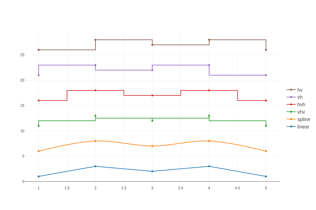 |
| Bar Charts | 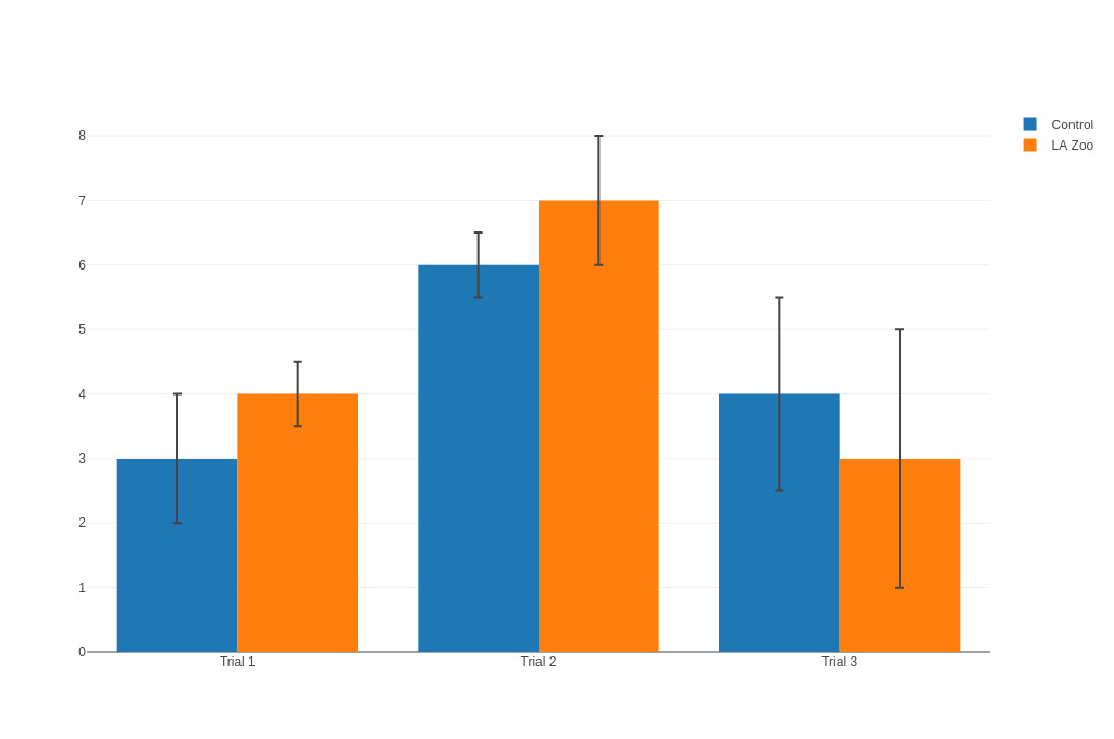 |
| Pie Charts | 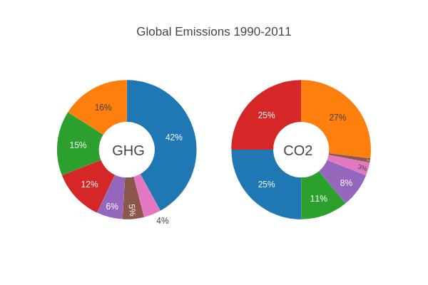 |
| Sankey Diagrams | 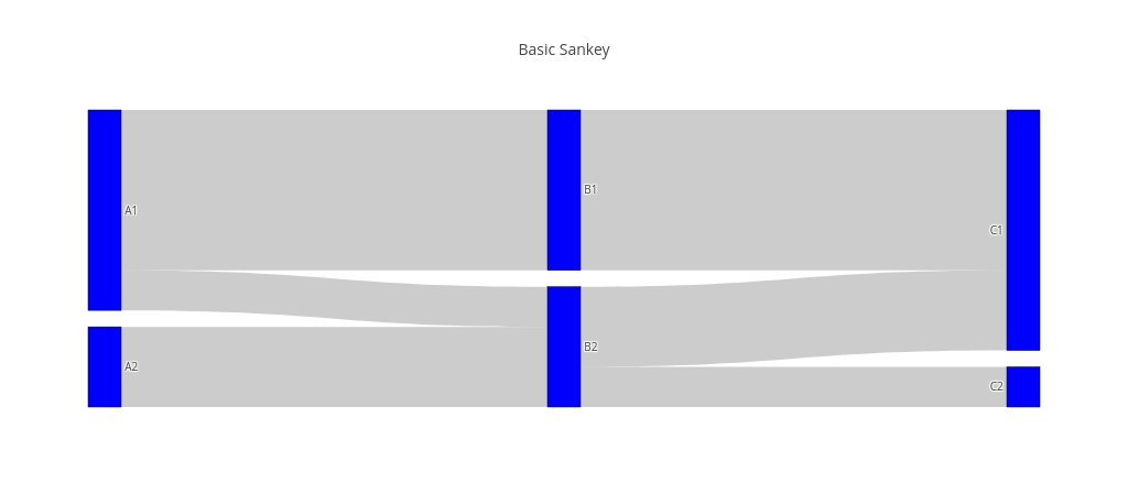 |
Scatter Plots
The following imports have been used to produce the plots below:
#![allow(unused)] fn main() { use ndarray::Array; use plotly::common::{ ColorScale, ColorScalePalette, DashType, Fill, Font, Line, LineShape, Marker, Mode, Title, }; use plotly::layout::{Axis, BarMode, Layout, Legend, TicksDirection}; use plotly::{Bar, color::{NamedColor, Rgb, Rgba}, Plot, Scatter}; use rand_distr::{Distribution, Normal, Uniform}; }
The to_inline_html method is used to produce the html plot displayed in this page.
Simple Scatter Plot
#![allow(unused)] fn main() { fn simple_scatter_plot(show: bool, file_name: &str) { let n: usize = 100; let t: Vec<f64> = Array::linspace(0., 10., n).into_raw_vec_and_offset().0; let y: Vec<f64> = t.iter().map(|x| x.sin()).collect(); let trace = Scatter::new(t, y).mode(Mode::Markers); let mut plot = Plot::new(); plot.add_trace(trace); let path = write_example_to_html(&plot, file_name); if show { plot.show_html(path); } } }
Line and Scatter Plots
#![allow(unused)] fn main() { fn line_and_scatter_plots(show: bool, file_name: &str) { let n: usize = 100; let mut rng = rand::rng(); let random_x: Vec<f64> = Array::linspace(0., 1., n).into_raw_vec_and_offset().0; let random_y0: Vec<f64> = Normal::new(5., 1.) .unwrap() .sample_iter(&mut rng) .take(n) .collect(); let random_y1: Vec<f64> = Normal::new(0., 1.) .unwrap() .sample_iter(&mut rng) .take(n) .collect(); let random_y2: Vec<f64> = Normal::new(-5., 1.) .unwrap() .sample_iter(&mut rng) .take(n) .collect(); let trace1 = Scatter::new(random_x.clone(), random_y0) .mode(Mode::Markers) .name("markers"); let trace2 = Scatter::new(random_x.clone(), random_y1) .mode(Mode::LinesMarkers) .name("linex+markers"); let trace3 = Scatter::new(random_x, random_y2) .mode(Mode::Lines) .name("lines"); let mut plot = Plot::new(); plot.add_trace(trace1); plot.add_trace(trace2); plot.add_trace(trace3); let path = write_example_to_html(&plot, file_name); if show { plot.show_html(path); } } }
Bubble Scatter Plots
#![allow(unused)] fn main() { fn bubble_scatter_plots(show: bool, file_name: &str) { let trace1 = Scatter::new(vec![1, 2, 3, 4], vec![10, 11, 12, 13]) .mode(Mode::Markers) .marker( Marker::new() .size_array(vec![40, 60, 80, 100]) .color_array(vec![ NamedColor::Red, NamedColor::Blue, NamedColor::Cyan, NamedColor::OrangeRed, ]), ); let mut plot = Plot::new(); plot.add_trace(trace1); let path = write_example_to_html(&plot, file_name); if show { plot.show_html(path); } } }
Polar Scatter Plots
#![allow(unused)] fn main() { fn polar_scatter_plot(show: bool, file_name: &str) { let n: usize = 400; let theta: Vec<f64> = Array::linspace(0., 360., n).into_raw_vec_and_offset().0; let r: Vec<f64> = theta .iter() .map(|x| { let x = x / 360. * core::f64::consts::TAU; let x = x.cos(); 1. / 8. * (63. * x.powf(5.) - 70. * x.powf(3.) + 15. * x).abs() }) .collect(); let trace = ScatterPolar::new(theta, r).mode(Mode::Lines); let mut plot = Plot::new(); plot.add_trace(trace); let ticks = PolarAxisTicks::new().tick_color("#222222"); let axis_attributes = PolarAxisAttributes::new() .grid_color("#888888") .ticks(ticks); let radial_axis = RadialAxis::new() .title("My Title") .axis_attributes(axis_attributes.clone()); let angular_axis = AngularAxis::new() .direction(PolarDirection::Clockwise) .rotation(45.0) .axis_attributes(axis_attributes); let layout_polar = LayoutPolar::new() .bg_color("#eeeeee") .radial_axis(radial_axis) .angular_axis(angular_axis); let layout = Layout::new().polar(layout_polar); plot.set_layout(layout); let path = write_example_to_html(&plot, file_name); if show { plot.show_html(path); } } }
Data Labels Hover
#![allow(unused)] fn main() { fn data_labels_hover(show: bool, file_name: &str) { let trace1 = Scatter::new(vec![1, 2, 3, 4, 5], vec![1, 6, 3, 6, 1]) .mode(Mode::Markers) .name("Team A") .marker(Marker::new().size(12)); let trace2 = Scatter::new(vec![1.5, 2.5, 3.5, 4.5, 5.5], vec![4, 1, 7, 1, 4]) .mode(Mode::Markers) .name("Team B") .marker(Marker::new().size(12)); let mut plot = Plot::new(); plot.add_trace(trace1); plot.add_trace(trace2); let layout = Layout::new() .title("Data Labels Hover") .x_axis(Axis::new().title("x").range(vec![0.75, 5.25])) .y_axis(Axis::new().title("y").range(vec![0., 8.])); plot.set_layout(layout); let path = write_example_to_html(&plot, file_name); if show { plot.show_html(path); } } }
Data Labels on the Plot
#![allow(unused)] fn main() { fn data_labels_on_the_plot(show: bool, file_name: &str) { let trace1 = Scatter::new(vec![1, 2, 3, 4, 5], vec![1, 6, 3, 6, 1]) .mode(Mode::Markers) .name("Team A") .marker(Marker::new().size(12)) .text_array(vec!["A-1", "A-2", "A-3", "A-4", "A-5"]); let trace2 = Scatter::new(vec![1.5, 2.5, 3.5, 4.5, 5.5], vec![4, 1, 7, 1, 4]) .mode(Mode::Markers) .name("Team B") .text_array(vec!["B-a", "B-b", "B-c", "B-d", "B-e"]) .marker(Marker::new().size(12)); let mut plot = Plot::new(); plot.add_trace(trace1); plot.add_trace(trace2); let layout = Layout::new() .title("Data Labels on the Plot") .x_axis(Axis::new().range(vec![0.75, 5.25])) .y_axis(Axis::new().range(vec![0., 8.])); plot.set_layout(layout); let path = write_example_to_html(&plot, file_name); if show { plot.show_html(path); } } }
Colored and Styled Scatter Plot
#![allow(unused)] fn main() { fn colored_and_styled_scatter_plot(show: bool, file_name: &str) { let trace1 = Scatter::new(vec![52698, 43117], vec![53, 31]) .mode(Mode::Markers) .name("North America") .text_array(vec!["United States", "Canada"]) .marker( Marker::new() .color(Rgb::new(164, 194, 244)) .size(12) .line(Line::new().color(NamedColor::White).width(0.5)), ); let trace2 = Scatter::new( vec![ 39317, 37236, 35650, 30066, 29570, 27159, 23557, 21046, 18007, ], vec![33, 20, 13, 19, 27, 19, 49, 44, 38], ) .mode(Mode::Markers) .name("Europe") .text_array(vec![ "Germany", "Britain", "France", "Spain", "Italy", "Czech Rep.", "Greece", "Poland", ]) .marker(Marker::new().color(Rgb::new(255, 217, 102)).size(12)); let trace3 = Scatter::new( vec![42952, 37037, 33106, 17478, 9813, 5253, 4692, 3899], vec![23, 42, 54, 89, 14, 99, 93, 70], ) .mode(Mode::Markers) .name("Asia/Pacific") .text_array(vec![ "Australia", "Japan", "South Korea", "Malaysia", "China", "Indonesia", "Philippines", "India", ]) .marker(Marker::new().color(Rgb::new(234, 153, 153)).size(12)); let trace4 = Scatter::new( vec![19097, 18601, 15595, 13546, 12026, 7434, 5419], vec![43, 47, 56, 80, 86, 93, 80], ) .mode(Mode::Markers) .name("Latin America") .text_array(vec![ "Chile", "Argentina", "Mexico", "Venezuela", "Venezuela", "El Salvador", "Bolivia", ]) .marker(Marker::new().color(Rgb::new(142, 124, 195)).size(12)); let layout = Layout::new() .title("Quarter 1 Growth") .x_axis( Axis::new() .title("GDP per Capita") .show_grid(false) .zero_line(false), ) .y_axis(Axis::new().title("Percent").show_line(false)); let mut plot = Plot::new(); plot.add_trace(trace1); plot.add_trace(trace2); plot.add_trace(trace3); plot.add_trace(trace4); plot.set_layout(layout); let path = write_example_to_html(&plot, file_name); if show { plot.show_html(path); } } }
Large Data Sets
#![allow(unused)] fn main() { fn large_data_sets(show: bool, file_name: &str) { let n: usize = 100_000; let mut rng = rand::rng(); let r: Vec<f64> = Uniform::new(0., 1.) .unwrap() .sample_iter(&mut rng) .take(n) .collect(); let theta: Vec<f64> = Normal::new(0., 2. * std::f64::consts::PI) .unwrap() .sample_iter(&mut rng) .take(n) .collect(); let x: Vec<f64> = r .iter() .zip(theta.iter()) .map(|args| args.0 * args.1.cos()) .collect(); let y: Vec<f64> = r .iter() .zip(theta.iter()) .map(|args| args.0 * args.1.sin()) .collect(); let trace = Scatter::new(x, y) .web_gl_mode(true) .mode(Mode::Markers) .marker( Marker::new() .color_scale(ColorScale::Palette(ColorScalePalette::Viridis)) .line(Line::new().width(1.)), ); let mut plot = Plot::new(); plot.add_trace(trace); let path = write_example_to_html(&plot, file_name); if show { plot.show_html(path); } } }
Line Charts
The following imports have been used to produce the plots below:
#![allow(unused)] fn main() { use ndarray::Array; use plotly::common::{ ColorScale, ColorScalePalette, DashType, Fill, Font, Line, LineShape, Marker, Mode, Title, }; use plotly::layout::{Axis, BarMode, Layout, Legend, TicksDirection}; use plotly::{Bar, color::{NamedColor, Rgb, Rgba}, Plot, Scatter}; use rand_distr::{Distribution, Normal, Uniform}; }
The to_inline_html method is used to produce the html plot displayed in this page.
Adding Names to Line and Scatter Plot
#![allow(unused)] fn main() { fn adding_names_to_line_and_scatter_plot(show: bool, file_name: &str) { let trace1 = Scatter::new(vec![1, 2, 3, 4], vec![10, 15, 13, 17]) .mode(Mode::Markers) .name("Scatter"); let trace2 = Scatter::new(vec![2, 3, 4, 5], vec![16, 5, 11, 9]) .mode(Mode::Lines) .name("Lines"); let trace3 = Scatter::new(vec![1, 2, 3, 4], vec![12, 9, 15, 12]) .mode(Mode::LinesMarkers) .name("Scatter + Lines"); let layout = Layout::new().title("Adding Names to Line and Scatter Plot"); let mut plot = Plot::new(); plot.add_trace(trace1); plot.add_trace(trace2); plot.add_trace(trace3); plot.set_layout(layout); let path = write_example_to_html(&plot, file_name); if show { plot.show_html(path); } } }
Line and Scatter Styling
#![allow(unused)] fn main() { fn line_and_scatter_styling(show: bool, file_name: &str) { let trace1 = Scatter::new(vec![1, 2, 3, 4], vec![10, 15, 13, 17]) .mode(Mode::Markers) .name("trace1") .marker(Marker::new().color(Rgb::new(219, 64, 82)).size(12)); let trace2 = Scatter::new(vec![2, 3, 4, 5], vec![16, 5, 11, 9]) .mode(Mode::Lines) .name("trace2") .line(Line::new().color(Rgb::new(55, 128, 191)).width(3.0)); let trace3 = Scatter::new(vec![1, 2, 3, 4], vec![12, 9, 15, 12]) .mode(Mode::LinesMarkers) .name("trace3") .marker(Marker::new().color(Rgb::new(128, 0, 128)).size(12)) .line(Line::new().color(Rgb::new(128, 0, 128)).width(1.0)); let layout = Layout::new().title("Line and Scatter Styling"); let mut plot = Plot::new(); plot.add_trace(trace1); plot.add_trace(trace2); plot.add_trace(trace3); plot.set_layout(layout); let path = write_example_to_html(&plot, file_name); if show { plot.show_html(path); } } }
Styling Line Plot
#![allow(unused)] fn main() { fn styling_line_plot(show: bool, file_name: &str) { let trace1 = Scatter::new(vec![1, 2, 3, 4], vec![10, 15, 13, 17]) .mode(Mode::Markers) .name("Red") .line(Line::new().color(Rgb::new(219, 64, 82)).width(3.0)); let trace2 = Scatter::new(vec![1, 2, 3, 4], vec![12, 9, 15, 12]) .mode(Mode::LinesMarkers) .name("Blue") .line(Line::new().color(Rgb::new(55, 128, 191)).width(1.0)); let layout = Layout::new() .title("Styling Line Plot") .width(500) .height(500); let mut plot = Plot::new(); plot.add_trace(trace1); plot.add_trace(trace2); plot.set_layout(layout); let path = write_example_to_html(&plot, file_name); if show { plot.show_html(path); } } }
Line Shape Options for Interpolation
#![allow(unused)] fn main() { fn line_shape_options_for_interpolation(show: bool, file_name: &str) { let trace1 = Scatter::new(vec![1, 2, 3, 4, 5], vec![1, 3, 2, 3, 1]) .mode(Mode::LinesMarkers) .name("linear") .line(Line::new().shape(LineShape::Linear)); let trace2 = Scatter::new(vec![1, 2, 3, 4, 5], vec![6, 8, 7, 8, 6]) .mode(Mode::LinesMarkers) .name("spline") .line(Line::new().shape(LineShape::Spline)); let trace3 = Scatter::new(vec![1, 2, 3, 4, 5], vec![11, 13, 12, 13, 11]) .mode(Mode::LinesMarkers) .name("vhv") .line(Line::new().shape(LineShape::Vhv)); let trace4 = Scatter::new(vec![1, 2, 3, 4, 5], vec![16, 18, 17, 18, 16]) .mode(Mode::LinesMarkers) .name("hvh") .line(Line::new().shape(LineShape::Hvh)); let trace5 = Scatter::new(vec![1, 2, 3, 4, 5], vec![21, 23, 22, 23, 21]) .mode(Mode::LinesMarkers) .name("vh") .line(Line::new().shape(LineShape::Vh)); let trace6 = Scatter::new(vec![1, 2, 3, 4, 5], vec![26, 28, 27, 28, 26]) .mode(Mode::LinesMarkers) .name("hv") .line(Line::new().shape(LineShape::Hv)); let mut plot = Plot::new(); let layout = Layout::new().legend( Legend::new() .y(0.5) .trace_order(TraceOrder::Reversed) .font(Font::new().size(16)), ); plot.set_layout(layout); plot.add_trace(trace1); plot.add_trace(trace2); plot.add_trace(trace3); plot.add_trace(trace4); plot.add_trace(trace5); plot.add_trace(trace6); let path = write_example_to_html(&plot, file_name); if show { plot.show_html(path); } } }
Line Dash
#![allow(unused)] fn main() { fn line_dash(show: bool, file_name: &str) { let trace1 = Scatter::new(vec![1, 2, 3, 4, 5], vec![1, 3, 2, 3, 1]) .mode(Mode::LinesMarkers) .name("solid") .line(Line::new().dash(DashType::Solid)); let trace2 = Scatter::new(vec![1, 2, 3, 4, 5], vec![6, 8, 7, 8, 6]) .mode(Mode::LinesMarkers) .name("dashdot") .line(Line::new().dash(DashType::DashDot)); let trace3 = Scatter::new(vec![1, 2, 3, 4, 5], vec![11, 13, 12, 13, 11]) .mode(Mode::LinesMarkers) .name("dash") .line(Line::new().dash(DashType::Dash)); let trace4 = Scatter::new(vec![1, 2, 3, 4, 5], vec![16, 18, 17, 18, 16]) .mode(Mode::LinesMarkers) .name("dot") .line(Line::new().dash(DashType::Dot)); let trace5 = Scatter::new(vec![1, 2, 3, 4, 5], vec![21, 23, 22, 23, 21]) .mode(Mode::LinesMarkers) .name("longdash") .line(Line::new().dash(DashType::LongDash)); let trace6 = Scatter::new(vec![1, 2, 3, 4, 5], vec![26, 28, 27, 28, 26]) .mode(Mode::LinesMarkers) .name("longdashdot") .line(Line::new().dash(DashType::LongDashDot)); let mut plot = Plot::new(); let layout = Layout::new() .legend( Legend::new() .y(0.5) .trace_order(TraceOrder::Reversed) .font(Font::new().size(16)), ) .x_axis(Axis::new().range(vec![0.95, 5.05]).auto_range(false)) .y_axis(Axis::new().range(vec![0.0, 28.5]).auto_range(false)); plot.set_layout(layout); plot.add_trace(trace1); plot.add_trace(trace2); plot.add_trace(trace3); plot.add_trace(trace4); plot.add_trace(trace5); plot.add_trace(trace6); let path = write_example_to_html(&plot, file_name); if show { plot.show_html(path); } } }
Filled Lines
#![allow(unused)] fn main() { fn filled_lines(show: bool, file_name: &str) { let x1 = vec![ 1.0, 2.0, 3.0, 4.0, 5.0, 6.0, 7.0, 8.0, 9.0, 10.0, 10.0, 9.0, 8.0, 7.0, 6.0, 5.0, 4.0, 3.0, 2.0, 1.0, ]; let x2 = (1..=10).map(|iv| iv as f64).collect::<Vec<f64>>(); let trace1 = Scatter::new( x1.clone(), vec![ 2.0, 3.0, 4.0, 5.0, 6.0, 7.0, 8.0, 9.0, 10.0, 11.0, 9.0, 8.0, 7.0, 6.0, 5.0, 4.0, 3.0, 2.0, 1.0, 0.0, ], ) .fill(Fill::ToZeroX) .fill_color(Rgba::new(0, 100, 80, 0.2)) .line(Line::new().color(NamedColor::Transparent)) .name("Fair") .show_legend(false); let trace2 = Scatter::new( x1.clone(), vec![ 5.5, 3.0, 5.5, 8.0, 6.0, 3.0, 8.0, 5.0, 6.0, 5.5, 4.75, 5.0, 4.0, 7.0, 2.0, 4.0, 7.0, 4.4, 2.0, 4.5, ], ) .fill(Fill::ToZeroX) .fill_color(Rgba::new(0, 176, 246, 0.2)) .line(Line::new().color(NamedColor::Transparent)) .name("Premium") .show_legend(false); let trace3 = Scatter::new( x1, vec![ 11.0, 9.0, 7.0, 5.0, 3.0, 1.0, 3.0, 5.0, 3.0, 1.0, -1.0, 1.0, 3.0, 1.0, -0.5, 1.0, 3.0, 5.0, 7.0, 9.0, ], ) .fill(Fill::ToZeroX) .fill_color(Rgba::new(231, 107, 243, 0.2)) .line(Line::new().color(NamedColor::Transparent)) .name("Fair") .show_legend(false); let trace4 = Scatter::new( x2.clone(), vec![1.0, 2.0, 3.0, 4.0, 5.0, 6.0, 7.0, 8.0, 9.0, 10.0], ) .line(Line::new().color(Rgb::new(0, 100, 80))) .name("Fair"); let trace5 = Scatter::new( x2.clone(), vec![5.0, 2.5, 5.0, 7.5, 5.0, 2.5, 7.5, 4.5, 5.5, 5.0], ) .line(Line::new().color(Rgb::new(0, 176, 246))) .name("Premium"); let trace6 = Scatter::new(x2, vec![10.0, 8.0, 6.0, 4.0, 2.0, 0.0, 2.0, 4.0, 2.0, 0.0]) .line(Line::new().color(Rgb::new(231, 107, 243))) .name("Ideal"); let layout = Layout::new() .paper_background_color(Rgb::new(255, 255, 255)) .plot_background_color(Rgb::new(229, 229, 229)) .x_axis( Axis::new() .grid_color(Rgb::new(255, 255, 255)) .range(vec![1.0, 10.0]) .show_grid(true) .show_line(false) .show_tick_labels(true) .tick_color(Rgb::new(127, 127, 127)) .ticks(TicksDirection::Outside) .zero_line(false), ) .y_axis( Axis::new() .grid_color(Rgb::new(255, 255, 255)) .show_grid(true) .show_line(false) .show_tick_labels(true) .tick_color(Rgb::new(127, 127, 127)) .ticks(TicksDirection::Outside) .zero_line(false), ); let mut plot = Plot::new(); plot.set_layout(layout); plot.add_trace(trace1); plot.add_trace(trace2); plot.add_trace(trace3); plot.add_trace(trace4); plot.add_trace(trace5); plot.add_trace(trace6); let path = write_example_to_html(&plot, file_name); if show { plot.show_html(path); } } }
Setting Lower or Upper Bounds on Axis
This example demonstrates how to set partial axis ranges using both the new AxisRange API and the backward-compatible vector syntax. The x-axis uses both the new AxisRange::upper() method and the traditional vec![None, Some(value)] syntax to set only an upper bound, while the y-axis uses only the vec![Some(value), None] syntax to set a lower bound.
#![allow(unused)] fn main() { fn set_lower_or_upper_bound_on_axis(show: bool, file_name: &str) { use std::fs::File; use std::io::BufReader; // Read the iris dataset let file = File::open("assets/iris.csv").expect("Failed to open iris.csv"); let reader = BufReader::new(file); let mut csv_reader = csv::Reader::from_reader(reader); // Parse the data let mut sepal_width = Vec::new(); let mut sepal_length = Vec::new(); let mut species = Vec::new(); for result in csv_reader.records() { let record = result.expect("Failed to read CSV record"); sepal_width.push(record[1].parse::<f64>().unwrap()); sepal_length.push(record[0].parse::<f64>().unwrap()); species.push(record[4].to_string()); } // Create separate traces for each species let mut traces = Vec::new(); let unique_species: Vec<String> = species .iter() .cloned() .collect::<std::collections::HashSet<_>>() .into_iter() .collect(); for (i, species_name) in unique_species.iter().enumerate() { let mut x = Vec::new(); let mut y = Vec::new(); for (j, s) in species.iter().enumerate() { if s == species_name { x.push(sepal_width[j]); y.push(sepal_length[j]); } } let trace = Scatter::new(x, y) .name(species_name) .mode(plotly::common::Mode::Markers) .x_axis(format!("x{}", i + 1)) .y_axis(format!("y{}", i + 1)); traces.push(trace); } let mut plot = Plot::new(); for trace in traces { plot.add_trace(trace); } // Create layout with subplots let mut layout = Layout::new() .title("Iris Dataset - Subplots by Species") .grid( LayoutGrid::new() .rows(1) .columns(3) .pattern(plotly::layout::GridPattern::Independent), ); // Set x-axis range for all subplots: [None, 4.5] layout = layout .x_axis( Axis::new() .title("sepal_width") // Can be set using a vec! of two optional values .range(vec![None, Some(4.5)]), ) .x_axis2( Axis::new() .title("sepal_width") // Or can be set using AxisRange::upper(4.5) .range(AxisRange::upper(4.5)), ) .x_axis3( Axis::new() .title("sepal_width") // Or can be set using AxisRange::upper(4.5) .range(AxisRange::upper(4.5)), ); // Set y-axis range for all subplots: [3, None] layout = layout .y_axis( Axis::new() .title("sepal_length") .range(vec![Some(3.0), None]), ) .y_axis2( Axis::new() .title("sepal_length") .range(vec![Some(3.0), None]), ) .y_axis3( Axis::new() .title("sepal_length") .range(vec![Some(3.0), None]), ); plot.set_layout(layout); let path = write_example_to_html(&plot, file_name); if show { plot.show_html(path); } } }
Bar Charts
The following imports have been used to produce the plots below:
#![allow(unused)] fn main() { use ndarray::Array; use plotly::common::{ ColorScale, ColorScalePalette, DashType, Fill, Font, Line, LineShape, Marker, Mode, Title, }; use plotly::layout::{Axis, BarMode, Layout, Legend, TicksDirection}; use plotly::{Bar, color::{NamedColor, Rgb, Rgba}, Plot, Scatter}; use rand_distr::{Distribution, Normal, Uniform}; }
The to_inline_html method is used to produce the html plot displayed in this page.
Basic Bar Chart
#![allow(unused)] fn main() { fn basic_bar_chart(show: bool, file_name: &str) { let animals = vec!["giraffes", "orangutans", "monkeys"]; let t = Bar::new(animals, vec![20, 14, 23]); let mut plot = Plot::new(); plot.add_trace(t); let path = write_example_to_html(&plot, file_name); if show { plot.show_html(path); } } }
Grouped Bar Chart
#![allow(unused)] fn main() { fn grouped_bar_chart(show: bool, file_name: &str) { let animals1 = vec!["giraffes", "orangutans", "monkeys"]; let trace1 = Bar::new(animals1, vec![20, 14, 23]).name("SF Zoo"); let animals2 = vec!["giraffes", "orangutans", "monkeys"]; let trace2 = Bar::new(animals2, vec![12, 18, 29]).name("LA Zoo"); let layout = Layout::new().bar_mode(BarMode::Group); let mut plot = Plot::new(); plot.add_trace(trace1); plot.add_trace(trace2); plot.set_layout(layout); let path = write_example_to_html(&plot, file_name); if show { plot.show_html(path); } } }
Stacked Bar Chart
#![allow(unused)] fn main() { fn stacked_bar_chart(show: bool, file_name: &str) { let animals1 = vec!["giraffes", "orangutans", "monkeys"]; let trace1 = Bar::new(animals1, vec![20, 14, 23]).name("SF Zoo"); let animals2 = vec!["giraffes", "orangutans", "monkeys"]; let trace2 = Bar::new(animals2, vec![12, 18, 29]).name("LA Zoo"); let layout = Layout::new().bar_mode(BarMode::Stack); let mut plot = Plot::new(); plot.add_trace(trace1); plot.add_trace(trace2); plot.set_layout(layout); let path = write_example_to_html(&plot, file_name); if show { plot.show_html(path); } } }
Pie Charts
The following imports have been used to produce the plots below:
#![allow(unused)] fn main() { use plotly::common::{Domain, Font, HoverInfo, Orientation}; use plotly::layout::{ Annotation, Layout, LayoutGrid}, use plotly::layout::Layout; use plotly::{Pie, Plot}; }
The to_inline_html method is used to produce the html plot displayed in this page.
Basic Pie Chart
#![allow(unused)] fn main() { fn basic_pie_chart(show: bool, file_name: &str) { let values = vec![2, 3, 4]; let labels = vec!["giraffes", "orangutans", "monkeys"]; let t = Pie::new(values).labels(labels); let mut plot = Plot::new(); plot.add_trace(t); let path = write_example_to_html(&plot, file_name); if show { plot.show_html(path); } } }
#![allow(unused)] fn main() { fn basic_pie_chart_labels(show: bool, file_name: &str) { let labels = ["giraffes", "giraffes", "orangutans", "monkeys"]; let t = Pie::<u32>::from_labels(&labels); let mut plot = Plot::new(); plot.add_trace(t); let path = write_example_to_html(&plot, file_name); if show { plot.show_html(path); } } }
Grouped Pie Chart
#![allow(unused)] fn main() { fn grouped_donout_pie_charts(show: bool, file_name: &str) { let mut plot = Plot::new(); let values = vec![16, 15, 12, 6, 5, 4, 42]; let labels = vec![ "US", "China", "European Union", "Russian Federation", "Brazil", "India", "Rest of World", ]; let t = Pie::new(values) .labels(labels) .name("GHG Emissions") .hover_info(HoverInfo::All) .text("GHG") .hole(0.4) .domain(Domain::new().column(0)); plot.add_trace(t); let values = vec![27, 11, 25, 8, 1, 3, 25]; let labels = vec![ "US", "China", "European Union", "Russian Federation", "Brazil", "India", "Rest of World", ]; let t = Pie::new(values) .labels(labels) .name("CO2 Emissions") .hover_info(HoverInfo::All) .text("CO2") .text_position(plotly::common::Position::Inside) .hole(0.4) .domain(Domain::new().column(1)); plot.add_trace(t); let layout = Layout::new() .title("Global Emissions 1990-2011") .height(400) .width(600) .annotations(vec![ Annotation::new() .font(Font::new().size(20)) .show_arrow(false) .text("GHG") .x(0.17) .y(0.5), Annotation::new() .font(Font::new().size(20)) .show_arrow(false) .text("CO2") .x(0.82) .y(0.5), ]) .show_legend(false) .grid( LayoutGrid::new() .columns(2) .rows(1) .pattern(plotly::layout::GridPattern::Independent), ); plot.set_layout(layout); let path = write_example_to_html(&plot, file_name); if show { plot.show_html(path); } } }
Pie Chart Text Control
#![allow(unused)] fn main() { fn pie_chart_text_control(show: bool, file_name: &str) { let values = vec![2, 3, 4, 4]; let labels = vec!["Wages", "Operating expenses", "Cost of sales", "Insurance"]; let t = Pie::new(values) .labels(labels) .automargin(true) .show_legend(true) .text_position(plotly::common::Position::Outside) .name("Costs") .text_info("label+percent"); let mut plot = Plot::new(); plot.add_trace(t); let layout = Layout::new().height(700).width(700).show_legend(true); plot.set_layout(layout); let path = write_example_to_html(&plot, file_name); if show { plot.show_html(path); } } }
Sankey Diagrams
The following imports have been used to produce the plots below:
#![allow(unused)] fn main() { use ndarray::Array; use plotly::common::{ ColorScale, ColorScalePalette, DashType, Fill, Font, Line, LineShape, Marker, Mode, Title, }; use plotly::layout::{Axis, BarMode, Layout, Legend, TicksDirection}; use plotly::Sankey; use rand_distr::{Distribution, Normal, Uniform}; }
The to_inline_html method is used to produce the html plot displayed in this page.
Constructing a basic Sankey diagram
#![allow(unused)] fn main() { fn basic_sankey_diagram(show: bool, file_name: &str) { // https://plotly.com/javascript/sankey-diagram/#basic-sankey-diagram let trace = Sankey::new() .orientation(Orientation::Horizontal) .node( Node::new() .pad(15) .thickness(30) .line(SankeyLine::new().color(NamedColor::Black).width(0.5)) .label(vec!["A1", "A2", "B1", "B2", "C1", "C2"]) .color_array(vec![ NamedColor::Blue, NamedColor::Blue, NamedColor::Blue, NamedColor::Blue, NamedColor::Blue, NamedColor::Blue, ]), ) .link( Link::new() .value(vec![8, 4, 2, 8, 4, 2]) .source(vec![0, 1, 0, 2, 3, 3]) .target(vec![2, 3, 3, 4, 4, 5]), ); let layout = Layout::new() .title("Basic Sankey") .font(Font::new().size(10)); let mut plot = Plot::new(); plot.add_trace(trace); plot.set_layout(layout); let path = write_example_to_html(&plot, file_name); if show { plot.show_html(path); } } }
Skankey diagram with defined node position
#![allow(unused)] fn main() { fn custom_node_sankey_diagram(show: bool, file_name: &str) { // https://plotly.com/javascript/sankey-diagram/#basic-sankey-diagram let trace = Sankey::new() .orientation(Orientation::Horizontal) .arrangement(plotly::sankey::Arrangement::Snap) .node( Node::new() .pad(15) .thickness(30) .line(SankeyLine::new().color(NamedColor::Black).width(0.5)) .label(vec!["A", "B", "C", "D", "E", "F"]) .x(vec![0.2, 0.1, 0.5, 0.7, 0.3, 0.5]) .y(vec![0.2, 0.1, 0.5, 0.7, 0.3, 0.5]) .pad(20), ) .link( Link::new() .source(vec![0, 0, 1, 2, 5, 4, 3, 5]) .target(vec![5, 3, 4, 3, 0, 2, 2, 3]) .value(vec![1, 2, 1, 1, 1, 1, 1, 2]), ); let layout = Layout::new() .title("Define Node Position") .font(Font::new().size(10)); let mut plot = Plot::new(); plot.add_trace(trace); plot.set_layout(layout); let path = write_example_to_html(&plot, file_name); if show { plot.show_html(path); } } }
Statistical Charts
The complete source code for the following examples can also be found here.
| Kind | Link |
|---|---|
| Error Bars | 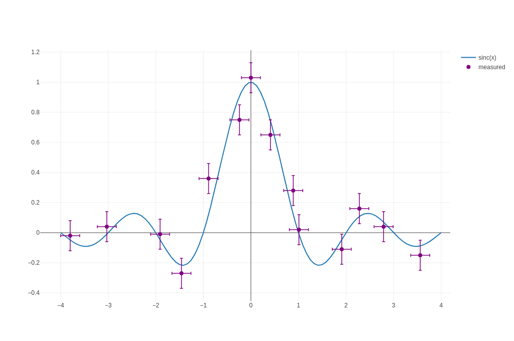 |
| Box Plots | 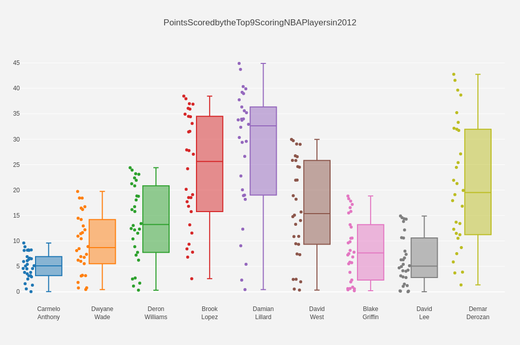 |
| Histograms | 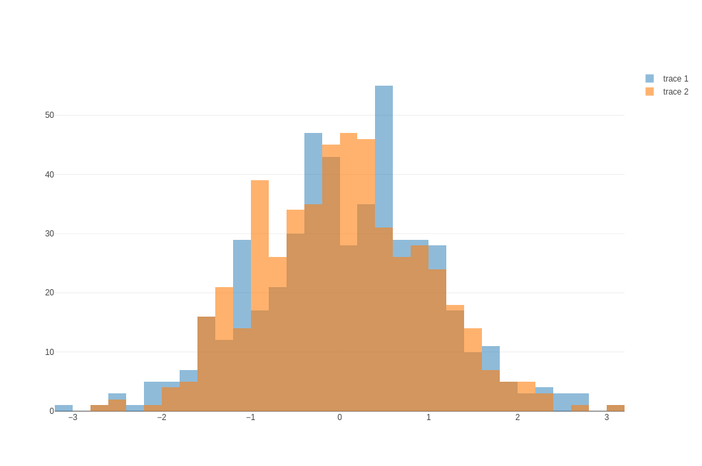 |
Error Bars
The following imports have been used to produce the plots below:
#![allow(unused)] fn main() { use ndarray::Array; use plotly::box_plot::{BoxMean, BoxPoints}; use plotly::common::{ErrorData, ErrorType, Line, Marker, Mode, Orientation, Title}; use plotly::histogram::{Bins, Cumulative, HistFunc, HistNorm}; use plotly::layout::{Axis, BarMode, BoxMode, Layout, Margin}; use plotly::{Bar, BoxPlot, Histogram, Plot, color::{NamedColor, Rgb, Rgba}, Scatter}; use rand_distr::{Distribution, Normal, Uniform}; }
The to_inline_html method is used to produce the html plot displayed in this page.
Basic Symmetric Error Bars
#![allow(unused)] fn main() { fn basic_symmetric_error_bars(show: bool, file_name: &str) { let trace1 = Scatter::new(vec![0, 1, 2], vec![6, 10, 2]) .name("trace1") .error_y(ErrorData::new(ErrorType::Data).array(vec![1.0, 2.0, 3.0])); let mut plot = Plot::new(); plot.add_trace(trace1); let path = write_example_to_html(&plot, file_name); if show { plot.show_html(path); } } }
Asymmetric Error Bars
#![allow(unused)] fn main() { fn asymmetric_error_bars(show: bool, file_name: &str) { let trace1 = Scatter::new(vec![1, 2, 3, 4], vec![2, 1, 3, 4]) .name("trace1") .error_y( ErrorData::new(ErrorType::Data) .array(vec![0.1, 0.2, 0.1, 0.1]) .array_minus(vec![0.2, 0.4, 1., 0.2]), ); let mut plot = Plot::new(); plot.add_trace(trace1); let path = write_example_to_html(&plot, file_name); if show { plot.show_html(path); } } }
Error Bars as a Percentage of the Y Value
#![allow(unused)] fn main() { fn error_bars_as_a_percentage_of_the_y_value(show: bool, file_name: &str) { let trace1 = Scatter::new(vec![0, 1, 2], vec![6, 10, 2]) .name("trace1") .error_y(ErrorData::new(ErrorType::Percent).value(50.).visible(true)); let mut plot = Plot::new(); plot.add_trace(trace1); let path = write_example_to_html(&plot, file_name); if show { plot.show_html(path); } } }
Asymmetric Error Bars with a Constant Offset
#![allow(unused)] fn main() { fn asymmetric_error_bars_with_a_constant_offset(show: bool, file_name: &str) { let trace1 = Scatter::new(vec![1, 2, 3, 4], vec![2, 1, 3, 4]) .name("trace1") .error_y( ErrorData::new(ErrorType::Percent) .symmetric(false) .value(15.) .value_minus(25.), ); let mut plot = Plot::new(); plot.add_trace(trace1); let path = write_example_to_html(&plot, file_name); if show { plot.show_html(path); } } }
Horizontal Error Bars
#![allow(unused)] fn main() { fn horizontal_error_bars(show: bool, file_name: &str) { let trace1 = Scatter::new(vec![1, 2, 3, 4], vec![2, 1, 3, 4]) .name("trace1") .error_x(ErrorData::new(ErrorType::Percent).value(10.)); let mut plot = Plot::new(); plot.add_trace(trace1); let path = write_example_to_html(&plot, file_name); if show { plot.show_html(path); } } }
Bar Chart with Error Bars
#![allow(unused)] fn main() { fn bar_chart_with_error_bars(show: bool, file_name: &str) { let trace_c = Bar::new(vec!["Trial 1", "Trial 2", "Trial 3"], vec![3, 6, 4]) .error_y(ErrorData::new(ErrorType::Data).array(vec![1., 0.5, 1.5])); let trace_e = Bar::new(vec!["Trial 1", "Trial 2", "Trial 3"], vec![4, 7, 3]) .error_y(ErrorData::new(ErrorType::Data).array(vec![0.5, 1., 2.])); let mut plot = Plot::new(); plot.add_trace(trace_c); plot.add_trace(trace_e); let layout = Layout::new().bar_mode(BarMode::Group); plot.set_layout(layout); let path = write_example_to_html(&plot, file_name); if show { plot.show_html(path); } } }
Colored and Styled Error Bars
#![allow(unused)] fn main() { fn colored_and_styled_error_bars(show: bool, file_name: &str) { let x_theo: Vec<f64> = Array::linspace(-4., 4., 100).into_raw_vec_and_offset().0; let sincx: Vec<f64> = x_theo .iter() .map(|x| (x * std::f64::consts::PI).sin() / (*x * std::f64::consts::PI)) .collect(); let x = vec![ -3.8, -3.03, -1.91, -1.46, -0.89, -0.24, -0.0, 0.41, 0.89, 1.01, 1.91, 2.28, 2.79, 3.56, ]; let y = vec![ -0.02, 0.04, -0.01, -0.27, 0.36, 0.75, 1.03, 0.65, 0.28, 0.02, -0.11, 0.16, 0.04, -0.15, ]; let trace1 = Scatter::new(x_theo, sincx).name("sinc(x)"); let trace2 = Scatter::new(x, y) .mode(Mode::Markers) .name("measured") .error_y( ErrorData::new(ErrorType::Constant) .value(0.1) .color(NamedColor::Purple) .thickness(1.5) .width(3), ) .error_x( ErrorData::new(ErrorType::Constant) .value(0.2) .color(NamedColor::Purple) .thickness(1.5) .width(3), ) .marker(Marker::new().color(NamedColor::Purple).size(8)); let mut plot = Plot::new(); plot.add_trace(trace1); plot.add_trace(trace2); let path = write_example_to_html(&plot, file_name); if show { plot.show_html(path); } } }
Box Plots
The following imports have been used to produce the plots below:
#![allow(unused)] fn main() { use ndarray::Array; use plotly::box_plot::{BoxMean, BoxPoints}; use plotly::common::{ErrorData, ErrorType, Line, Marker, Mode, Orientation, Title}; use plotly::histogram::{Bins, Cumulative, HistFunc, HistNorm}; use plotly::layout::{Axis, BarMode, BoxMode, Layout, Margin}; use plotly::{Bar, BoxPlot, Histogram, color::{NamedColor, Rgb, Rgba}, Scatter}; use rand_distr::{Distribution, Normal, Uniform}; }
The to_inline_html method is used to produce the html plot displayed in this page.
Basic Box Plot
#![allow(unused)] fn main() { fn basic_box_plot(show: bool, file_name: &str) { let mut rng = rand::rng(); let uniform1 = Uniform::new(0.0, 1.0).unwrap(); let uniform2 = Uniform::new(1.0, 2.0).unwrap(); let n = 50; let mut y0 = Vec::with_capacity(n); let mut y1 = Vec::with_capacity(n); for _ in 0..n { y0.push(uniform1.sample(&mut rng)); y1.push(uniform2.sample(&mut rng)); } let trace1 = BoxPlot::<f64, f64>::new(y0); let trace2 = BoxPlot::<f64, f64>::new(y1); let mut plot = Plot::new(); plot.add_trace(trace1); plot.add_trace(trace2); let path = write_example_to_html(&plot, file_name); if show { plot.show_html(path); } } }
Box Plot that Displays the Underlying Data
#![allow(unused)] fn main() { fn box_plot_that_displays_the_underlying_data(show: bool, file_name: &str) { let trace1 = BoxPlot::new(vec![0, 1, 1, 2, 3, 5, 8, 13, 21]) .box_points(BoxPoints::All) .jitter(0.3) .point_pos(-1.8); let mut plot = Plot::new(); plot.add_trace(trace1); let path = write_example_to_html(&plot, file_name); if show { plot.show_html(path); } } }
Horizontal Box Plot
#![allow(unused)] fn main() { fn horizontal_box_plot(show: bool, file_name: &str) { let x = vec![ "Set 1", "Set 1", "Set 1", "Set 1", "Set 1", "Set 1", "Set 1", "Set 1", "Set 1", "Set 2", "Set 2", "Set 2", "Set 2", "Set 2", "Set 2", "Set 2", "Set 2", "Set 2", ]; let trace = BoxPlot::new_xy( vec![1, 2, 3, 4, 4, 4, 8, 9, 10, 2, 3, 3, 3, 3, 5, 6, 6, 7], x.clone(), ) .orientation(Orientation::Horizontal); let mut plot = Plot::new(); plot.add_trace(trace); let path = write_example_to_html(&plot, file_name); if show { plot.show_html(path); } } }
Grouped Box Plot
#![allow(unused)] fn main() { fn grouped_box_plot(show: bool, file_name: &str) { let x = vec![ "day 1", "day 1", "day 1", "day 1", "day 1", "day 1", "day 2", "day 2", "day 2", "day 2", "day 2", "day 2", ]; let trace1 = BoxPlot::new_xy( x.clone(), vec![0.2, 0.2, 0.6, 1.0, 0.5, 0.4, 0.2, 0.7, 0.9, 0.1, 0.5, 0.3], ); let trace2 = BoxPlot::new_xy( x.clone(), vec![0.6, 0.7, 0.3, 0.6, 0.0, 0.5, 0.7, 0.9, 0.5, 0.8, 0.7, 0.2], ); let trace3 = BoxPlot::new_xy( x.clone(), vec![0.1, 0.3, 0.1, 0.9, 0.6, 0.6, 0.9, 1.0, 0.3, 0.6, 0.8, 0.5], ); let mut plot = Plot::new(); plot.add_trace(trace1); plot.add_trace(trace2); plot.add_trace(trace3); let layout = Layout::new() .y_axis(Axis::new().title("normalized moisture").zero_line(false)) .box_mode(BoxMode::Group); plot.set_layout(layout); let path = write_example_to_html(&plot, file_name); if show { plot.show_html(path); } } }
Box Plot Styling Outliers
#![allow(unused)] fn main() { fn box_plot_styling_outliers(show: bool, file_name: &str) { let y = vec![ 0.75, 5.25, 5.5, 6.0, 6.2, 6.6, 6.80, 7.0, 7.2, 7.5, 7.5, 7.75, 8.15, 8.15, 8.65, 8.93, 9.2, 9.5, 10.0, 10.25, 11.5, 12.0, 16.0, 20.90, 22.3, 23.25, ]; let trace1 = BoxPlot::new(y.clone()) .name("All Points") .jitter(0.3) .point_pos(-1.8) .marker(Marker::new().color(Rgb::new(7, 40, 89))) .box_points(BoxPoints::All); let trace2 = BoxPlot::new(y.clone()) .name("Only Whiskers") .marker(Marker::new().color(Rgb::new(9, 56, 125))) .box_points(BoxPoints::False); let trace3 = BoxPlot::new(y.clone()) .name("Suspected Outlier") .marker( Marker::new() .color(Rgb::new(8, 81, 156)) .outlier_color(Rgba::new(219, 64, 82, 0.6)) .line( Line::new() .outlier_color(Rgba::new(219, 64, 82, 1.0)) .outlier_width(2), ), ) .box_points(BoxPoints::SuspectedOutliers); let trace4 = BoxPlot::new(y) .name("Whiskers and Outliers") .marker(Marker::new().color(Rgb::new(107, 174, 214))) .box_points(BoxPoints::Outliers); let layout = Layout::new().title("Box Plot Styling Outliers"); let mut plot = Plot::new(); plot.set_layout(layout); plot.add_trace(trace1); plot.add_trace(trace2); plot.add_trace(trace3); plot.add_trace(trace4); let path = write_example_to_html(&plot, file_name); if show { plot.show_html(path); } } }
Box Plot Styling Mean and Standard Deviation
#![allow(unused)] fn main() { fn box_plot_styling_mean_and_standard_deviation(show: bool, file_name: &str) { let y = vec![ 2.37, 2.16, 4.82, 1.73, 1.04, 0.23, 1.32, 2.91, 0.11, 4.51, 0.51, 3.75, 1.35, 2.98, 4.50, 0.18, 4.66, 1.30, 2.06, 1.19, ]; let trace1 = BoxPlot::new(y.clone()) .name("Only Mean") .marker(Marker::new().color(Rgb::new(8, 81, 156))) .box_mean(BoxMean::True); let trace2 = BoxPlot::new(y) .name("Mean and Standard Deviation") .marker(Marker::new().color(Rgb::new(8, 81, 156))) .box_mean(BoxMean::StandardDeviation); let layout = Layout::new().title("Box Plot Styling Mean and Standard Deviation"); let mut plot = Plot::new(); plot.set_layout(layout); plot.add_trace(trace1); plot.add_trace(trace2); let path = write_example_to_html(&plot, file_name); if show { plot.show_html(path); } } }
Grouped Horizontal Box Plot
#![allow(unused)] fn main() { fn grouped_horizontal_box_plot(show: bool, file_name: &str) { let x = vec![ "day 1", "day 1", "day 1", "day 1", "day 1", "day 1", "day 2", "day 2", "day 2", "day 2", "day 2", "day 2", ]; let trace1 = BoxPlot::new_xy( vec![0.2, 0.2, 0.6, 1.0, 0.5, 0.4, 0.2, 0.7, 0.9, 0.1, 0.5, 0.3], x.clone(), ) .name("Kale") .marker(Marker::new().color("3D9970")) .box_mean(BoxMean::False) .orientation(Orientation::Horizontal); let trace2 = BoxPlot::new_xy( vec![0.6, 0.7, 0.3, 0.6, 0.0, 0.5, 0.7, 0.9, 0.5, 0.8, 0.7, 0.2], x.clone(), ) .name("Radishes") .marker(Marker::new().color("FF4136")) .box_mean(BoxMean::False) .orientation(Orientation::Horizontal); let trace3 = BoxPlot::new_xy( vec![0.1, 0.3, 0.1, 0.9, 0.6, 0.6, 0.9, 1.0, 0.3, 0.6, 0.8, 0.5], x.clone(), ) .name("Carrots") .marker(Marker::new().color("FF851B")) .box_mean(BoxMean::False) .orientation(Orientation::Horizontal); let mut plot = Plot::new(); plot.add_trace(trace1); plot.add_trace(trace2); plot.add_trace(trace3); let layout = Layout::new() .title("Grouped Horizontal Box Plot") .x_axis(Axis::new().title("normalized moisture").zero_line(false)) .box_mode(BoxMode::Group); plot.set_layout(layout); let path = write_example_to_html(&plot, file_name); if show { plot.show_html(path); } } }
Fully Styled Box Plot
#![allow(unused)] fn main() { fn fully_styled_box_plot(show: bool, file_name: &str) { let rnd_sample = |num, mul| -> Vec<f64> { let mut v: Vec<f64> = Vec::with_capacity(num); let mut rng = rand::rng(); let uniform = Uniform::new(0.0, mul).unwrap(); for _ in 0..num { v.push(uniform.sample(&mut rng)); } v }; let x_data = [ "Carmelo<br>Anthony", "Dwyane<br>Wade", "Deron<br>Williams", "Brook<br>Lopez", "Damian<br>Lillard", "David<br>West", "Blake<br>Griffin", "David<br>Lee", "Demar<br>Derozan", ]; let y_data = vec![ rnd_sample(30, 10.0), rnd_sample(30, 20.0), rnd_sample(30, 25.0), rnd_sample(30, 40.0), rnd_sample(30, 45.0), rnd_sample(30, 30.0), rnd_sample(30, 20.0), rnd_sample(30, 15.0), rnd_sample(30, 43.0), ]; let mut plot = Plot::new(); let layout = Layout::new() .title("Points Scored by the Top 9 Scoring NBA Players in 2012") .y_axis( Axis::new() .auto_range(true) .show_grid(true) .zero_line(true) .dtick(5.0) .grid_color(Rgb::new(255, 255, 255)) .grid_width(1) .zero_line_color(Rgb::new(255, 255, 255)) .zero_line_width(2), ) .margin(Margin::new().left(40).right(30).bottom(80).top(100)) .paper_background_color(Rgb::new(243, 243, 243)) .plot_background_color(Rgb::new(243, 243, 243)) .show_legend(false); plot.set_layout(layout); for index in 0..x_data.len() { let trace = BoxPlot::new(y_data[index].clone()) .name(x_data[index]) .box_points(BoxPoints::All) .jitter(0.5) .whisker_width(0.2) .marker(Marker::new().size(6)) .line(Line::new().width(2.0)); plot.add_trace(trace); } let path = write_example_to_html(&plot, file_name); if show { plot.show_html(path); } } }
Histograms
The following imports have been used to produce the plots below:
#![allow(unused)] fn main() { use ndarray::Array; use plotly::box_plot::{BoxMean, BoxPoints}; use plotly::common::{ErrorData, ErrorType, Line, Marker, Mode, Orientation, Title}; use plotly::histogram::{Bins, Cumulative, HistFunc, HistNorm}; use plotly::layout::{Axis, BarMode, BoxMode, Layout, Margin}; use plotly::{Bar, BoxPlot, Histogram, Plot, color::{NamedColor, Rgb, Rgba}, Scatter}; use rand_distr::{Distribution, Normal, Uniform}; }
The to_inline_html method is used to produce the html plot displayed in this page.
Basic Histogram
#![allow(unused)] fn main() { fn basic_histogram(show: bool, file_name: &str) { let samples = sample_normal_distribution(10_000, 0.0, 1.0); let trace = Histogram::new(samples).name("h"); let mut plot = Plot::new(); plot.add_trace(trace); let path = write_example_to_html(&plot, file_name); if show { plot.show_html(path); } } }
Horizontal Histogram
#![allow(unused)] fn main() { fn horizontal_histogram(show: bool, file_name: &str) { let samples = sample_normal_distribution(10_000, 0.0, 1.0); let trace = Histogram::new_vertical(samples) .name("h") .marker(Marker::new().color(NamedColor::Pink)); let mut plot = Plot::new(); plot.add_trace(trace); let path = write_example_to_html(&plot, file_name); if show { plot.show_html(path); } } }
Overlaid Histogram
#![allow(unused)] fn main() { fn overlaid_histogram(show: bool, file_name: &str) { let samples1 = sample_normal_distribution(500, 0.0, 1.0); let trace1 = Histogram::new(samples1) .name("trace 1") .opacity(0.5) .marker(Marker::new().color(NamedColor::Green)); let samples2 = sample_normal_distribution(500, 0.0, 1.0); let trace2 = Histogram::new(samples2) .name("trace 2") .opacity(0.6) .marker(Marker::new().color(NamedColor::Red)); let mut plot = Plot::new(); plot.add_trace(trace1); plot.add_trace(trace2); let layout = Layout::new().bar_mode(BarMode::Overlay); plot.set_layout(layout); let path = write_example_to_html(&plot, file_name); if show { plot.show_html(path); } } }
Stacked Histograms
#![allow(unused)] fn main() { fn stacked_histograms(show: bool, file_name: &str) { let samples1 = sample_normal_distribution(500, 0.0, 1.0); let trace1 = Histogram::new(samples1) .name("trace 1") .opacity(0.5) .marker(Marker::new().color(NamedColor::Green)); let samples2 = sample_normal_distribution(500, 0.0, 1.0); let trace2 = Histogram::new(samples2) .name("trace 2") .opacity(0.6) .marker(Marker::new().color(NamedColor::Red)); let mut plot = Plot::new(); plot.add_trace(trace1); plot.add_trace(trace2); let layout = Layout::new().bar_mode(BarMode::Stack); plot.set_layout(layout); let path = write_example_to_html(&plot, file_name); if show { plot.show_html(path); } } }
Colored and Styled Histograms
#![allow(unused)] fn main() { fn colored_and_styled_histograms(show: bool, file_name: &str) { let n = 500; let x1 = sample_uniform_distribution(n, 0.0, 5.0); let x2 = sample_uniform_distribution(n, 0.0, 10.0); let y1 = sample_uniform_distribution(n, 0.0, 1.0); let y2 = sample_uniform_distribution(n, 0.0, 2.0); let trace1 = Histogram::new_xy(x1, y1) .name("control") .hist_func(HistFunc::Count) .marker( Marker::new() .color(Rgba::new(255, 100, 102, 0.7)) .line(Line::new().color(Rgba::new(255, 100, 102, 1.0)).width(1.0)), ) .opacity(0.5) .auto_bin_x(false) .x_bins(Bins::new(0.5, 2.8, 0.06)); let trace2 = Histogram::new_xy(x2, y2) .name("experimental") .hist_func(HistFunc::Count) .marker( Marker::new() .color(Rgba::new(100, 200, 102, 0.7)) .line(Line::new().color(Rgba::new(100, 200, 102, 1.0)).width(1.0)), ) .opacity(0.75) .auto_bin_x(false) .x_bins(Bins::new(-3.2, 4.0, 0.06)); let layout = Layout::new() .title("Colored and Styled Histograms") .x_axis(Axis::new().title("Value")) .y_axis(Axis::new().title("Count")) .bar_mode(BarMode::Overlay) .bar_gap(0.05) .bar_group_gap(0.2); let mut plot = Plot::new(); plot.set_layout(layout); plot.add_trace(trace1); plot.add_trace(trace2); let path = write_example_to_html(&plot, file_name); if show { plot.show_html(path); } } }
Cumulative Histogram
#![allow(unused)] fn main() { fn cumulative_histogram(show: bool, file_name: &str) { let n = 500; let x = sample_uniform_distribution(n, 0.0, 1.0); let trace = Histogram::new(x) .cumulative(Cumulative::new().enabled(true)) .marker(Marker::new().color(NamedColor::BurlyWood)); let mut plot = Plot::new(); plot.add_trace(trace); let path = write_example_to_html(&plot, file_name); if show { plot.show_html(path); } } }
Normalized Histogram
#![allow(unused)] fn main() { fn normalized_histogram(show: bool, file_name: &str) { let n = 500; let x = sample_uniform_distribution(n, 0.0, 1.0); let trace = Histogram::new(x) .hist_norm(HistNorm::Probability) .marker(Marker::new().color(NamedColor::SeaGreen)); let mut plot = Plot::new(); plot.add_trace(trace); let path = write_example_to_html(&plot, file_name); if show { plot.show_html(path); } } }
Specify Binning Function
#![allow(unused)] fn main() { fn specify_binning_function(show: bool, file_name: &str) { let x = vec!["Apples", "Apples", "Apples", "Oranges", "Bananas"]; let y = vec!["5", "10", "3", "10", "5"]; let trace1 = Histogram::new_xy(x.clone(), y.clone()) .name("count") .hist_func(HistFunc::Count); let trace2 = Histogram::new_xy(x.clone(), y.clone()) .name("sum") .hist_func(HistFunc::Sum); let mut plot = Plot::new(); plot.add_trace(trace1); plot.add_trace(trace2); let path = write_example_to_html(&plot, file_name); if show { plot.show_html(path); } } }
Scientific Charts
The source code for the following examples can also be found here.
| Kind | Link |
|---|---|
| Contour Plots | 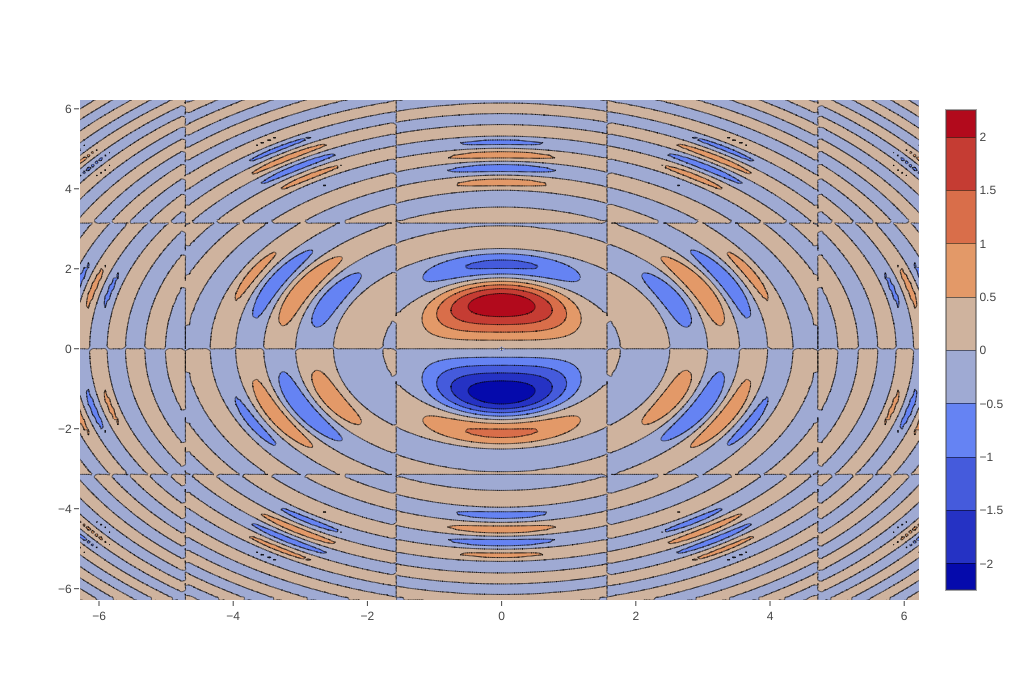 |
| Heatmaps |  |
Contour Plots
The following imports have been used to produce the plots below:
#![allow(unused)] fn main() { use plotly::common::{ColorScale, ColorScalePalette, Title}; use plotly::contour::Contours; use plotly::{Contour, HeatMap, Layout, Plot}; use std::f64::consts::PI; }
The to_inline_html method is used to produce the html plot displayed in this page.
Simple Contour Plot
#![allow(unused)] fn main() { fn simple_contour_plot(show: bool, file_name: &str) { let n = 200; let mut x = Vec::<f64>::new(); let mut y = Vec::<f64>::new(); let mut z: Vec<Vec<f64>> = Vec::new(); for index in 0..n { let value = -2.0 * PI + 4.0 * PI * (index as f64) / (n as f64); x.push(value); y.push(value); } y.iter().take(n).for_each(|y| { let mut row = Vec::<f64>::new(); x.iter().take(n).for_each(|x| { let radius_squared = x.powf(2.0) + y.powf(2.0); let zv = x.sin() * y.cos() * radius_squared.sin() / (radius_squared + 1.0).log10(); row.push(zv); }); z.push(row); }); let trace = Contour::new(x, y, z); let mut plot = Plot::new(); plot.add_trace(trace); let path = write_example_to_html(&plot, file_name); if show { plot.show_html(path); } } }
Colorscale for Contour Plot
#![allow(unused)] fn main() { fn colorscale_for_contour_plot(show: bool, file_name: &str) { let z = vec![ vec![10.0, 10.625, 12.5, 15.625, 20.0], vec![5.625, 6.25, 8.125, 11.25, 15.625], vec![2.5, 3.125, 5., 8.125, 12.5], vec![0.625, 1.25, 3.125, 6.25, 10.625], vec![0.0, 0.625, 2.5, 5.625, 10.0], ]; let trace = Contour::new_z(z).color_scale(ColorScale::Palette(ColorScalePalette::Jet)); let layout = Layout::new().title("Colorscale for Contour Plot"); let mut plot = Plot::new(); plot.set_layout(layout); plot.add_trace(trace); let path = write_example_to_html(&plot, file_name); if show { plot.show_html(path); } } }
Customizing Size and Range of a Contour Plot Contours
#![allow(unused)] fn main() { fn customizing_size_and_range_of_a_contour_plots_contours(show: bool, file_name: &str) { let z = vec![ vec![10.0, 10.625, 12.5, 15.625, 20.0], vec![5.625, 6.25, 8.125, 11.25, 15.625], vec![2.5, 3.125, 5., 8.125, 12.5], vec![0.625, 1.25, 3.125, 6.25, 10.625], vec![0.0, 0.625, 2.5, 5.625, 10.0], ]; let trace = Contour::new_z(z) .color_scale(ColorScale::Palette(ColorScalePalette::Jet)) .auto_contour(false) .contours(Contours::new().start(0.0).end(8.0).size(2.0)); let layout = Layout::new().title("Customizing Size and Range of Contours"); let mut plot = Plot::new(); plot.set_layout(layout); plot.add_trace(trace); let path = write_example_to_html(&plot, file_name); if show { plot.show_html(path); } } }
Customizing Spacing Between X and Y Ticks
#![allow(unused)] fn main() { fn customizing_spacing_between_x_and_y_ticks(show: bool, file_name: &str) { let z = vec![ vec![10.0, 10.625, 12.5, 15.625, 20.0], vec![5.625, 6.25, 8.125, 11.25, 15.625], vec![2.5, 3.125, 5., 8.125, 12.5], vec![0.625, 1.25, 3.125, 6.25, 10.625], vec![0.0, 0.625, 2.5, 5.625, 10.0], ]; let trace = Contour::new_z(z) .color_scale(ColorScale::Palette(ColorScalePalette::Jet)) .dx(10.0) .x0(5.0) .dy(10.0) .y0(10.0); let layout = Layout::new().title("Customizing Size and Range of Contours"); let mut plot = Plot::new(); plot.set_layout(layout); plot.add_trace(trace); let path = write_example_to_html(&plot, file_name); if show { plot.show_html(path); } } }
Heatmaps
The following imports have been used to produce the plots below:
#![allow(unused)] fn main() { use plotly::common::{ColorScale, ColorScalePalette, Title}; use plotly::contour::Contours; use plotly::{Contour, HeatMap, Layout, Plot}; use std::f64::consts::PI; }
The to_inline_html method is used to produce the html plot displayed in this page.
Basic Heatmap
#![allow(unused)] fn main() { fn basic_heat_map(show: bool, file_name: &str) { let z = vec![vec![1, 20, 30], vec![20, 1, 60], vec![30, 60, 1]]; let trace = HeatMap::new_z(z) .zmin(1.0) .zmax(60.0) .hover_info(HoverInfo::Text) .hover_text_matrix(vec![ vec!["A", "B", "C"], vec!["D", "E", "F"], vec!["G", "H", "I"], ]); let mut plot = Plot::new(); plot.add_trace(trace); let path = write_example_to_html(&plot, file_name); if show { plot.show_html(path); } } }
Financial Charts
The source code for the following examples can also be found here.
| Kind | Link |
|---|---|
| Time Series and Date Axes | 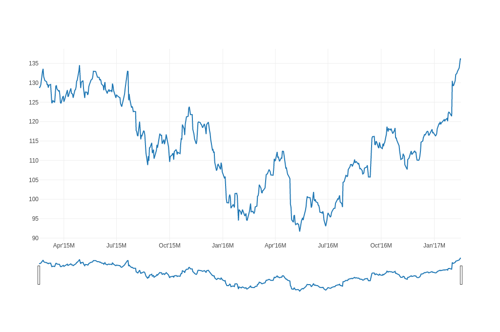 |
| Candlestick Charts | 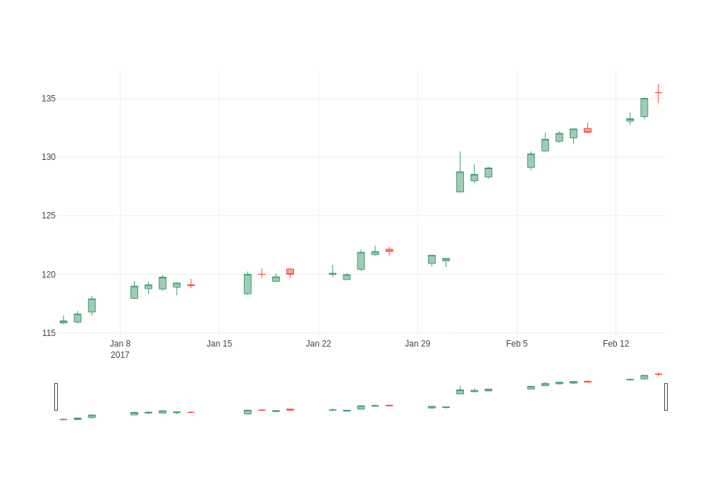 |
| OHLC Charts | 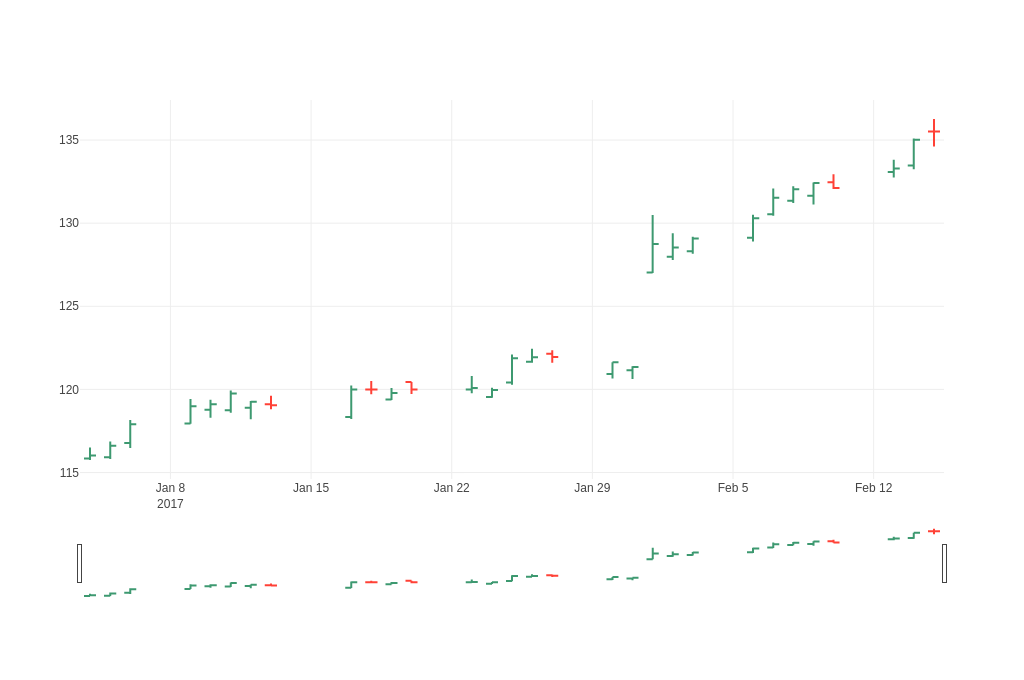 |
| Rangebreaks | 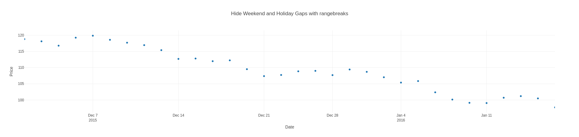 |
Time Series and Date Axes
The following imports have been used to produce the plots below:
#![allow(unused)] fn main() { use plotly::common::{TickFormatStop, Title}; use plotly::layout::{Axis, RangeSelector, RangeSlider, SelectorButton, SelectorStep, StepMode}; use plotly::{Candlestick, Layout, Ohlc, Plot, Scatter}; use serde::Deserialize; use std::env; use std::path::PathBuf; }
The to_inline_html method is used to produce the html plot displayed in this page.
Time Series Plot with Custom Date Range
#![allow(unused)] fn main() { fn time_series_plot_with_custom_date_range(show: bool, file_name: &str) { let data = load_apple_data(); let date: Vec<String> = data.iter().map(|d| d.date.clone()).collect(); let high: Vec<f64> = data.iter().map(|d| d.high).collect(); let trace = Scatter::new(date, high); let mut plot = Plot::new(); plot.add_trace(trace); let layout = Layout::new() .x_axis(Axis::new().range(vec!["2016-07-01", "2016-12-31"])) .title("Manually Set Date Range"); plot.set_layout(layout); let path = write_example_to_html(&plot, file_name); if show { plot.show_html(path); } } }
Time Series with Range Slider
#![allow(unused)] fn main() { fn time_series_with_range_slider(show: bool, file_name: &str) { let data = load_apple_data(); let date: Vec<String> = data.iter().map(|d| d.date.clone()).collect(); let high: Vec<f64> = data.iter().map(|d| d.high).collect(); let trace = Scatter::new(date, high); let mut plot = Plot::new(); plot.add_trace(trace); let layout = Layout::new() .x_axis(Axis::new().range_slider(RangeSlider::new().visible(true))) .title("Manually Set Date Range"); plot.set_layout(layout); let path = write_example_to_html(&plot, file_name); if show { plot.show_html(path); } } }
Time Series with Range Selector Buttons
#![allow(unused)] fn main() { fn time_series_with_range_selector_buttons(show: bool, file_name: &str) { let data = load_apple_data(); let date: Vec<String> = data.iter().map(|d| d.date.clone()).collect(); let high: Vec<f64> = data.iter().map(|d| d.high).collect(); let trace = Scatter::new(date, high); let mut plot = Plot::new(); plot.add_trace(trace); let layout = Layout::new().x_axis( Axis::new() .range_slider(RangeSlider::new().visible(true)) .range_selector(RangeSelector::new().buttons(vec![ SelectorButton::new() .count(1) .label("1m") .step(SelectorStep::Month) .step_mode(StepMode::Backward), SelectorButton::new() .count(6) .label("6m") .step(SelectorStep::Month) .step_mode(StepMode::Backward), SelectorButton::new() .count(1) .label("YTD") .step(SelectorStep::Year) .step_mode(StepMode::ToDate), SelectorButton::new() .count(1) .label("1y") .step(SelectorStep::Year) .step_mode(StepMode::Backward), SelectorButton::new().step(SelectorStep::All), ])), ); plot.set_layout(layout); let path = write_example_to_html(&plot, file_name); if show { plot.show_html(path); } } }
Customizing Tick Label Formatting by Zoom Level
#![allow(unused)] fn main() { fn customizing_tick_label_formatting_by_zoom_level(show: bool, file_name: &str) { let data = load_apple_data(); let date: Vec<String> = data.iter().map(|d| d.date.clone()).collect(); let high: Vec<f64> = data.iter().map(|d| d.high).collect(); let trace = Scatter::new(date, high); let mut plot = Plot::new(); plot.add_trace(trace); let layout = Layout::new().x_axis( Axis::new() .range_slider(RangeSlider::new().visible(true)) .tick_format_stops(vec![ TickFormatStop::new() .dtick_range(vec![0, 1000]) .value("%H:%M:%S.%L ms"), TickFormatStop::new() .dtick_range(vec![1000, 60000]) .value("%H:%M:%S s"), TickFormatStop::new() .dtick_range(vec![60000, 3600000]) .value("%H:%M m"), TickFormatStop::new() .dtick_range(vec![3600000, 86400000]) .value("%H:%M h"), TickFormatStop::new() .dtick_range(vec![86400000, 604800000]) .value("%e. %b d"), TickFormatStop::new() .dtick_range(vec!["M1", "M12"]) .value("%b '%y M"), ]), ); plot.set_layout(layout); let path = write_example_to_html(&plot, file_name); if show { plot.show_html(path); } } }
Candlestick Charts
The following imports have been used to produce the plots below:
#![allow(unused)] fn main() { use plotly::common::{TickFormatStop, Title}; use plotly::layout::{Axis, RangeSelector, RangeSlider, SelectorButton, SelectorStep, StepMode}; use plotly::{Candlestick, Layout, Ohlc, Plot, Scatter}; use serde::Deserialize; use std::env; use std::path::PathBuf; }
The to_inline_html method is used to produce the html plot displayed in this page.
Simple Candlestick Chart
#![allow(unused)] fn main() { fn simple_candlestick_chart(show: bool, file_name: &str) { let x = vec![ "2017-01-04", "2017-01-05", "2017-01-06", "2017-01-09", "2017-01-10", "2017-01-11", "2017-01-12", "2017-01-13", "2017-01-17", "2017-01-18", "2017-01-19", "2017-01-20", "2017-01-23", "2017-01-24", "2017-01-25", "2017-01-26", "2017-01-27", "2017-01-30", "2017-01-31", "2017-02-01", "2017-02-02", "2017-02-03", "2017-02-06", "2017-02-07", "2017-02-08", "2017-02-09", "2017-02-10", "2017-02-13", "2017-02-14", "2017-02-15", ]; let open = vec![ 115.849998, 115.919998, 116.779999, 117.949997, 118.769997, 118.739998, 118.900002, 119.110001, 118.339996, 120.0, 119.400002, 120.449997, 120.0, 119.550003, 120.419998, 121.669998, 122.139999, 120.93, 121.150002, 127.029999, 127.980003, 128.309998, 129.130005, 130.539993, 131.350006, 131.649994, 132.460007, 133.080002, 133.470001, 135.520004, ]; let high = vec![ 116.510002, 116.860001, 118.160004, 119.43, 119.379997, 119.93, 119.300003, 119.620003, 120.239998, 120.5, 120.089996, 120.449997, 120.809998, 120.099998, 122.099998, 122.440002, 122.349998, 121.629997, 121.389999, 130.490005, 129.389999, 129.190002, 130.5, 132.089996, 132.220001, 132.449997, 132.940002, 133.820007, 135.089996, 136.270004, ]; let low = vec![ 115.75, 115.809998, 116.470001, 117.940002, 118.300003, 118.599998, 118.209999, 118.809998, 118.220001, 119.709999, 119.370003, 119.730003, 119.769997, 119.5, 120.279999, 121.599998, 121.599998, 120.660004, 120.620003, 127.010002, 127.779999, 128.160004, 128.899994, 130.449997, 131.220001, 131.119995, 132.050003, 132.75, 133.25, 134.619995, ]; let close = vec![ 116.019997, 116.610001, 117.910004, 118.989998, 119.110001, 119.75, 119.25, 119.040001, 120.0, 119.989998, 119.779999, 120.0, 120.080002, 119.970001, 121.879997, 121.940002, 121.949997, 121.629997, 121.349998, 128.75, 128.529999, 129.080002, 130.289993, 131.529999, 132.039993, 132.419998, 132.119995, 133.289993, 135.020004, 135.509995, ]; let trace1 = Candlestick::new(x, open, high, low, close); let mut plot = Plot::new(); plot.add_trace(trace1); let path = write_example_to_html(&plot, file_name); if show { plot.show_html(path); } } }
OHLC Charts
The following imports have been used to produce the plots below:
#![allow(unused)] fn main() { use plotly::common::{TickFormatStop, Title}; use plotly::layout::{Axis, RangeSelector, RangeSlider, SelectorButton, SelectorStep, StepMode}; use plotly::{Candlestick, Layout, Ohlc, Plot, Scatter}; use serde::Deserialize; use std::env; use std::path::PathBuf; }
The to_inline_html method is used to produce the html plot displayed in this page.
Simple OHLC Chart
#![allow(unused)] fn main() { fn simple_ohlc_chart(show: bool, file_name: &str) { let x = vec![ "2017-01-04", "2017-01-05", "2017-01-06", "2017-01-09", "2017-01-10", "2017-01-11", "2017-01-12", "2017-01-13", "2017-01-17", "2017-01-18", "2017-01-19", "2017-01-20", "2017-01-23", "2017-01-24", "2017-01-25", "2017-01-26", "2017-01-27", "2017-01-30", "2017-01-31", "2017-02-01", "2017-02-02", "2017-02-03", "2017-02-06", "2017-02-07", "2017-02-08", "2017-02-09", "2017-02-10", "2017-02-13", "2017-02-14", "2017-02-15", ]; let open = vec![ 115.849998, 115.919998, 116.779999, 117.949997, 118.769997, 118.739998, 118.900002, 119.110001, 118.339996, 120.0, 119.400002, 120.449997, 120.0, 119.550003, 120.419998, 121.669998, 122.139999, 120.93, 121.150002, 127.029999, 127.980003, 128.309998, 129.130005, 130.539993, 131.350006, 131.649994, 132.460007, 133.080002, 133.470001, 135.520004, ]; let high = vec![ 116.510002, 116.860001, 118.160004, 119.43, 119.379997, 119.93, 119.300003, 119.620003, 120.239998, 120.5, 120.089996, 120.449997, 120.809998, 120.099998, 122.099998, 122.440002, 122.349998, 121.629997, 121.389999, 130.490005, 129.389999, 129.190002, 130.5, 132.089996, 132.220001, 132.449997, 132.940002, 133.820007, 135.089996, 136.270004, ]; let low = vec![ 115.75, 115.809998, 116.470001, 117.940002, 118.300003, 118.599998, 118.209999, 118.809998, 118.220001, 119.709999, 119.370003, 119.730003, 119.769997, 119.5, 120.279999, 121.599998, 121.599998, 120.660004, 120.620003, 127.010002, 127.779999, 128.160004, 128.899994, 130.449997, 131.220001, 131.119995, 132.050003, 132.75, 133.25, 134.619995, ]; let close = vec![ 116.019997, 116.610001, 117.910004, 118.989998, 119.110001, 119.75, 119.25, 119.040001, 120.0, 119.989998, 119.779999, 120.0, 120.080002, 119.970001, 121.879997, 121.940002, 121.949997, 121.629997, 121.349998, 128.75, 128.529999, 129.080002, 130.289993, 131.529999, 132.039993, 132.419998, 132.119995, 133.289993, 135.020004, 135.509995, ]; let trace1 = Ohlc::new(x, open, high, low, close); let mut plot = Plot::new(); plot.add_trace(trace1); let path = write_example_to_html(&plot, file_name); if show { plot.show_html(path); } } }
Rangebreaks
The following imports have been used to produce the plots below:
#![allow(unused)] fn main() { use plotly::common::{Mode, Title}; use plotly::layout::{Axis, RangeBreak}; use plotly::{Layout, Plot, Scatter}; use chrono::{DateTime, Duration}; use rand::{Rng, SeedableRng}; use rand_chacha::ChaCha8Rng; }
The to_inline_html method is used to produce the html plot displayed in this page.
Series with Weekend and Holiday Gaps
#![allow(unused)] fn main() { fn series_with_gaps_for_weekends_and_holidays(show: bool, file_name: &str) { let data = load_apple_data(); // Filter data for the specific date range as in the Python example let filtered_data: Vec<&FinData> = data .iter() .filter(|d| d.date.as_str() >= "2015-12-01" && d.date.as_str() <= "2016-01-15") .collect(); let date: Vec<String> = filtered_data.iter().map(|d| d.date.clone()).collect(); let high: Vec<f64> = filtered_data.iter().map(|d| d.high).collect(); let trace = Scatter::new(date, high).mode(plotly::common::Mode::Markers); let mut plot = Plot::new(); plot.add_trace(trace); let layout = Layout::new() .title("Series with Weekend and Holiday Gaps") .x_axis( Axis::new() .range(vec!["2015-12-01", "2016-01-15"]) .title("Date"), ) .y_axis(Axis::new().title("Price")); plot.set_layout(layout); let path = write_example_to_html(&plot, file_name); if show { plot.show_html(path); } } }
Hiding Weekend and Holiday Gaps with Rangebreaks
#![allow(unused)] fn main() { fn hiding_weekends_and_holidays_with_rangebreaks(show: bool, file_name: &str) { let data = load_apple_data(); // Filter data for the specific date range as in the Python example let filtered_data: Vec<&FinData> = data .iter() .filter(|d| d.date.as_str() >= "2015-12-01" && d.date.as_str() <= "2016-01-15") .collect(); let date: Vec<String> = filtered_data.iter().map(|d| d.date.clone()).collect(); let high: Vec<f64> = filtered_data.iter().map(|d| d.high).collect(); let trace = Scatter::new(date, high).mode(plotly::common::Mode::Markers); let mut plot = Plot::new(); plot.add_trace(trace); let layout = Layout::new() .title("Hide Weekend and Holiday Gaps with rangebreaks") .x_axis( Axis::new() .range(vec!["2015-12-01", "2016-01-15"]) .title("Date") .range_breaks(vec![ plotly::layout::RangeBreak::new() .bounds("sat", "mon"), // hide weekends plotly::layout::RangeBreak::new() .values(vec!["2015-12-25", "2016-01-01"]), // hide Christmas and New Year's ]), ) .y_axis(Axis::new().title("Price")); plot.set_layout(layout); let path = write_example_to_html(&plot, file_name); if show { plot.show_html(path); } } }
Series with Non-Business Hours Gaps
#![allow(unused)] fn main() { fn series_with_non_business_hours_gaps(show: bool, file_name: &str) { use chrono::NaiveDateTime; use chrono::Timelike; let (dates, all_values) = generate_business_hours_data(); let mut values = Vec::with_capacity(all_values.len()); for (date_str, v) in dates.iter().zip(all_values.iter()) { // Parse the date string to extract hour // Format is "2020-03-02 09:00:00" if let Ok(datetime) = NaiveDateTime::parse_from_str(date_str, "%Y-%m-%d %H:%M:%S") { let hour = datetime.hour(); if (9..17).contains(&hour) { values.push(*v); } else { values.push(f64::NAN); } } else { values.push(f64::NAN); } } let trace = Scatter::new(dates, values).mode(plotly::common::Mode::Markers); let mut plot = Plot::new(); plot.add_trace(trace); let layout = Layout::new() .title("Series with Non-Business Hour Gaps") .x_axis(Axis::new().title("Time").tick_format("%b %d, %Y %H:%M")) .y_axis(Axis::new().title("Value")); plot.set_layout(layout); let path = write_example_to_html(&plot, file_name); if show { plot.show_html(path); } } }
Hiding Non-Business Hours Gaps with Rangebreaks
#![allow(unused)] fn main() { fn hiding_non_business_hours_with_rangebreaks(show: bool, file_name: &str) { let (dates, values) = generate_business_hours_data(); let trace = Scatter::new(dates, values).mode(plotly::common::Mode::Markers); let mut plot = Plot::new(); plot.add_trace(trace); let layout = Layout::new() .title("Hide Non-Business Hour Gaps with rangebreaks") .x_axis( Axis::new() .title("Time") .tick_format("%b %d, %Y %H:%M") .range_breaks(vec![ plotly::layout::RangeBreak::new() .bounds(17, 9) .pattern("hour"), // hide hours outside of 9am-5pm ]), ) .y_axis(Axis::new().title("Value")); plot.set_layout(layout); let path = write_example_to_html(&plot, file_name); if show { plot.show_html(path); } } }
3D Charts
The complete source code for the following examples can also be found here.
| Kind | Link |
|---|---|
| Scatter3D |  |
Scatter 3D Charts
The following imports have been used to produce the plots below:
#![allow(unused)] fn main() { use ndarray::Array; use plotly::common::{ ColorScale, ColorScalePalette, DashType, Fill, Font, Line, LineShape, Marker, Mode, Title, }; use plotly::layout::{Axis, BarMode, Layout, Legend, TicksDirection}; use plotly::Sankey; use rand_distr::{Distribution, Normal, Uniform}; }
The to_inline_html method is used to produce the html plot displayed in this page.
Constructing a basic Scatter 3D plot
#![allow(unused)] fn main() { fn simple_scatter3d_plot(show: bool, file_name: &str) { let n: usize = 100; let t: Vec<f64> = Array::linspace(0., 10., n).into_raw_vec_and_offset().0; let y: Vec<f64> = t.iter().map(|x| x.sin()).collect(); let z: Vec<f64> = t.iter().map(|x| x.cos()).collect(); let trace = Scatter3D::new(t, y, z).mode(Mode::Markers); let mut plot = Plot::new(); plot.add_trace(trace); let path = write_example_to_html(&plot, file_name); if show { plot.show_html(path); } } }
Subplots
The complete source code for the following examples can also be found here.
| Kind | Link |
|---|---|
| Subplots | 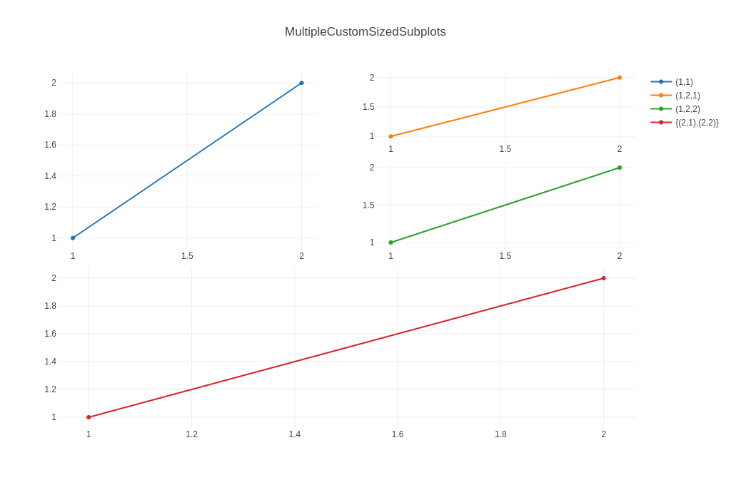 |
| Multiple Axes | 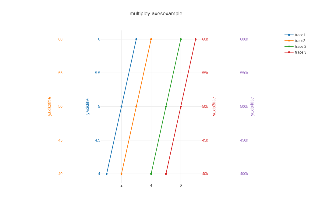 |
Subplots
The following imports have been used to produce the plots below:
#![allow(unused)] fn main() { use plotly::common::{Font, Side, Title}; use plotly::layout::{Axis, GridPattern, Layout, LayoutGrid, Legend, RowOrder}; use plotly::{Plot, Rgb, Scatter}; }
The to_inline_html method is used to produce the html plot displayed in this page.
Simple Subplot
#![allow(unused)] fn main() { fn simple_subplot(show: bool, file_name: &str) { let trace1 = Scatter::new(vec![1, 2, 3], vec![4, 5, 6]).name("trace1"); let trace2 = Scatter::new(vec![20, 30, 40], vec![50, 60, 70]) .name("trace2") .x_axis("x2") .y_axis("y2"); let mut plot = Plot::new(); plot.add_trace(trace1); plot.add_trace(trace2); let layout = Layout::new().grid( LayoutGrid::new() .rows(1) .columns(2) .pattern(GridPattern::Independent), ); plot.set_layout(layout); let path = write_example_to_html(&plot, file_name); if show { plot.show_html(path); } } }
Subplots with Multiple Traces
#![allow(unused)] fn main() { fn subplots_with_multiple_traces(show: bool, file_name: &str) { // Create multiple traces for the first subplot (left side) let trace1 = Scatter::new(vec![1, 2, 3, 4], vec![10, 11, 12, 13]) .name("Line 1") .mode(plotly::common::Mode::LinesMarkers); let trace2 = Scatter::new(vec![1, 2, 3, 4], vec![8, 9, 10, 11]) .name("Line 2") .mode(plotly::common::Mode::LinesMarkers); let trace3 = Scatter::new(vec![1, 2, 3, 4], vec![12, 13, 14, 15]) .name("Line 3") .mode(plotly::common::Mode::LinesMarkers); // Create traces for the second subplot (right side) let trace4 = Scatter::new(vec![1, 2, 3, 4], vec![20, 25, 30, 35]) .name("Dots 1") .x_axis("x2") .y_axis("y2") .mode(plotly::common::Mode::Markers); let trace5 = Scatter::new(vec![1, 2, 3, 4], vec![15, 20, 25, 30]) .name("Dots 2") .x_axis("x2") .y_axis("y2") .mode(plotly::common::Mode::Markers); let mut plot = Plot::new(); // Add traces to first subplot (default axes) plot.add_trace(trace1); plot.add_trace(trace2); plot.add_trace(trace3); // Add traces to second subplot (x2, y2 axes) plot.add_trace(trace4); plot.add_trace(trace5); let layout = Layout::new().title("Subplots with Multiple Traces").grid( LayoutGrid::new() .rows(1) .columns(2) .pattern(GridPattern::Independent), ); plot.set_layout(layout); let path = write_example_to_html(&plot, file_name); if show { plot.show_html(path); } } }
Custom Sized Subplot
#![allow(unused)] fn main() { fn custom_sized_subplot(show: bool, file_name: &str) { let trace1 = Scatter::new(vec![1, 2, 3], vec![4, 5, 6]).name("trace1"); let trace2 = Scatter::new(vec![20, 30, 40], vec![50, 60, 70]) .name("trace2") .x_axis("x2") .y_axis("y2"); let mut plot = Plot::new(); plot.add_trace(trace1); plot.add_trace(trace2); let layout = Layout::new() .x_axis(Axis::new().domain(&[0., 0.7])) .y_axis2(Axis::new().anchor("x2")) .x_axis2(Axis::new().domain(&[0.8, 1.])); plot.set_layout(layout); let path = write_example_to_html(&plot, file_name); if show { plot.show_html(path); } } }
Multiple Subplots
#![allow(unused)] fn main() { fn multiple_subplots(show: bool, file_name: &str) { let trace1 = Scatter::new(vec![1, 2, 3], vec![4, 5, 6]).name("trace1"); let trace2 = Scatter::new(vec![20, 30, 40], vec![50, 60, 70]) .name("trace2") .x_axis("x2") .y_axis("y2"); let trace3 = Scatter::new(vec![300, 400, 500], vec![600, 700, 800]) .x_axis("x3") .y_axis("y3"); let trace4 = Scatter::new(vec![4000, 5000, 6000], vec![7000, 8000, 9000]) .x_axis("x4") .y_axis("y4"); let mut plot = Plot::new(); plot.add_trace(trace1); plot.add_trace(trace2); plot.add_trace(trace3); plot.add_trace(trace4); let layout = Layout::new().grid( LayoutGrid::new() .rows(2) .columns(2) .pattern(GridPattern::Independent), ); plot.set_layout(layout); let path = write_example_to_html(&plot, file_name); if show { plot.show_html(path); } } }
Stacked Subplots
#![allow(unused)] fn main() { fn stacked_subplots(show: bool, file_name: &str) { let trace1 = Scatter::new(vec![0, 1, 2], vec![10, 11, 12]).name("trace1"); let trace2 = Scatter::new(vec![2, 3, 4], vec![100, 110, 120]) .name("trace2") .x_axis("x2") .y_axis("y2"); let trace3 = Scatter::new(vec![3, 4, 5], vec![1000, 1100, 1200]) .x_axis("x3") .y_axis("y3"); let mut plot = Plot::new(); plot.add_trace(trace1); plot.add_trace(trace2); plot.add_trace(trace3); let layout = Layout::new().grid( LayoutGrid::new() .rows(3) .columns(1) .pattern(GridPattern::Independent) .row_order(RowOrder::BottomToTop), ); plot.set_layout(layout); let path = write_example_to_html(&plot, file_name); if show { plot.show_html(path); } } }
Stacked Subplots with Shared X Axis
#![allow(unused)] fn main() { fn stacked_subplots_with_shared_x_axis(show: bool, file_name: &str) { let trace1 = Scatter::new(vec![0, 1, 2], vec![10, 11, 12]).name("trace1"); let trace2 = Scatter::new(vec![2, 3, 4], vec![100, 110, 120]) .name("trace2") .y_axis("y2"); let trace3 = Scatter::new(vec![3, 4, 5], vec![1000, 1100, 1200]).y_axis("y3"); let mut plot = Plot::new(); plot.add_trace(trace1); plot.add_trace(trace2); plot.add_trace(trace3); let layout = Layout::new() .y_axis(Axis::new().domain(&[0., 0.33])) .legend(Legend::new().trace_order(TraceOrder::Reversed)) .y_axis2(Axis::new().domain(&[0.33, 0.66])) .y_axis3(Axis::new().domain(&[0.66, 1.])); plot.set_layout(layout); let path = write_example_to_html(&plot, file_name); if show { plot.show_html(path); } } }
Multiple Custom Sized Subplots
#![allow(unused)] fn main() { fn multiple_custom_sized_subplots(show: bool, file_name: &str) { let trace1 = Scatter::new(vec![1, 2], vec![1, 2]).name("(1,1)"); let trace2 = Scatter::new(vec![1, 2], vec![1, 2]) .name("(1,2,1)") .x_axis("x2") .y_axis("y2"); let trace3 = Scatter::new(vec![1, 2], vec![1, 2]) .name("(1,2,2)") .x_axis("x3") .y_axis("y3"); let trace4 = Scatter::new(vec![1, 2], vec![1, 2]) .name("{(2,1), (2,2)}") .x_axis("x4") .y_axis("y4"); let mut plot = Plot::new(); plot.add_trace(trace1); plot.add_trace(trace2); plot.add_trace(trace3); plot.add_trace(trace4); let layout = Layout::new() .title("Multiple Custom Sized Subplots") .x_axis(Axis::new().domain(&[0., 0.45]).anchor("y1")) .y_axis(Axis::new().domain(&[0.5, 1.]).anchor("x1")) .x_axis2(Axis::new().domain(&[0.55, 1.]).anchor("y2")) .y_axis2(Axis::new().domain(&[0.8, 1.]).anchor("x2")) .x_axis3(Axis::new().domain(&[0.55, 1.]).anchor("y3")) .y_axis3(Axis::new().domain(&[0.5, 0.75]).anchor("x3")) .x_axis4(Axis::new().domain(&[0., 1.]).anchor("y4")) .y_axis4(Axis::new().domain(&[0., 0.45]).anchor("x4")); plot.set_layout(layout); let path = write_example_to_html(&plot, file_name); if show { plot.show_html(path); } } }
Multiple Axes
The following imports have been used to produce the plots below:
#![allow(unused)] fn main() { use plotly::common::{Font, AxisSide, Title}; use plotly::layout::{Axis, GridPattern, Layout, LayoutGrid, Legend, RowOrder}; use plotly::{Plot, Rgb, Scatter}; }
The to_inline_html method is used to produce the html plot displayed in this page.
Two Y Axes
#![allow(unused)] fn main() { fn two_y_axes(show: bool, file_name: &str) { let trace1 = Scatter::new(vec![1, 2, 3], vec![40, 50, 60]).name("trace1"); let trace2 = Scatter::new(vec![2, 3, 4], vec![4, 5, 6]) .name("trace2") .y_axis("y2"); let mut plot = Plot::new(); plot.add_trace(trace1); plot.add_trace(trace2); let layout = Layout::new() .title("Double Y Axis Example") .y_axis(Axis::new().title("yaxis title")) .y_axis2( Axis::new() .title(Title::from("yaxis2 title").font(Font::new().color(Rgb::new(148, 103, 189)))) .tick_font(Font::new().color(Rgb::new(148, 103, 189))) .overlaying("y") .side(AxisSide::Right), ); plot.set_layout(layout); let path = write_example_to_html(&plot, file_name); if show { plot.show_html(path); } } }
Multiple Axes
#![allow(unused)] fn main() { fn multiple_axes(show: bool, file_name: &str) { let trace1 = Scatter::new(vec![1, 2, 3], vec![4, 5, 6]).name("trace1"); let trace2 = Scatter::new(vec![2, 3, 4], vec![40, 50, 60]) .name("trace2") .y_axis("y2"); let trace3 = Scatter::new(vec![4, 5, 6], vec![40_000, 50_000, 60_000]).y_axis("y3"); let trace4 = Scatter::new(vec![5, 6, 7], vec![400_000, 500_000, 600_000]).y_axis("y4"); let mut plot = Plot::new(); plot.add_trace(trace1); plot.add_trace(trace2); plot.add_trace(trace3); plot.add_trace(trace4); let layout = Layout::new() .title("multiple y-axes example") .width(800) .x_axis(Axis::new().domain(&[0.3, 0.7])) .y_axis( Axis::new() .title(Title::from("yaxis title").font(Font::new().color("#1f77b4"))) .tick_font(Font::new().color("#1f77b4")), ) .y_axis2( Axis::new() .title(Title::from("yaxis2 title").font(Font::new().color("#ff7f0e"))) .tick_font(Font::new().color("#ff7f0e")) .anchor("free") .overlaying("y") .side(AxisSide::Left) .position(0.15), ) .y_axis3( Axis::new() .title(Title::from("yaxis3 title").font(Font::new().color("#d62728"))) .tick_font(Font::new().color("#d62728")) .anchor("x") .overlaying("y") .side(AxisSide::Right), ) .y_axis4( Axis::new() .title(Title::from("yaxis4 title").font(Font::new().color("#9467bd"))) .tick_font(Font::new().color("#9467bd")) .anchor("free") .overlaying("y") .side(AxisSide::Right) .position(0.85), ); plot.set_layout(layout); let path = write_example_to_html(&plot, file_name); if show { plot.show_html(path); } } }
Custom Controls
This section covers interactive controls that can be added to plots to modify data or layout attributes dynamically.
| Control Type | Preview |
|---|---|
| Dropdown Menus and Buttons | 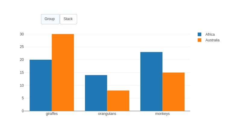 |
| Sliders | 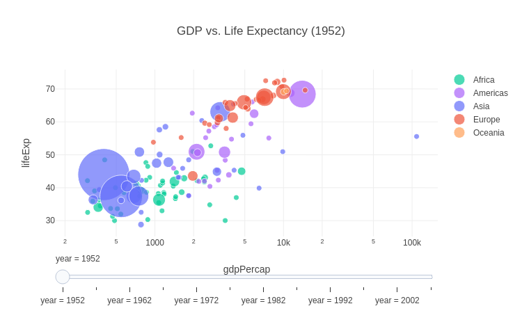 |
| Animations | 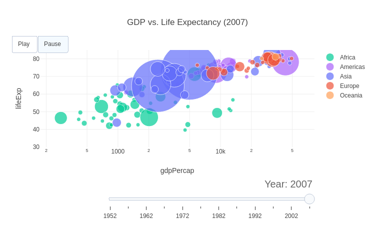 |
Dropdown Menus
Dropdown menus, implemented as an UpdateMenu in Plotly.rs, allow users to modify a plot's data or layout attributes by selecting an option from a list.
Dropdown for Selecting Data
You can use a dropdown menu to switch between different sets of data. In this example, we show two different bar charts and use a dropdown to select which one is visible.
#![allow(unused)] fn main() { /// Display a bar chart with an associated dropdown selector to show different /// data. fn bar_plot_with_dropdown_for_different_data(show: bool, file_name: &str) { type BarType = Bar<&'static str, i32>; let mut plot = Plot::new(); plot.add_trace( BarType::new(vec!["Giraffes", "Orangutans", "Monkeys"], vec![20, 14, 23]).name("Animals"), ); plot.add_trace( BarType::new( vec!["Little Grebes", "Nuthatches", "Firecrests", "Goldfinches"], vec![8, 23, 17, 2], ) .name("Birds") .visible(Visible::False), ); let buttons = vec![ ButtonBuilder::new() .label("Animals") .push_restyle(BarType::modify_visible(vec![Visible::True, Visible::False])) .build() .unwrap(), ButtonBuilder::new() .label("Birds") .push_restyle(BarType::modify_visible(vec![Visible::False, Visible::True])) .build() .unwrap(), ]; plot.set_layout(Layout::new().update_menus(vec![UpdateMenu::new().y(0.8).buttons(buttons)])); let path = write_example_to_html(&plot, file_name); if show { plot.show_html(path); } } }
Dropdown for Modifying Layout
Update menus can also modify layout attributes. Here, we use buttons (a variation of a dropdown) to change the bar_mode of a bar chart, toggling between grouped and stacked bars.
#![allow(unused)] fn main() { /// Display a bar chart, with buttons to toggle between stacked or grouped /// display modes. fn bar_chart_with_modifiable_bar_mode(show: bool, file_name: &str) { type BarType = Bar<&'static str, i32>; let mut plot = Plot::new(); plot.add_trace( BarType::new(vec!["giraffes", "orangutans", "monkeys"], vec![20, 14, 23]).name("Africa"), ); plot.add_trace( BarType::new(vec!["giraffes", "orangutans", "monkeys"], vec![30, 8, 15]).name("Australia"), ); let buttons = vec![("Group", BarMode::Group), ("Stack", BarMode::Stack)] .into_iter() .map(|(label, bar_mode)| { ButtonBuilder::new() .label(label) .push_relayout(Layout::modify_bar_mode(bar_mode)) .build() .unwrap() }) .collect_vec(); plot.set_layout(Layout::new().update_menus(vec![UpdateMenu::new() .x(0.1) .x_anchor(Anchor::Left) .y(1.2) .y_anchor(Anchor::Top) .ty(UpdateMenuType::Buttons) .direction(UpdateMenuDirection::Right) .buttons(buttons)])); let path = write_example_to_html(&plot, file_name); if show { plot.show_html(path); } } }
Dropdown for Modifying Colorscales
You can dynamically change the colorscale of a heatmap or contour plot.
#![allow(unused)] fn main() { /// Display a heat map, with buttons to allow for toggling of different /// colorscales. fn heat_map_with_modifiable_colorscale(show: bool, file_name: &str) { type HeatMapType = HeatMap<f64, f64, Vec<f64>>; let gauss = |v: i32| (-v as f64 * v as f64 / 200.0).exp(); let z = (-30..30) .map(|x| (-30..30).map(|y| gauss(x) * gauss(y)).collect_vec()) .collect_vec(); let trace = HeatMapType::new_z(z).color_scale(ColorScalePalette::Viridis.into()); let mut plot = Plot::new(); plot.add_trace(trace); let buttons = IntoIterator::into_iter([ ("Viridis", ColorScalePalette::Viridis), ("Portland", ColorScalePalette::Portland), ("Blackbody", ColorScalePalette::Blackbody), ]) .map(|(label, palette)| { ButtonBuilder::new() .label(label) .push_restyle(HeatMapType::modify_all_color_scale(palette.into())) .build() .unwrap() }) .collect_vec(); plot.set_layout(Layout::new().update_menus(vec![UpdateMenu::new() .ty(UpdateMenuType::Buttons) .y(0.8) .buttons(buttons)])); let path = write_example_to_html(&plot, file_name); if show { plot.show_html(path); } } }
Sliders
Sliders provide interactive controls to animate through different data states or parameters. They are different from range sliders and are typically used for animating through time series data or changing plot parameters dynamically.
Data sliders support various customization options including:
- Positioning: Control x, y coordinates and anchors
- Styling: Background color, border color, width, and font
- Behavior: Active step highlighting, step execution control
- Dimensions: Length, width, and orientation (horizontal/vertical)
- Steps: Multiple steps with different data states or parameters
Customizing a Simple Data Slider
Sliders are perfect for stepping through sequential data, like time series. This example creates a slider to show the population of different animals for four consecutive years. It shows how to use the slider API to customize slider features.
#![allow(unused)] fn main() { /// Display a bar chart with a data slider to animate through different years, /// showing how to customize the slider. fn bar_chart_with_slider_customization(show: bool, file_name: &str) { type BarType = Bar<&'static str, i32>; let mut plot = Plot::new(); plot.add_trace( BarType::new(vec!["Giraffes", "Orangutans", "Monkeys"], vec![20, 14, 23]) .name("2019") .visible(Visible::True), ); plot.add_trace( BarType::new(vec!["Giraffes", "Orangutans", "Monkeys"], vec![25, 18, 28]) .name("2020") .visible(Visible::False), ); plot.add_trace( BarType::new(vec!["Giraffes", "Orangutans", "Monkeys"], vec![22, 16, 25]) .name("2021") .visible(Visible::False), ); plot.add_trace( BarType::new(vec!["Giraffes", "Orangutans", "Monkeys"], vec![28, 20, 30]) .name("2022") .visible(Visible::False), ); let slider_steps = vec![ SliderStepBuilder::new() .label("2019") .value("2019") .push_restyle(BarType::modify_visible(vec![ Visible::True, Visible::False, Visible::False, Visible::False, ])) .build() .unwrap(), SliderStepBuilder::new() .label("2020") .value("2020") .push_restyle(BarType::modify_visible(vec![ Visible::False, Visible::True, Visible::False, Visible::False, ])) .build() .unwrap(), SliderStepBuilder::new() .label("2021") .value("2021") .push_restyle(BarType::modify_visible(vec![ Visible::False, Visible::False, Visible::True, Visible::False, ])) .build() .unwrap(), SliderStepBuilder::new() .label("2022") .value("2022") .push_restyle(BarType::modify_visible(vec![ Visible::False, Visible::False, Visible::False, Visible::True, ])) .build() .unwrap(), ]; plot.set_layout( Layout::new() .title("Animal Population by Year (Custom Slider Fields)") .sliders(vec![Slider::new() .active(0) .steps(slider_steps) .x(0.2) .x_anchor(Anchor::Left) .y(-0.6) .y_anchor(Anchor::Bottom) .length(0.8) .background_color("#f8fafc") .border_color("#bec8d9") .border_width(2) .tick_color("#e74c3c") .tick_length(15) .tick_width(4) .current_value( SliderCurrentValue::new() .prefix("Year: ") .suffix(" (selected)") .visible(true) .x_anchor(SliderCurrentValueXAnchor::Center) .font(Font::new().size(16).color("#2c3e50")) .offset(5), )]), ); let path = write_example_to_html(&plot, file_name); if show { plot.show_html(path); } } }
Slider for Parameter Control
Sliders aren't just for data; they can also be used to control parameters in a function. Here, a slider modifies the frequency of a sinusoidal wave, updating the plot in real-time.
#![allow(unused)] fn main() { // Sinusoidal Wave with Slider Control fn sinusoidal_slider_example(show: bool, file_name: &str) { use ndarray::Array; let mut plot = Plot::new(); let num_steps = 51; // 0..=50 for frequencies 0.0 to 5.0 in 0.1 steps // Add traces, one for each slider step (frequency parameter) for step in 0..=num_steps { let frequency = step as f64 / 10.0; // 0.0, 0.1, ..., 5.0 let x: Vec<f64> = Array::linspace(0.0, 10.0, 1001).into_raw_vec().to_vec(); let y: Vec<f64> = x.iter().map(|&x_val| (frequency * x_val).sin()).collect(); let trace = Scatter::new(x, y) .visible(if step == 10 { Visible::True } else { Visible::False }) // Make 10th trace visible .line(plotly::common::Line::new().color("#00CED1").width(6.0)) .name(format!("ν = {frequency:.1}")); plot.add_trace(trace); } // Create slider steps let mut steps = Vec::new(); for i in 0..num_steps { let frequency = i as f64 / 10.0; let mut visible = vec![Visible::False; num_steps]; visible[i] = Visible::True; let step = SliderStepBuilder::new() .label(format!("step-{i}")) .value(format!("{frequency:.1}")) .push_restyle(Scatter::<f64, f64>::modify_visible(visible)) .push_relayout(Layout::modify_title(format!( "Slider switched to step: {i}" ))) .build() .unwrap(); steps.push(step); } let layout = Layout::new() .title(Title::with_text("Simple Slider Control")) .sliders(vec![Slider::new() .active(10) .pad(Pad::new(50, 0, 0)) .steps(steps)]); plot.set_layout(layout); let path = write_example_to_html(&plot, file_name); if show { plot.show_html(path); } } }
Advanced Slider: GDP vs. Life Expectancy
This example, based on the Python Plotly Gapminder dataset, demonstrates a more complex use case. A slider is used to animate a bubble chart showing the relationship between GDP per capita and life expectancy across different continents over several decades. See https://plotly.com/python/sliders/
#![allow(unused)] fn main() { // GDP per Capita/Life Expectancy Slider (matches second plot in https://plotly.com/python/sliders/) fn gdp_life_expectancy_slider_example(show: bool, file_name: &str) { let data = load_gapminder_data(); // Get unique years and sort them let years: Vec<i32> = data .iter() .map(|d| d.year) .collect::<std::collections::HashSet<_>>() .into_iter() .sorted() .collect(); // Create color mapping for continents to match the Python plotly example let continent_colors = HashMap::from([ ("Asia".to_string(), "rgb(99, 110, 250)"), ("Europe".to_string(), "rgb(239, 85, 59)"), ("Africa".to_string(), "rgb(0, 204, 150)"), ("Americas".to_string(), "rgb(171, 99, 250)"), ("Oceania".to_string(), "rgb(255, 161, 90)"), ]); let continents: Vec<String> = continent_colors.keys().cloned().sorted().collect(); let mut plot = Plot::new(); // Create a trace for each continent for each year for &year in &years { for continent in &continents { let records: Vec<&GapminderData> = data .iter() .filter(|d| d.continent == *continent && d.year == year) .collect(); if !records.is_empty() { let x: Vec<f64> = records.iter().map(|r| r.gdp_per_cap).collect(); let y: Vec<f64> = records.iter().map(|r| r.life_exp).collect(); let size: Vec<f64> = records.iter().map(|r| r.pop).collect(); let hover: Vec<String> = records.iter().map(|r| r.country.clone()).collect(); let trace = Scatter::new(x, y) .name(continent) .mode(Mode::Markers) .hover_text_array(hover) .visible(if year == years[0] { Visible::True } else { Visible::False }) .marker( plotly::common::Marker::new() .color(*continent_colors.get(continent).unwrap()) .size_array(size.into_iter().map(|s| s as usize).collect()) .size_mode(plotly::common::SizeMode::Area) .size_ref(200000) .size_min(4), ); plot.add_trace(trace); } } } // Create slider steps for each year let steps: Vec<SliderStep> = years .iter() .enumerate() .map(|(i, &year)| { let mut visible = vec![Visible::False; years.len() * continents.len()]; let start = i * continents.len(); let end = start + continents.len(); visible[start..end].fill(Visible::True); SliderStepBuilder::new() .label(year.to_string()) .value(year) .push_restyle(Scatter::<f64, f64>::modify_visible(visible)) .push_relayout(Layout::modify_title(format!( "GDP vs. Life Expectancy ({year})" ))) .build() .unwrap() }) .collect(); let layout = Layout::new() .title(Title::with_text(format!( "GDP vs. Life Expectancy ({})", years[0] ))) .x_axis( Axis::new() .title(Title::with_text("gdpPercap")) .type_(plotly::layout::AxisType::Log), ) .y_axis( Axis::new() .title(Title::with_text("lifeExp")) .range(vec![30.0, 85.0]), // Fixed range for Life Expectancy ) .sliders(vec![Slider::new().active(0).steps(steps).current_value( SliderCurrentValue::new() .visible(true) .prefix("Year: ") .x_anchor(SliderCurrentValueXAnchor::Right) .font(Font::new().size(20).color("rgb(102, 102, 102)")), )]); plot.set_layout(layout); let path = write_example_to_html(&plot, file_name); if show { plot.show_html(path); } } }
Animations
Animations in Plotly.rs allow you to create dynamic, interactive visualizations that can play through different data states over time.
GDP vs. Life Expectancy Animation
This example demonstrates an animation based on the Gapminder dataset, showing the relationship between GDP per capita and life expectancy across different continents over several decades. The animation is based on the JavaScript example https://plotly.com/javascript/gapminder-example/ and shows how to create buttons and sliders that interact with the animation mechanism.
#![allow(unused)] fn main() { // GDP per Capita/Life Expectancy Animation (animated version of the slider // example) fn gdp_life_expectancy_animation_example(show: bool, file_name: &str) { use plotly::{ common::Font, common::Pad, common::Title, layout::Axis, layout::{ update_menu::{ButtonBuilder, UpdateMenu, UpdateMenuDirection, UpdateMenuType}, Animation, AnimationMode, Frame, FrameSettings, Slider, SliderCurrentValue, SliderCurrentValueXAnchor, SliderStepBuilder, TransitionSettings, }, Layout, Plot, Scatter, }; let data = load_gapminder_data(); // Get unique years and sort them let years: Vec<i32> = data .iter() .map(|d| d.year) .collect::<std::collections::HashSet<_>>() .into_iter() .sorted() .collect(); // Create color mapping for continents to match the Python plotly example let continent_colors = HashMap::from([ ("Asia".to_string(), "rgb(99, 110, 250)"), ("Europe".to_string(), "rgb(239, 85, 59)"), ("Africa".to_string(), "rgb(0, 204, 150)"), ("Americas".to_string(), "rgb(171, 99, 250)"), ("Oceania".to_string(), "rgb(255, 161, 90)"), ]); let continents: Vec<String> = continent_colors.keys().cloned().sorted().collect(); let mut plot = Plot::new(); let mut initial_traces = Vec::new(); for (frame_index, &year) in years.iter().enumerate() { let mut frame_traces = plotly::Traces::new(); for continent in &continents { let records: Vec<&GapminderData> = data .iter() .filter(|d| d.continent == *continent && d.year == year) .collect(); if !records.is_empty() { let x: Vec<f64> = records.iter().map(|r| r.gdp_per_cap).collect(); let y: Vec<f64> = records.iter().map(|r| r.life_exp).collect(); let size: Vec<f64> = records.iter().map(|r| r.pop).collect(); let hover: Vec<String> = records.iter().map(|r| r.country.clone()).collect(); let trace = Scatter::new(x, y) .name(continent) .mode(Mode::Markers) .hover_text_array(hover) .marker( plotly::common::Marker::new() .color(*continent_colors.get(continent).unwrap()) .size_array(size.into_iter().map(|s| s as usize).collect()) .size_mode(plotly::common::SizeMode::Area) .size_ref(200000) .size_min(4), ); frame_traces.push(trace.clone()); // Store traces from first year for initial plot if frame_index == 0 { initial_traces.push(trace); } } } // Create layout for this frame let frame_layout = Layout::new() .title(Title::with_text(format!( "GDP vs. Life Expectancy ({year})" ))) .x_axis( Axis::new() .title(Title::with_text("gdpPercap")) .type_(plotly::layout::AxisType::Log), ) .y_axis( Axis::new() .title(Title::with_text("lifeExp")) .range(vec![30.0, 85.0]), // Fixed range for Life Expectancy ); // Add frame with all traces for this year plot.add_frame( Frame::new() .name(format!("frame{frame_index}")) .data(frame_traces) .layout(frame_layout), ); } // Add initial traces to the plot (all traces from first year) for trace in initial_traces { plot.add_trace(trace); } // Create animation configuration for playing all frames let play_animation = Animation::all_frames().options( AnimationOptions::new() .mode(AnimationMode::Immediate) .frame(FrameSettings::new().duration(500).redraw(false)) .transition(TransitionSettings::new().duration(300)) .fromcurrent(true), ); let play_button = ButtonBuilder::new() .label("Play") .animation(play_animation) .build() .unwrap(); let pause_animation = Animation::pause(); let pause_button = ButtonBuilder::new() .label("Pause") .animation(pause_animation) .build() .unwrap(); let updatemenu = UpdateMenu::new() .ty(UpdateMenuType::Buttons) .direction(UpdateMenuDirection::Right) .buttons(vec![play_button, pause_button]) .x(0.1) .y(1.15) .show_active(true) .visible(true); // Create slider steps for each year let mut slider_steps = Vec::new(); for (i, &year) in years.iter().enumerate() { let frame_animation = Animation::frames(vec![format!("frame{}", i)]).options( AnimationOptions::new() .mode(AnimationMode::Immediate) .frame(FrameSettings::new().duration(300).redraw(false)) .transition(TransitionSettings::new().duration(300)), ); let step = SliderStepBuilder::new() .label(year.to_string()) .value(year) .animation(frame_animation) .build() .unwrap(); slider_steps.push(step); } let slider = Slider::new() .pad(Pad::new(55, 0, 130)) .current_value( SliderCurrentValue::new() .visible(true) .prefix("Year: ") .x_anchor(SliderCurrentValueXAnchor::Right) .font(Font::new().size(20).color("rgb(102, 102, 102)")), ) .steps(slider_steps); // Set the layout with initial title, buttons, and slider let layout = Layout::new() .title(Title::with_text(format!( "GDP vs. Life Expectancy ({}) - Click 'Play' to animate", years[0] ))) .x_axis( Axis::new() .title(Title::with_text("gdpPercap")) .type_(plotly::layout::AxisType::Log), ) .y_axis( Axis::new() .title(Title::with_text("lifeExp")) .range(vec![30.0, 85.0]), // Fixed range for Life Expectancy ) .update_menus(vec![updatemenu]) .sliders(vec![slider]); plot.set_layout(layout); let path = write_example_to_html(&plot, file_name); if show { plot.show_html(path); } } }